ISAAK LIEN
UI DESIGN & VISUAL SYSTEMS
Hands-on UI designer and art director creating polished interfaces, scalable visual systems, and production-ready assets for complex interactive products.


3. Supports rapid decision‑making
One‑tap resource assignment
Clear prioritization of threats
Intelligent recommendations (e.g., “Air tanker ETA too long—suggest rerouting Helicopter 3”)
Alert hierarchy that prevents overload
Project Intro:
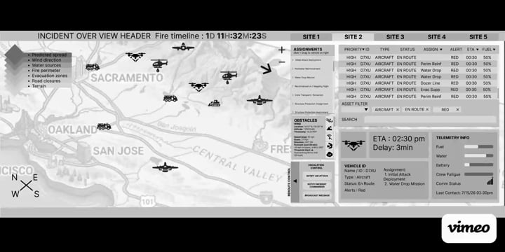
Designed as a desktop command-and-control interface for operators coordinating multiple aerial and ground assets during a fast-moving wildfire incident. The interface prioritizes rapid scanning, clear status hierarchy, and persistent operational context, allowing users to move from incident-level awareness to a specific asset, alert, or assignment without losing sight of the broader response.
Reusable interface patterns, layered information, and explicit status cues help keep high-density operational data coherent as incident complexity increases.
UX Challenge
Create a UI/UX solution that:
1. Unifies all asset data
Real‑time aircraft telemetry
Ground vehicle GPS + crew status
Fuel levels, water capacity, ETA, availability
Mission assignments
2. Visualizes fire behavior clearly
Live perimeter
Predicted spread
Wind direction
Terrain constraints
Evacuation zones
4. Reduces cognitive load
Simplified information architecture
Progressive disclosure
Clear status indicators
Operator‑friendly color coding (avoiding red/green for color‑blind users)
Pain Points
“I can’t see aircraft and ground crew status in one place.”
“I lose track of which units are already assigned.”
“Wind changes aren’t obvious; I have to dig for them.”
“I’m constantly switching between maps, radios, and spreadsheets.”
“I need a way to quickly compare ETAs and capacities.”
“Alerts come in too fast, I can’t tell what’s actually critical.”


WILDFIRE INCIDENT COMMAND UI
Multi-Asset Command & Control UI Concept
Independent concept — no client or classified information.
UX Wireframing & Rationale: The main challenge was researching domain-specific operational details (such as vehicle classifications, active obstacles, resource allocation, and real-time telemetry) and structuring them into an intuitive layout. I prioritized the primary vehicle list and active task queue at the top of the interface to give coordinators immediate visibility over critical data, while placing detailed vehicle cards lower on the dashboard to maintain a clean visual hierarchy.
Final Design
HARDWARE: While dual-monitor setups are practical, designing for an ultra-wide curved display creates a seamless, continuous workspace without bezel interruptions -ideal for high-density command-and-control monitoring.


DESIGN PRINCIPLES
Rapid Scanning
Prioritize clear visual hierarchy so critical status, assignments, and asset health can be recognized quickly.
Persistent Context
Preserve incident-level awareness while allowing deeper inspection of individual assets and alerts.
Controlled Density
Organize high volumes of information through grouping, spacing, typography, and progressive disclosure rather than visual simplification alone.
Purposeful Visual Identity
Use contrast, typography, and restrained visual accents to create a distinctive interface without competing with operational information.


INTERACTIVE MICRO-INTERACTIONS PROTOTYPING : utilizing Figma protoyping tools to create some of the micro-interaction functionalities:
Assigning tasks : Drag and drop tasks from the assignment queue directly onto target vehicles.
Rerouting control: Expand the side panel to adjust routes and manage navigation in real time.
Case Study:
Wildfires in California are becoming larger, faster, and more unpredictable. During active incidents, a Wildfire Response Coordinator (WRC) sits inside a mobile command vehicle and manages:
Aerial assets — helicopters, air tankers, drones
Ground assets — engines, bulldozers, hand crews, tenders
Environmental data — wind shifts, terrain, fire spread models
Communications — dispatch, pilots, crew supervisors, CAL FIRE, USFS
The WRC currently uses five separate systems that do not talk to each other. This creates delays, miscommunication, and dangerous blind spots.
DESIGN COMPONENT SYSTEM : Rules regarding font size, type face, color palettes, shape language, button styles, used for consistency to scale this layout.

RAPID UX PROTOTYPING IN FIGMA
Innovated the UX for multi-table Baccarat gameplay by streamlining trend-board navigation to maximize betting velocity. Architected the core logic for board customization, expansion state UI, gesture-based scrolling, and dynamic board additions to ensure a seamless multi-board experience.
Developed initial UX concepts and interactive Figma prototypes for an immersive virtual pit experience. Designed end-to-end user flows for lobby entry with personalized avatars, rapid table transitions, and real-time 3D previews for each game mode.


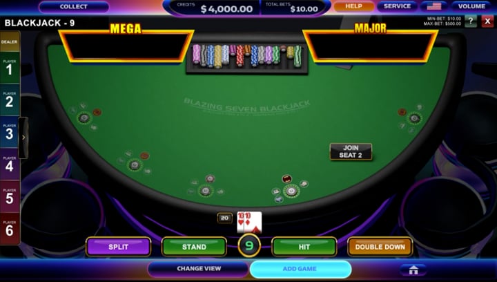
OBSIDIAN UI V2
BRAND IDENTY INCORPORATION
The existing UI lacked a distinct brand identity. To resolve this, I explored color palettes aligned with Light & Wonder’s branding, leveraging theatrical show lights to evoke a sense of wonder. By contrasting warm lighting effects against deep blue surfaces during key interactions—such as credit rollups during wins—I introduced visual novelty that sets the UI apart from competitors and strengthens brand recognition.


COOKIE JAM
Live-Ops UI Production & Visual Systems
High-volume live-ops production required frequent visual iteration while maintaining consistency across an established game interface. These examples show controlled variation in headers, boosters, color treatments, and icon families while preserving hierarchy and recognizability
Prioritize:
header variants
color/booster variant grids
bomb and line-breaker families
icon families


VFX ANIMATION DESIGN EXPLORATION
SPLASH SCREEN DESIGN
Select and arrange in-game assets that align with the monthly theme to build a balanced, compelling composition.
Design custom supporting elements, including targeted glows, visual effects, and hand-painted assets.
Develop a seamless background pattern and a summer-inspired color palette that preserve overall stylistic consistency.
SELECTED VISUAL CRAFT
Selected illustration and art-direction work demonstrating visual range beyond interface design.


UI and Icon graphics I created to mockup a casino mobile game. I named it Triton Splash just to throw it some more oceanic greek mythology thematics.
TRITON SPLASH


ISHTAR + BLAZING DEMIGOD iGAMING SLOTS
Explored end-to-end iGaming slot concepts and also creating the UI for them using a combination of AI prompting and photoshop editing.
MOBILE GAME UI
Hands-on UI designer creating polished mobile game interfaces, scalable visual systems, and production-ready assets for fun casual interactive games.
JELLY SMASHERS
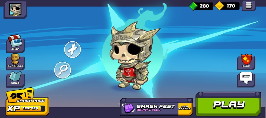
Building on an earlier character-art exploration, I developed a UI concept that extends the same yet contrasting visual language across currency displays, game modes, navigation, and supporting interface elements. The goal was to keep the experience playful and visually cohesive while maintaining clear hierarchy and readability.
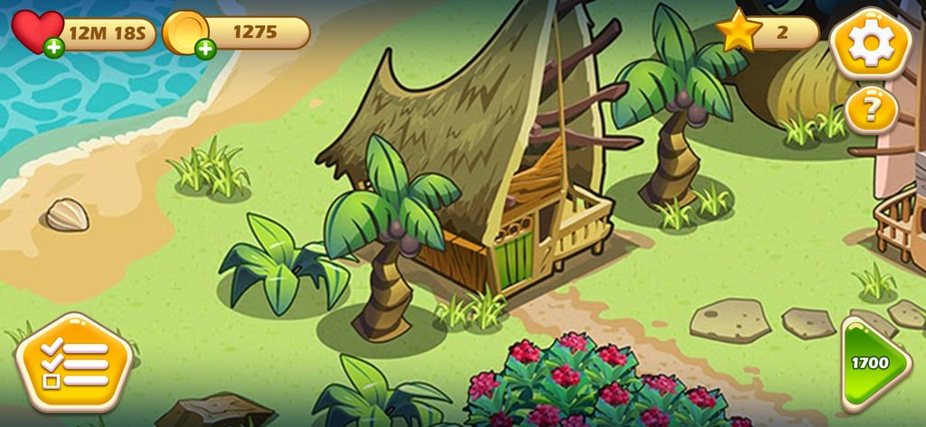
BEGENEROUS
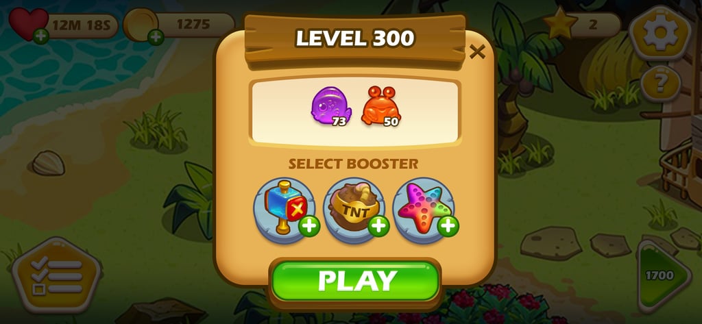
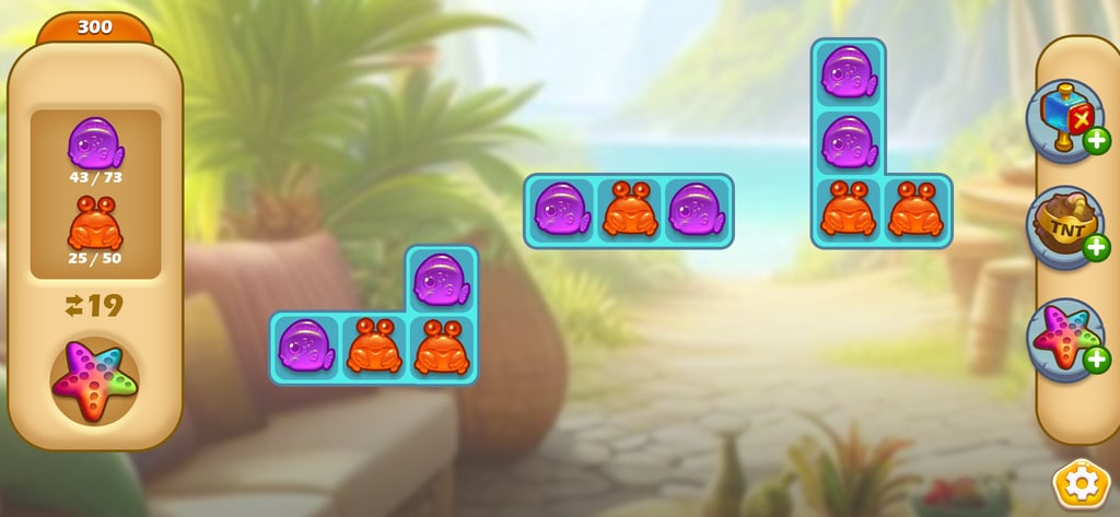
This is a game mockup I created for this never-released game called, Begenerous. The point of the game was to clean up the environment and build a beautiful island resort village. I thought it would be cool if I built a UI around it being more a match 3 builder game like homescapes. Here are some UI elements I created. I tried to keep everything a bit softer and more relaxing looking to match the Tropical Island Vibe.
GREEKVILLE
UI I created for a Greekville game pitch I did in the past while at Kung Fu Factory.


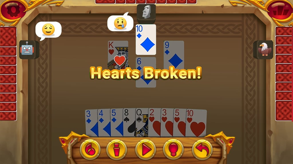
HEARTS UI REDESIGN
I tried to take one of the card games from mobilityware to add a bit of fantasy thematic. I would have added some characters or repainted some of the emojis and avatars to make them more exciting if I had more time.
Director
Explore Isaak's impressive art director and art portfolio pieces.
About me
isaaklien@gmail.com
626.592.0697
© 2024. All rights reserved.