ART DIRECTOR PORTFOLIO
Showcasing my creative vision and artistic talent through a curated collection of work.
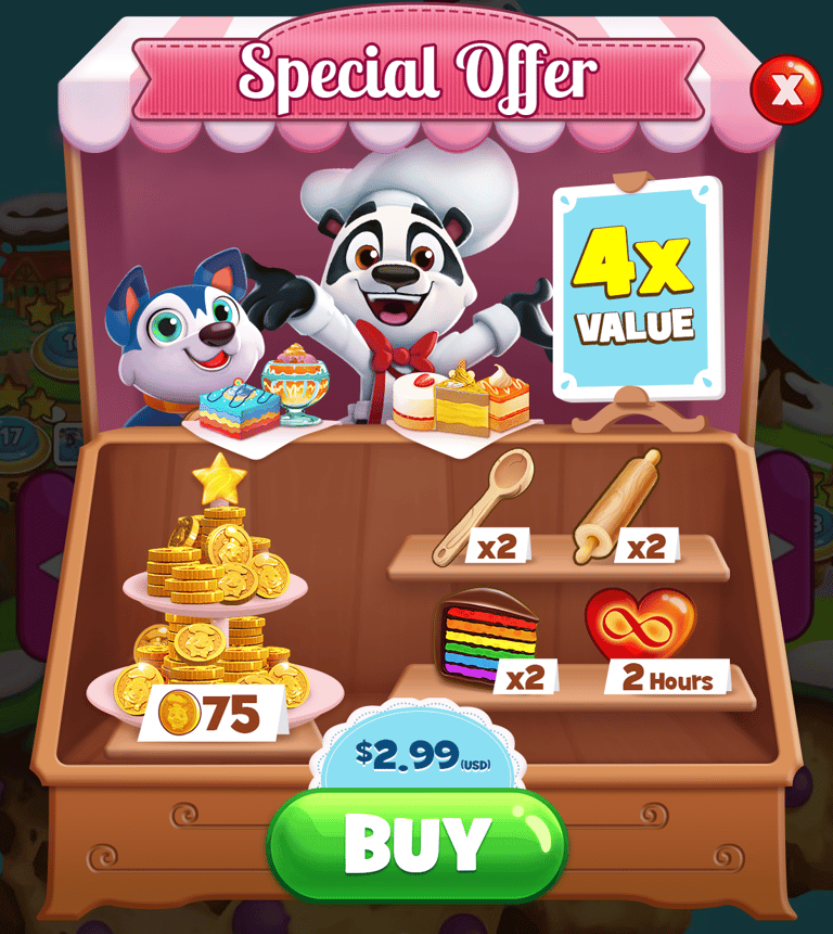
CASINO GAMES
Due to the multi-year development and rollout pipelines typical of enterprise gaming products, a significant portion of my recent portfolio remains under NDA. The case studies featured below represent a curated selection of publicly released titles and platforms.


Logo Animation Direction:
The Brief: Establish a unique, fast-paced, "next-gen" animation language that enhances brand impact and progressive linking nature.
The Focus: Drive intentional kinetic movement through the central 'X' to maximize brand recall on the casino floor.
The Collaboration: Partnered closely with the Senior Animator, providing direction that translated abstract brand concepts into a dynamic, polished final asset.
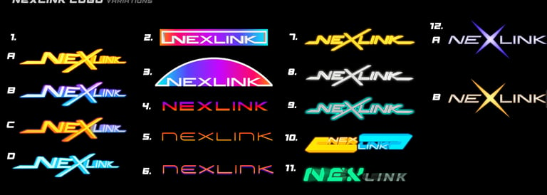
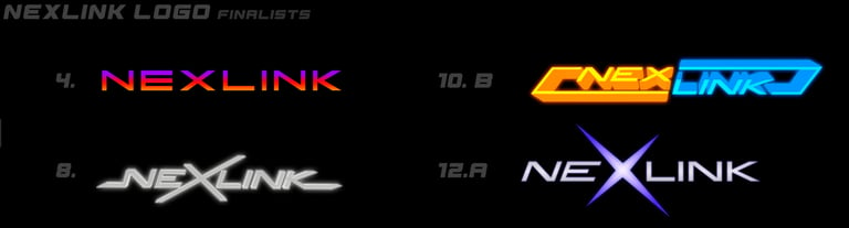
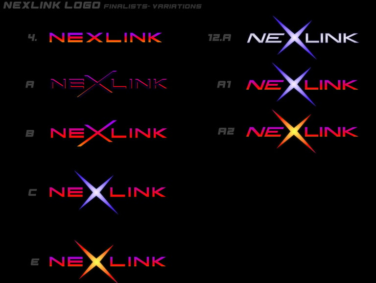
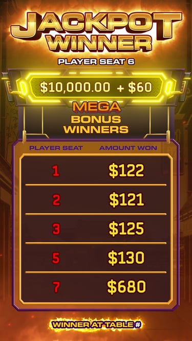
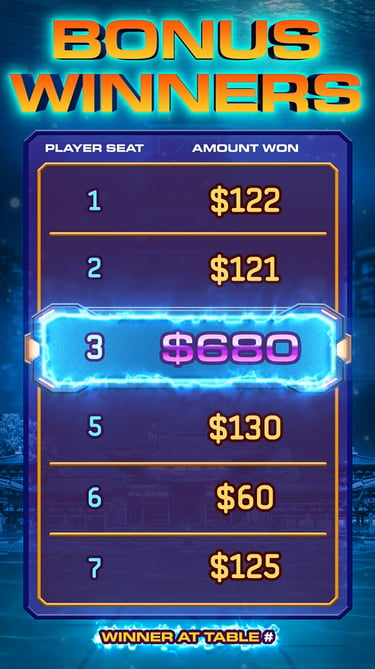
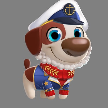
NEXLINK Logo Design
NEXLINK is Light & Wonder’s premier Table Games Progressive line, serving as the next-generation upgrade to the legacy GM Atlas line.
As the Art Director, I led the visual development of the NEXLINK identity from initial genesis to final asset delivery. High-stakes product branding requires balancing distinct creative ambition with corporate alignment; the core challenge was navigating executive and leadership inputs to find the sweet spot between a trend-forward aesthetic and corporate longevity.
Creative Vision
My goal was to establish a modern, clean, and powerful visual identity using high-contrast sans-serif typography. The final design anchors on a stylized, memorable 'X' that symbolizes connectivity, paired with a subtle "dawn of a new era" gradient effect.
The Process
To maintain alignment across stakeholders, the project was executed in three distinct phases:
Phase 1: Exploration – Concepting, typography studies, and brand positioning.
Phase 2: Selection – Narrowing down directions and iterating based on executive feedback.
Phase 3: Finalization –Iterating on 2 major finalist designs and combining the best of each to create the best fusion design.
I worked with our advanced production artist to make this logo come alive, striking a great balance between my vision and his creativity.


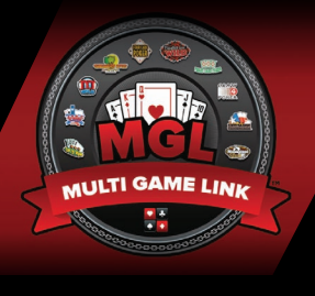
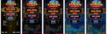
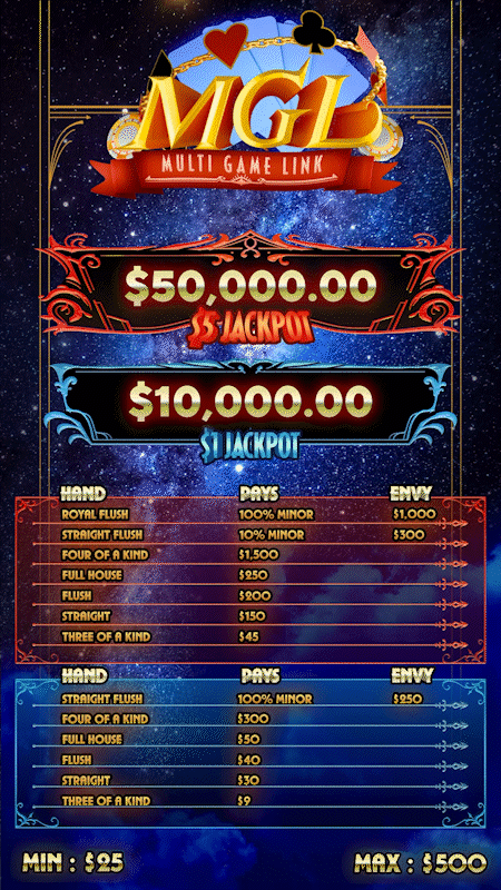

This promotional reel, debuted at G2E 2025, highlights three of which two flagship products from our lineup: MGL and Imperial Lanterns were spearheaded by me. For this showcase, I personally designed the core logo and executed the initial conceptual mockups to set the visual benchmark. From there, I guided my creative team as they built out the asset pipeline and finalized the production art featured in this video.
Collaborative Vision: Concept to Sequence
During the initial phases of MGL, I was actively building out my creative team. This unique constraint led to a tight, direct collaboration between myself and the Progressive PDM to lock in the product's identity. Together, we established a vision centered on elegance and sophistication.
My creative direction leaned into the ornamental luxury of Art Nouveau and Baroque art, paired with an atmospheric midnight-sky theme. This imagery was chosen to evoke the elite feeling of premium nightlife.
After building the foundational mockup, I guided our newly formed artist and animation team to bring the asset pipeline to life. I led the visual development of the game’s core motion loops, including the perceived persistence assets, jackpot celebrations, and cash spin sequences, ensuring the final execution perfectly mirrored the initial art vision.
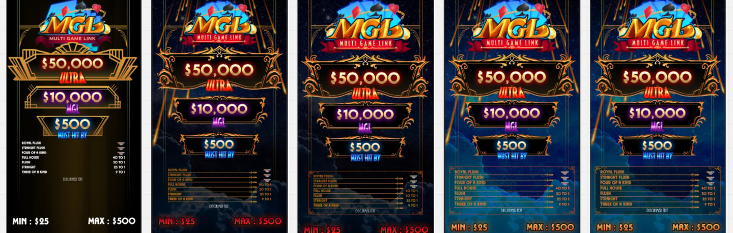
MGL Identity Redesign
The original MGL logo suffered from a lack of visual identity—it attempted to communicate too many disparate ideas at once, resulting in a cluttered aesthetic that lacked the premium polish the product deserved. I took the initiative to completely recreate the logo, establishing a strategic art vision centered on sophistication and clarity.
The Art Vision
To elevate the brand, I focused on four core design pillars:
Elegance: Instilling a premium, high-end aesthetic suited for a flagship product.
Subtle Thematic Imagery: Integrating clever, understated visual nods to the game's theme without overcrowding the canvas.
Abstract Uniqueness: Creating a proprietary, memorable mark that stands out on the casino floor.
Three-Dimensionality: Layering depth and lighting to ensure the asset pops in dynamic digital environments.
BEFORE
AFTER

This is the format of the old GM Atlas progressive format
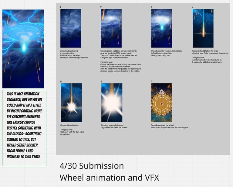


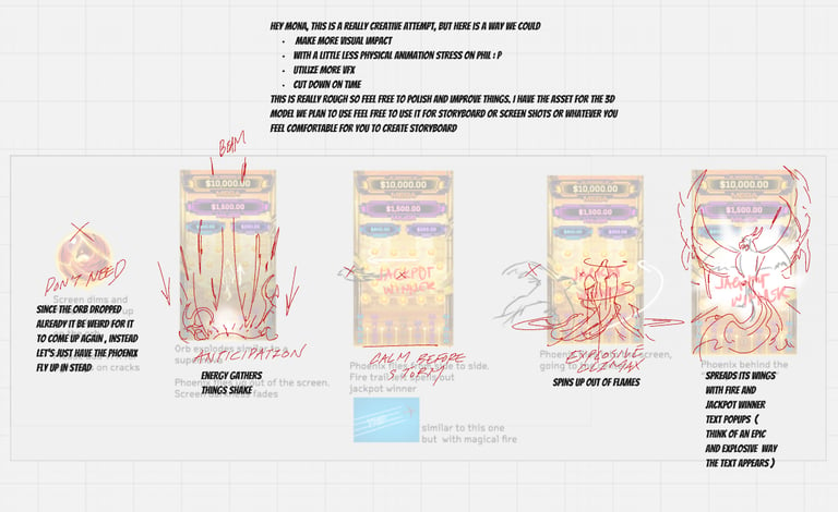
Transition & Celebration Kinematics
The Objective: Guide the team through the storyboarding and animatic phases to develop high-impact motion loops that elevate the game's emotional peaks.
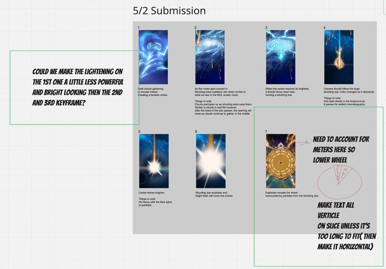
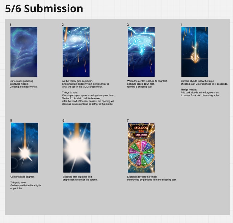
1. The Transition Sequence (Anticipation)
The Direction: Harmonize with the environmental theme while injecting dramatic contrast.
The Execution: Utilized a swirling, atmospheric vortex cloud effect to abruptly break the calm, premium aesthetic of the main game screen, signaling a high-stakes transition to the player.
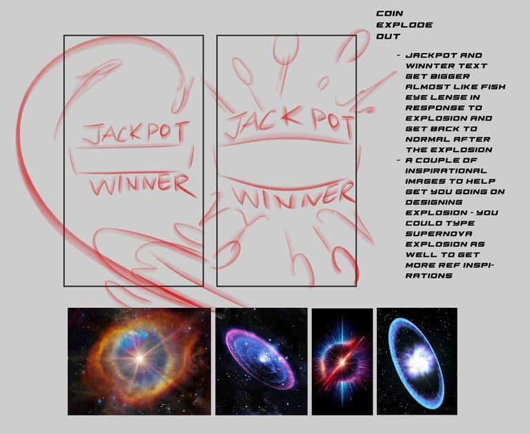
2. The Jackpot Celebration (Reward)
The Direction: Maximize player satisfaction through stylized, high-energy particle and asset acceleration.
The Execution: Tuned the screen's dynamism by directing streamlined shooting star paths, explosive coin bursts, vibrant color amplification, and heavy typographic distortion for maximum kinetic impact.
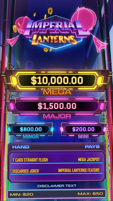
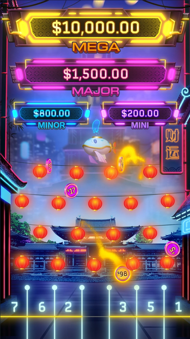
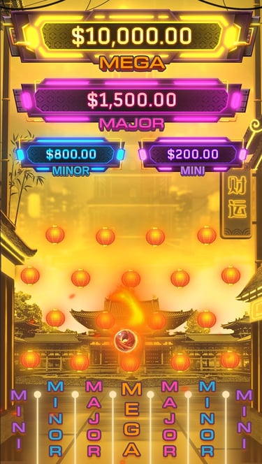
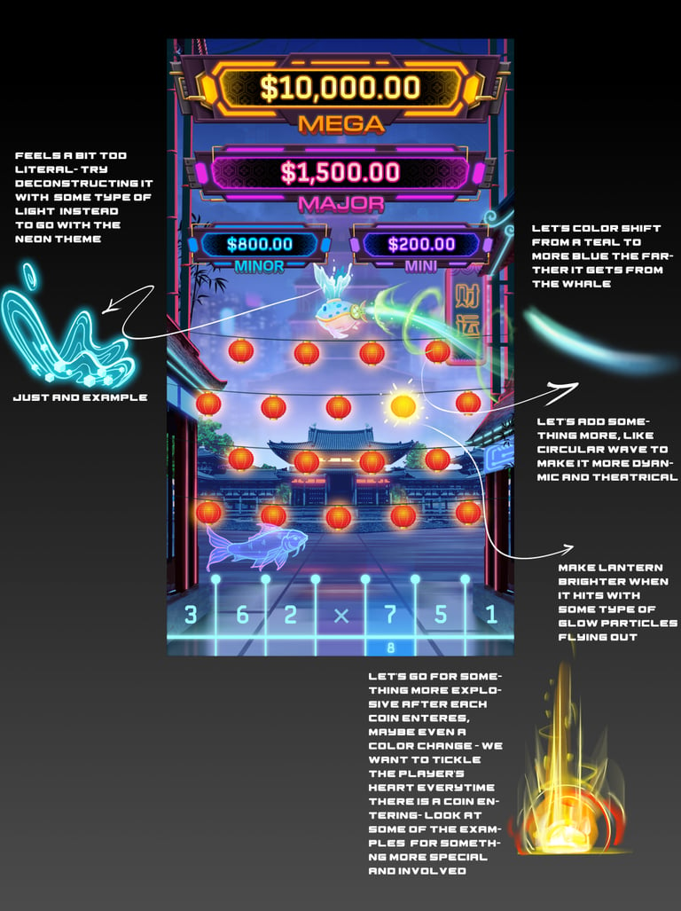
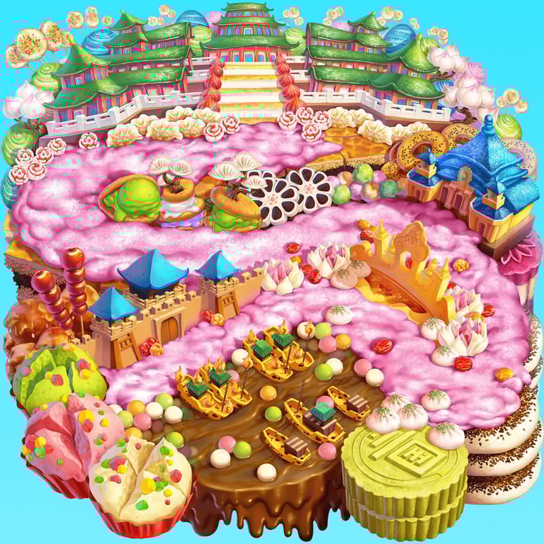
Imperial Lanterns: Concept & Technical Collaboration
Imperial Lanterns represents a major progressive line where I spearheaded the end-to-end creative lifecycle—leading the initial team brainstorming sessions, establishing the visual pillars, and driving the comprehensive art direction. The bonus mechanic is unlike anything else that has been on progressive table's market.
The Art Vision
The creative objective was a stylistic fusion: blending traditional Chinese cultural themes with a sleek, futuristic cyberpunk nightlife aesthetic.
Cross-Functional & Technical Art Problem Solving
A beautiful vision requires flawless execution, so I partnered closely with the Design Lead and Technical Art team to ensure the aesthetic seamlessly supported the core game mechanics.
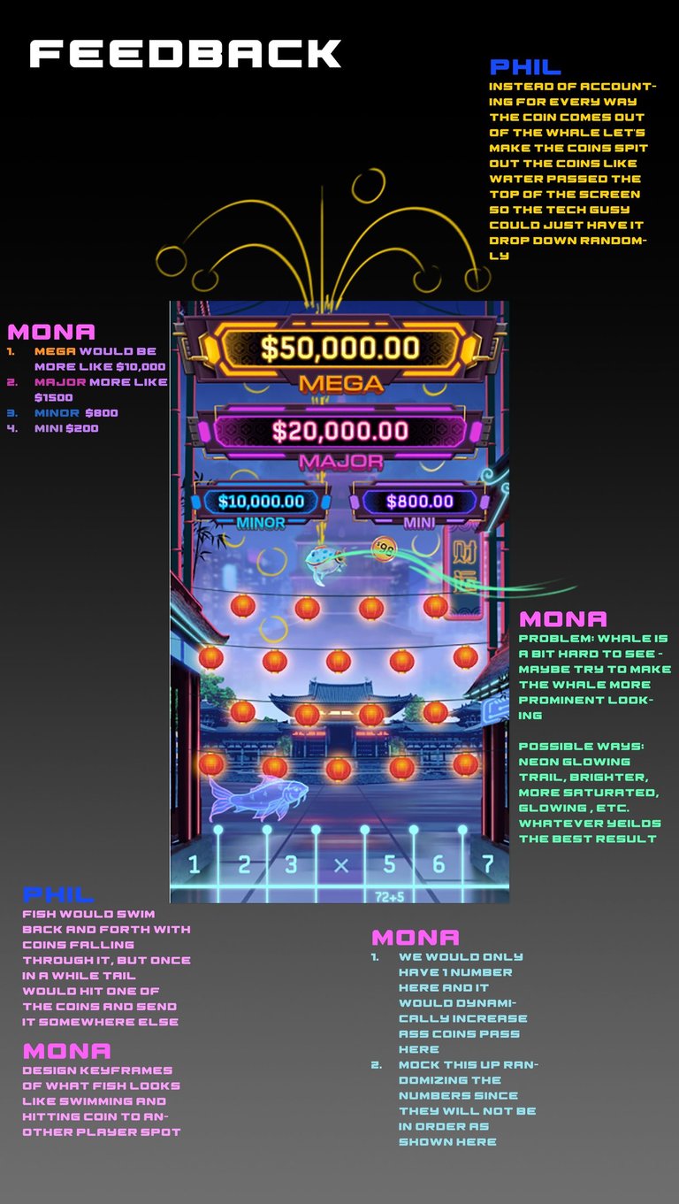
We hit a complex asset-delivery challenge regarding the spit out and coin-drop logistics. The gameplay required an impactful coin-cascade animation, but true random physics became an issue at the top when it transitions from animation to realtime values. I collaborated directly with Tech Art to devise a hybrid solution: a beautifully controlled, sequenced spit out beyone the board and drop that mitigated a need to create calculated physics in realtime and simplifying the randomness of the drop of the coins with clearly visible realtime values.

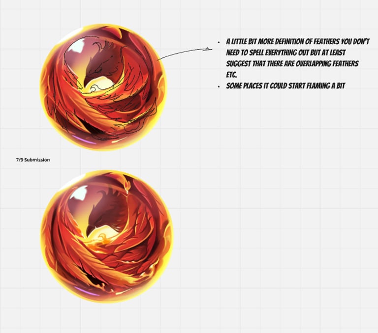
Refinement Phase: Imperial Lanterns Logo
The Selection: The Final iteration was chosen by me for its grand scale, thematic synergy, and modern color palette.
The Critique: The layout of the coins and lanterns felt forced and imbalanced, and certain elements lacked consistent three-dimensionality, creating a jarring disconnect in depth and rendering style across the asset.
The Direction: I instructed the senior artist to adjust the orientation of the main assets like the lantern to correct the 3D perspective and lighting consistency. I then integrated a smaller counter-weight asset on the opposite side and reoriented the coins to bring absolute structural and compositional harmony to the final mark.
UX/UI Refinement & Brand Stewardship
Cross-Functional Design Alignment: The final interface is the result of close collaboration and extensive iterative reviews between myself and our Senior UI/UX Designer. Our primary objective was to subtly integrate Light & Wonder’s corporate brand identity into the platform's layout while ensuring the interface remained clean and highly functional.
Strategic Visual Pivot: While early iterations were aesthetically polished, critical review revealed that the styling felt overly derivative of generic consumer tech ecosystems (resembling a standard Apple aesthetic). To protect our product's distinct competitive identity, I pivoted the visual direction away from a derivative look toward a proprietary, sophisticated visual language tailored specifically for a premium casino environment.
Component-Level Execution: I directed the UI designer to implement a minimalist yet striking color hierarchy, limiting the primary interface to 2–3 core brand tones to avoid visual clutter. Additionally, I introduced a sophisticated dual-color gradient strategy on key interactive button elements, successfully enhancing tactile feedback and player legibility without sacrificing the interface's clean, modern appeal.
NEXLINK DEALER TERMINAL

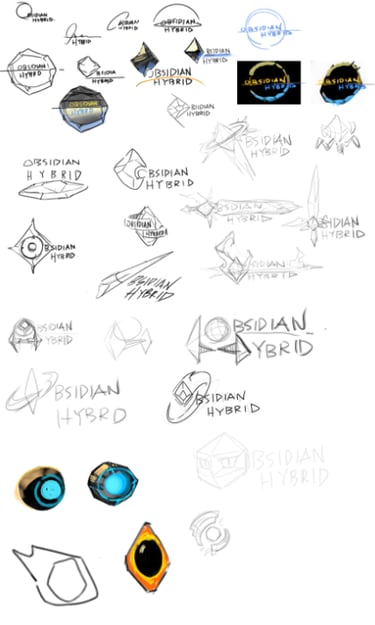
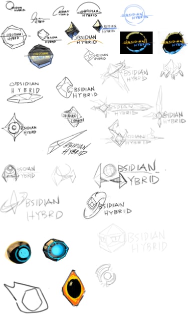
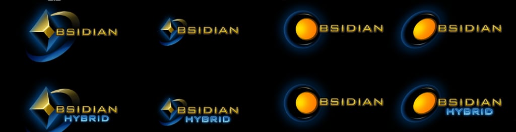
OBSIDIAN Identity Design
OBSIDIAN represents Light & Wonder’s Electronic Table Games (ETG) platform.
I spearheaded the end-to-end design lifecycle for this flagship logo—hands-on from the initial sketch to final production. To ensure total enterprise alignment, I guided the selection process alongside the PDM and executive leadership to arrive at the final mark.
The Brief: Develop a high-end corporate identity that directly reflects the sleek, dark aesthetic of the physical product line.
The Art Direction: Balance crisp, professional corporate structures with abstract, subtle textures that evoke the sharp geometry of natural obsidian.
The Result: A minimalist, highly versatile, and memorable brand asset tailored for dynamic digital and physical hardware integration.

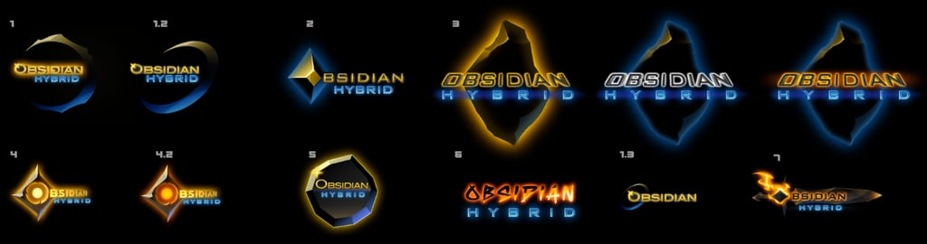
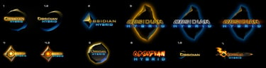
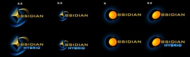
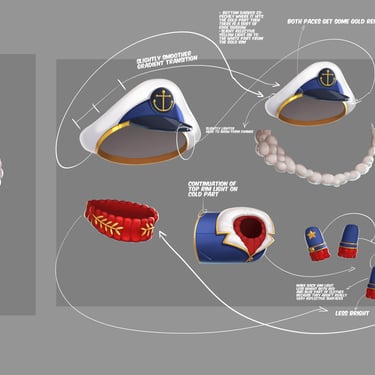
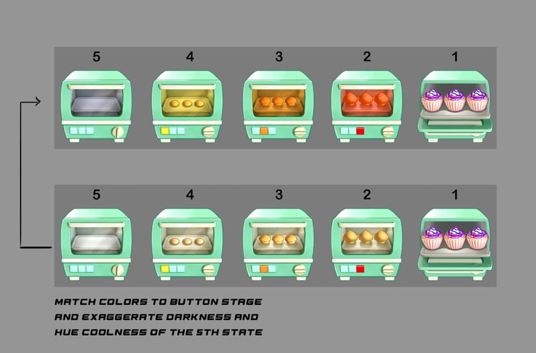
Refinement Phase: OBSIDIAN Motion Direction
The Challenge: Initial iterations suffered from rendering style inconsistencies and an unbalanced focus on the starting letter 'O,' which created ambiguity around the full logo's legibility.
The Direction: Shifted the creative focus toward unified materialization and typographic clarity.
The Result: A polished, synchronized animation sequence where the 3D textures reveal the entire brand name harmoniously, maintaining absolute readability on screen.

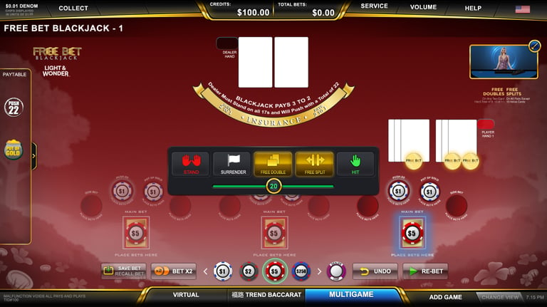
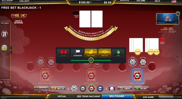


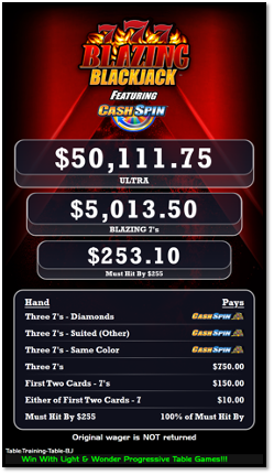
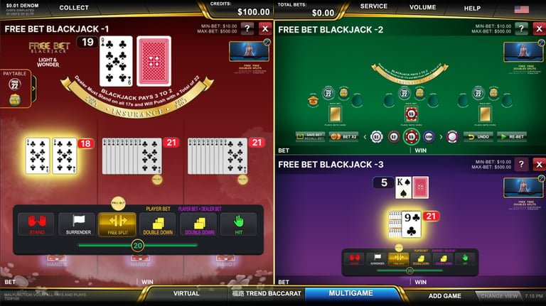
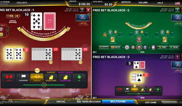
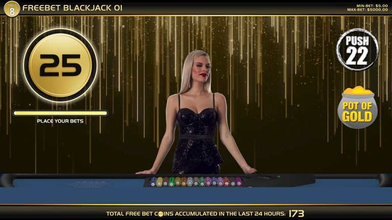
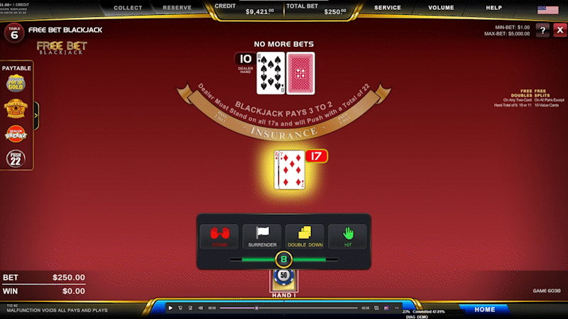
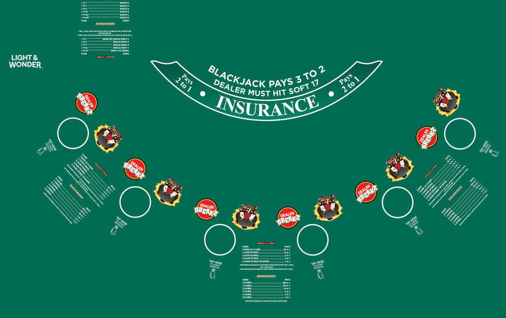
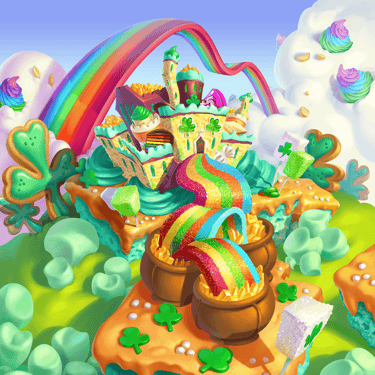
Case Study: Transforming Traditional Blackjack
The Challenge: Balancing legacy table game expectations with innovative, theme-driven features to break through a crowded blackjack market.
The Strategy:
IP Expansion: Integrated the Rainbow Riches slot character, directing a suite of expressive, comedic animations to heighten entertainment value.
Immersive Felt Design: Replaced standard, flat table elements with a rich environmental layout that integrated the gameplay directly into the character's narrative setting.
Dynamic Feedback Systems: Engineered high-contrast gold "Free Bet" UI assets utilizing custom coin and particle animations to maximize visual clarity and reinforce game mechanics.
This is for the major central displayed usually displayed in front of all player terminals. The goal here was to come up with a desgin. I worked closely with the PDM, art manger, as well as our talented concept and production art team to provide a dazzleling experience for the player. The animated side bet icon are usually advertised on the side. The initial pass on the animated side bets were decent but lacked more dynamism and celebration so there were some subtle movements, squash stretch, timing, particle fx, that I receommended to the artist.


Case Study: Dynamic IP Animation
The Creative Vision: Inject comedic, high-entertainment value into an iconic brand asset by directing pop-culture parody animations (including Thor, Terminator, Kung Fu, and space-warp concepts) with our concept artist and animator.
The Layout Pivot:
Initial State: Character locked to the top-right corner.
The Pivot: Led a team alignment to shift the animations into contextual, trigger-based assets tied directly to tactical player choices (Hit, Stand, Bust).
The Technical Hurdle: Partnered directly with the Engineering and Dev teams to solve strict technical constraints, meticulously optimizing asset duration, frame timing, and UI placement around the main player decision bar.
Key Adjustments Made:
Elevated the Comedic Examples: Kept your awesome references to Thor and Terminator but framed them professionally as "injecting comedic pop-culture parodies" or "high-entertainment value."
Reframed the Layout Decision: Changed "after some discussion with the team" to "collaborative team reviews" and "led a team alignment." This highlights your leadership in fostering a smart, democratic creative environment.
Refined the Engineering Challenge: Translated "decide with the given tech limitations" into "navigating strict engine and technical limitations" and "optimizing asset duration and frame timing." This proves you speak the same language as your developer partners.

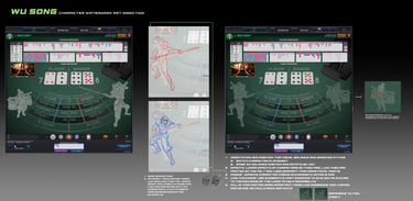
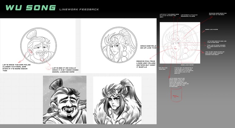
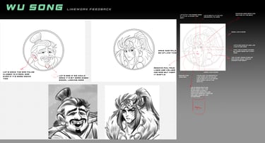
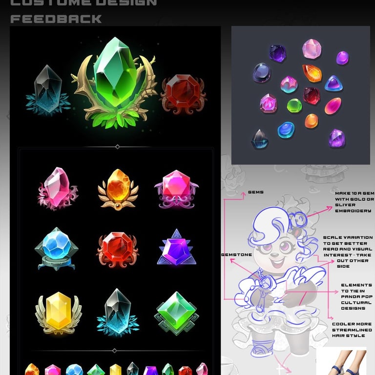
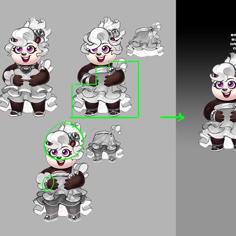
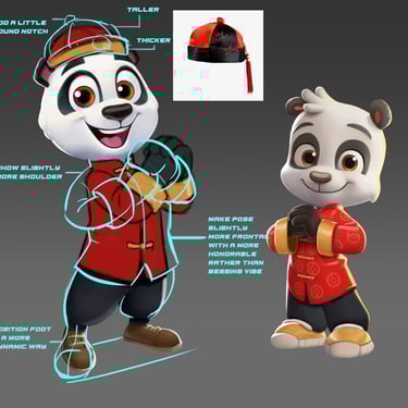
Wu Song Baccarat: Character Development & Direction
Wu Song Baccarat features a highly popular, specialized side bet named after the legendary tiger-slaying hero from the classic Chinese novel Water Margin. In this variant, the win condition triggers specifically when the player achieves a 3-card victory totaling exactly 6 points.
Creative Direction & IP Elevation
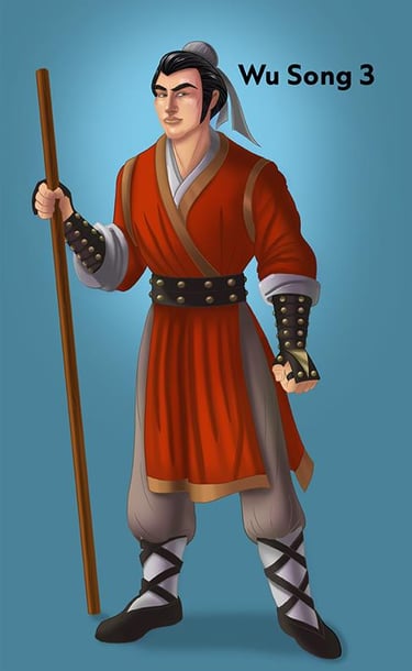
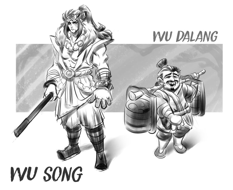
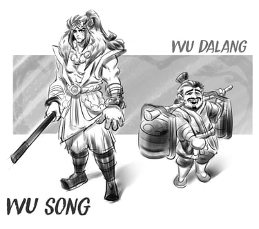
My primary focus for this title was guiding the visual development of the main characters. The initial design iterations felt standard and unmemorable, lacking the mythic presence and rich storytelling befitting of Wu Song’s legacy.
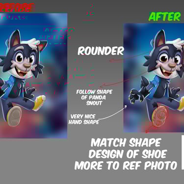
To push the concept further, I provided hands-on artistic mentorship—supplying targeted draw-overs and structural feedback to inspire the team. I directed them to infuse more distinct personality, heroic stature, and narrative depth into the character designs. The sketches and design notes below outline the iterative process used to elevate the final assets.
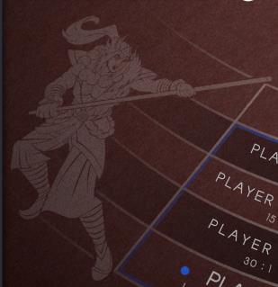
Baccarat Identity & Character Design
I designed the core logo for this title with a distinct artistic vision: to instantly communicate the main character's persona at a single glance, differentiating it from traditional baccarat products on the market.
While embedding high-fidelity character art directly into a logo breaks from conventional branding norms, premium illustration subconsciously elevates the player’s perception of a game's value. By merging rich storytelling with the visual identity, we amplified the product's premium appeal and seamlessly complemented its established gameplay mechanics.


TRADITIONAL FELT GAMES
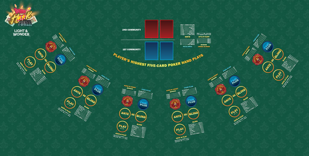
Double Hook Poker is a casino table game based on Ultimate Texas Hold'em where you get two chances to make a winning hand. You are dealt three hole cards and two separate pairs of community cards, allowing you to use your cards to form two distinct 5-card poker. The reason it's called double hook poker refers to the minimum winning conditions of having at least a pair of J's or better in your 5 card hands.
Project Overview
As one of the foundational projects in this lineup, I had the unique opportunity to drive the visual development with a highly hands-on approach. I partnered closely with Game Designer Matt—creator of the flagship Double Down Madness Blackjack—to extend his established "Double" brand into the poker space. To ensure absolute brand continuity, I seamlessly integrated his iconic maroon "Double Down" chips directly into the letterforms of the main logo.
Artistic Direction
High-Level Considerations
Future-Proofing for Digital Scalability: Anticipating that traditional felt games are ultimately engineered to scale into electronic formats, I designed the visual identity with long-term adaptability in mind. I integrated true three-dimensionality, kinetic dynamism, and localized illumination zones into the logo, establishing a perfect framework for high-impact screen animations.
Visual Hierarchy & Brand Continuity
Strategic Typographic Balance: Because the word "Double" serves as a direct bridge to the legacy brand, the primary creative objective was elevating "Hook"—the true product differentiator.
Execution: I anchored the word "Double" in the signature maroon color to secure immediate brand recognition. Conversely, I rendered "Hook" with a bespoke, hand-drawn 3D structure to make it pop as the focal point. "Poker" was treated strictly as a functional category identifier; I utilized a muted dark gray with subtle teal undertones to complement the primary maroon palette while ensuring sharp, legible contrast against standard medium-to-dark felt backgrounds.
Innovation & Composition
Asymmetric Structural Design: A core initiative of this project was breaking through a crowded market with a distinct, premium aesthetic. I utilized varied 3D structural weights and subtle perspective warping to create an eye-catching asymmetric balance that naturally guides the player's eye directly to the "Hook" branding.
Bespoke Asset Illustration: To deliver a completely fresh look while respecting the genre's heritage, I hand-drew custom Jack playing cards, blending a traditional layout with a clean, contemporary rendering style.
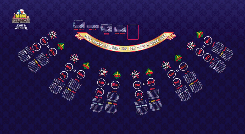
Mini Ultimate Texas Hold'em is a faster-paced, streamlined variant of the classic casino game. Its main selling point is being a more approachable, quick-play iteration designed to eliminate some of the slower betting rounds of standard Ultimate Texas Hold
Strategic Visual Direction & Logo Development
Iconography & Theme Alignment: I partnered closely with our Senior UI/UX Designer to execute the brand's logo redesign, actively steering the visual language to mirror the game's rapid pace. I established a creative framework focused on a clean, simplified aesthetic—introducing smooth, organic curves and a minimalist star motif that feels approachable and immediately "right to the point."
Color Strategy & Product Differentiation: To distinctively separate this title from the legacy Ultimate Texas Hold'em product line, I provided critical direction on the gradient map. By shifting the palette toward a vibrant, sunset(Dark blue, pink, and hot orange) color transition with crisp tricolor accents, we successfully forged a unique identity while maintaining enterprise brand harmony.
Asset Integration & Side Bet Mechanics
Thematic Consistency (Flush Plus): For the Flush Plus side bet, I directed the implementation of a cohesive star-shaped design language. By strategically placing the card suit icons on each corner of the star, I tied the peripheral betting UI directly back to the main logo's theme. This layout unified the table’s visual narrative while reinforcing the game's high-frequency, fast-paced gameplay.
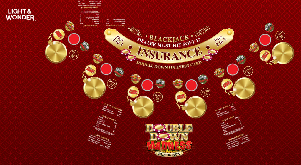

WAR IS MADNESS SIDE WAGER: The War is Madness side wager is resolved based on the player's first card and the dealer's face-up card. If the player's card is of a higher rank than the dealer's card it pays out 1 to 1, otherwise the wager loses.
MATCHMAKER MADNESS SIDE WAGER: The Matchmaker Madness side wager is resolved based on the player's first card and the dealer's face-up card. If the two cards are of the same suit, and/or create a pair, the wager is paid out according to the chosen paytable, otherwise the wager loses.
Side Bet Identity & Collaboration
Cross-Functional Design Leadership: I spearheaded the visual development of the side bet logos for the Double Down Madness brand, partnering closely with our Game Designer and Senior UI/UX Designer. Through an iterative review process, we successfully balanced creative concepting with product readability and brand consistency.
Iterative Refinement & Solutions
Optimizing Legibility (Matchmaker Madness): The initial design pass for Matchmaker Madness featured an aggressive, blown-up perspective on the letterforms for "Madness." While conceptually striking, it introduced significant readability hurdles for the player. I directed the team to align the typography to a unified, clean perspective, seamlessly shifting the focal point to custom-rendered dual Ace playing cards within the logo to clearly signal the game mechanics.
Establishing Visual Hierarchy (War is Madness): In early iterations of the War is Madness logo, the word "War" was rendered in the same red palette as "Madness," creating an unbalanced visual weight and burying the title's impact. To establish a distinct hierarchy, I recommended transforming "War" into a high-contrast, polished metallic texture. This strategic material shift separated the two thoughts, allowing the logo to pop dynamically against the felt environment.


AFTER
AFTER
BEFORE
BEFORE
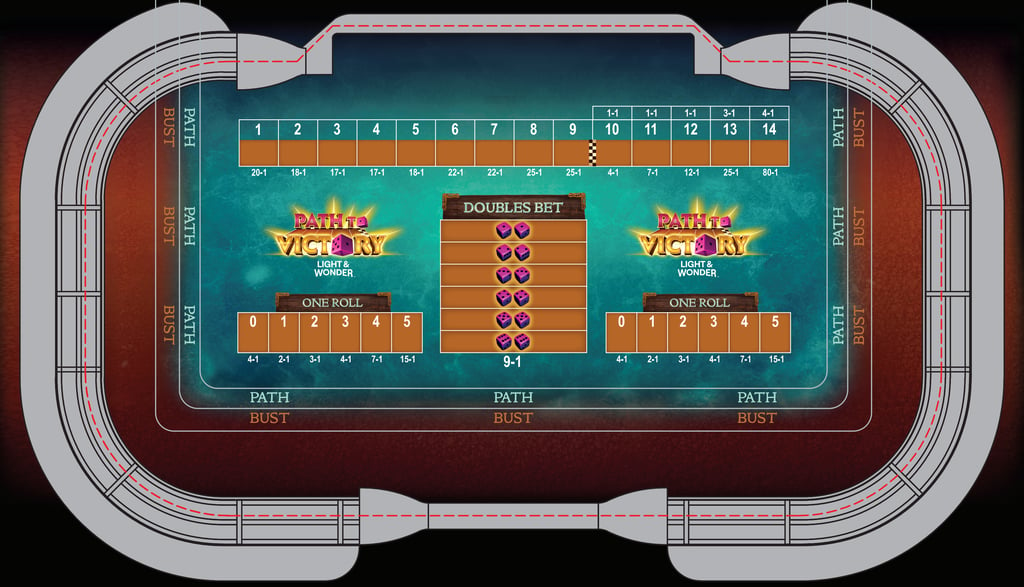
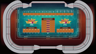
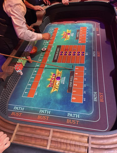
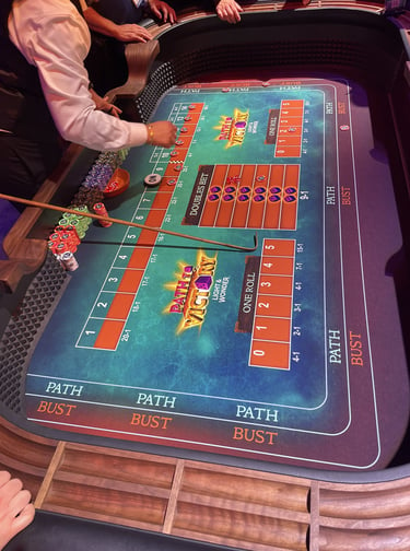
Path to Victory shakes up the traditional dice pit by replacing the intimidating layout of classic Craps with an intuitive, milestone-driven progression track. What makes it special is how movement is determined: players roll a pair of dice, and the numerical difference between the two dice determines exactly how many spaces your marker advances along the linear path. This unique mechanic creates a gripping risk-vs-reward dynamic as you chase escalating win with every step forward, while constantly dodging volatile rolls of "doubles" that could put the whole game in bust.
Conceptual Genesis & Thematic Direction
Executive Brand Alignment: Upon initial product briefing with the Design Manager, the title Path to Victory instinctively suggested a rugged, Norse-inspired undertone. I partnered closely with executive leadership and the game design manager to establish a unified, premium art vision that honors this thematic direction before launching asset development.
Iterative Visual Development: Working side-by-side with our Senior Artist, we executed multiple design passes to strike the perfect balance between gameplay mechanics and raw visual impact. My goal was to deliver a glorious, eye-catching aesthetic befitting the game's mythic theme, anchoring the identity with a custom, Viking-inspired typeface.
Environmental Styling & Composition
Thematic Material Palette: For the initial design iteration, I established a striking visual contrast by pairing a dominant, textured "sea of ice" color palette with rugged terrain borders along the edge of the layout. To ensure immediate canvas readability, I kept the overall color palette minimal and distinct, integrating organic wood grain textures and weathered bronze embellishments into the signage and betting placards to subtly reinforce the narrative.
Design Handoff & Optimization
Creative Pipeline Leadership: Once the overarching thematic direction, material identity, and layout composition were firmly anchored, I transitioned the project to our Senior UI/UX Designer. I provided targeted creative guidance to ensure that the subsequent refinement, asset optimization, and functional UI polish remained strictly aligned with the initial artistic vision.
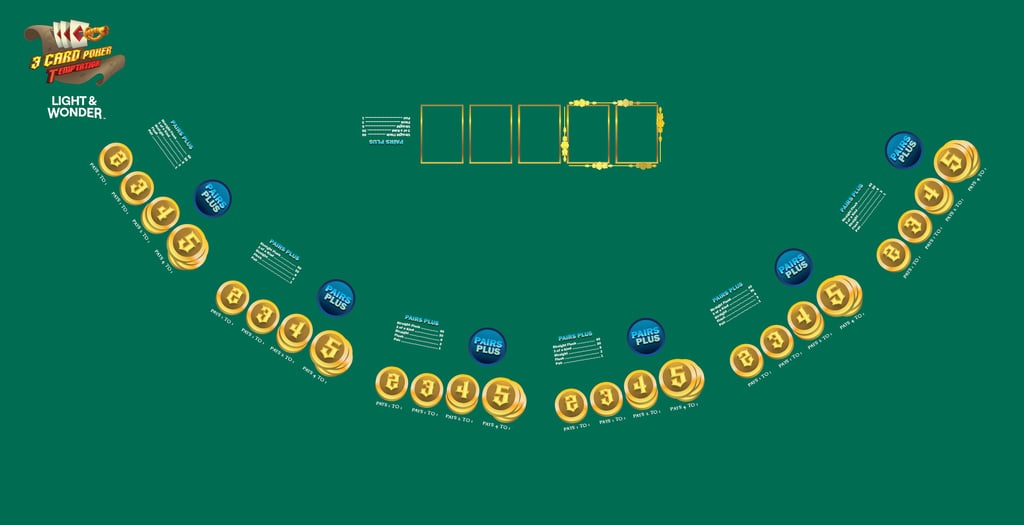

Three Card Poker Temptation completely flips the structure of standard Three Card Poker by turning a simple "showdown" game into a progressive, multi-stage game of "Deal or No Deal."
Instead of making just one decision to play or fold against a hidden hand, the game relies on an escalating, multi-stage layout where you try to force the dealer to bust. What makes it special boils down to these core mechanics:
Conceptual Genesis & Strategic Direction
Thematic Integration: In close collaboration with the Game Design Manager, we established a high-seas, pirate-inspired narrative framework for this title. My primary creative objective was to weave this theme into subtle, sophisticated touchpoints throughout the logo and layout without cluttering the canvas.
Brand Modernization: While Three Card Poker is an established legacy brand, the original identity felt dated. To elevate the visual narrative, I conceptualized a dynamic central mark: the 3 of Diamonds card pierced by a custom pirate cutlass, anchored against a weathered treasure map backdrop. This composition provided a rich, thematic foundation for the primary game logo.
Visual Hierarchy & Player Psychology
Three-Dimensional Asset Scaling: Traditional table layouts frequently rely on flat, uninspiring side-bet iconography. To disrupt this norm, I directed the implementation of tactile, high-dimension betting coins that instantly pop off the felt.
Mechanic-Driven Design: This volumetric rendering style was a deliberate psychological strategy; by elevating the visual weight of the betting zones, we successfully amplified the excitement of the game’s core "temptation" mechanic, subconsciously encouraging higher player engagement and progressive wagering.
Strategic Visual Direction & Collaboration
Thematic Modernization: I partnered closely with our Senior UI/UX Designer to establish a visually impactful identity for Middle Strike. While the designer brought a compelling, nostalgic sensibility to the initial concept, my objective was to elevate and modernize the aesthetic to align with a contemporary casino floor. I directed the integration of dramatic, high-energy lighting and electricity effects to give the title a dynamic, next-gen edge.
Art Direction & Structural Problem Solving
Anatomical & Compositional Refinement: A major focus of my hands-on direction was refining the central fist asset, ensuring the anatomy, weight, and positioning felt powerful and balanced within the layout.
Typographic Innovation: The core creative challenge lay in seamlessly weaving the electricity theme into the logo's typography. I guided the designer through an innovative structural solution: using raw lightning bolts centered between the text to double as the letter "I"s. This execution successfully communicated the game's high-impact mechanics while maintaining sharp brand legibility.
Middle Strike, a blackjack side wager, is resolved based on the rank of the dealer's card compared to the ranks of the two player cards. The wager wins if the rank of the dealer's card falls in between the ranks of player's initial two cards and pays out based on the number of ranks in between the ranks of the player's initial two cards.
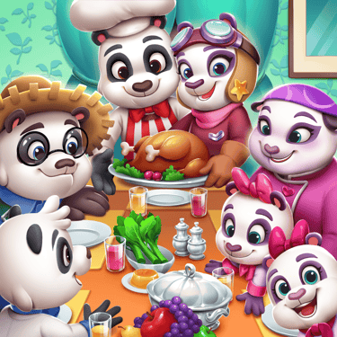
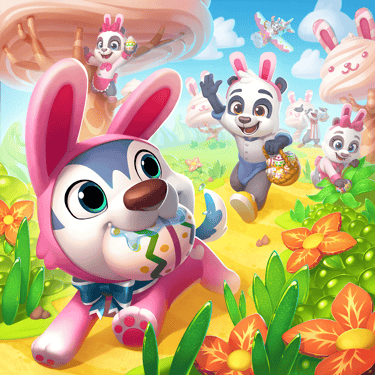
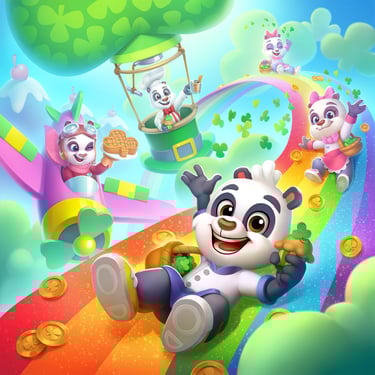
MOBILE GAMES
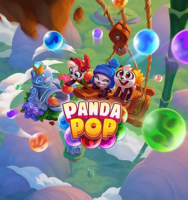
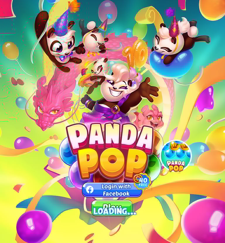
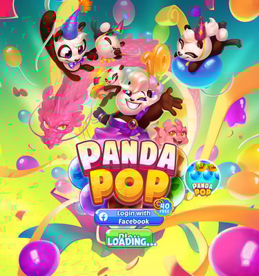
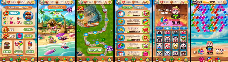
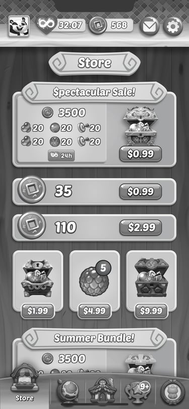
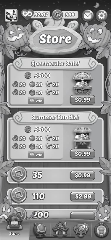
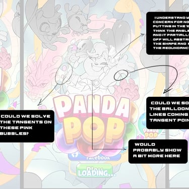
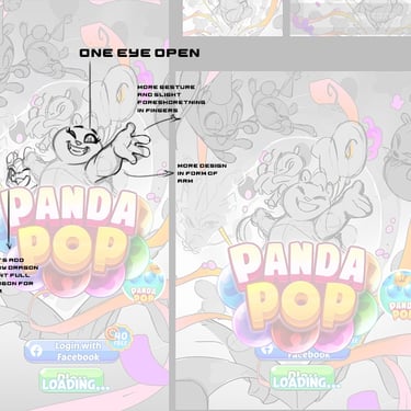
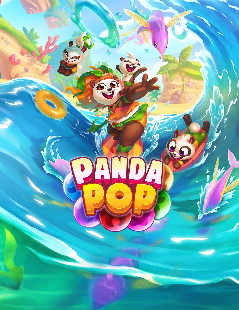
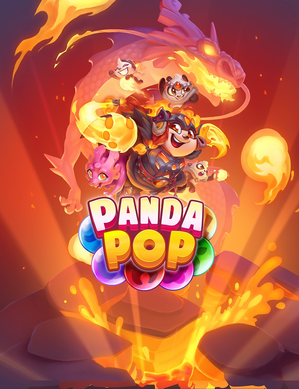
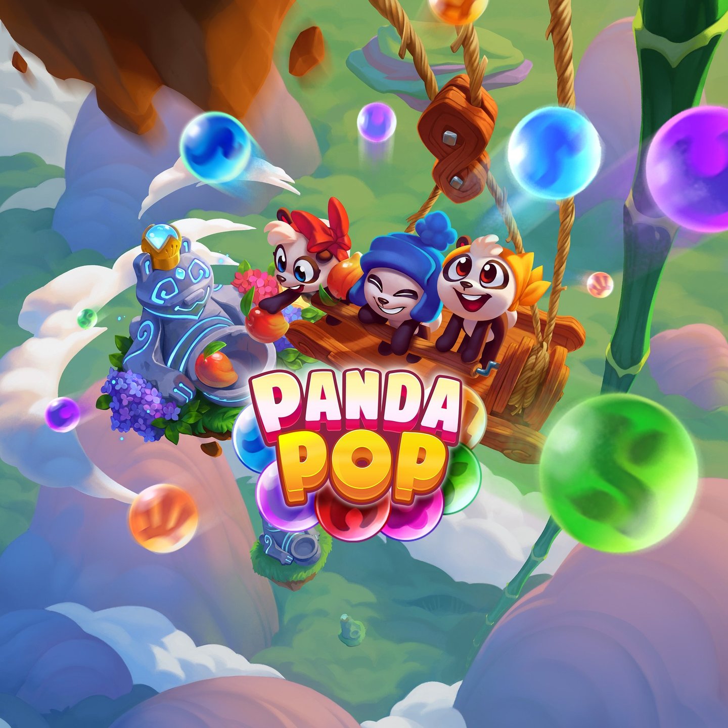
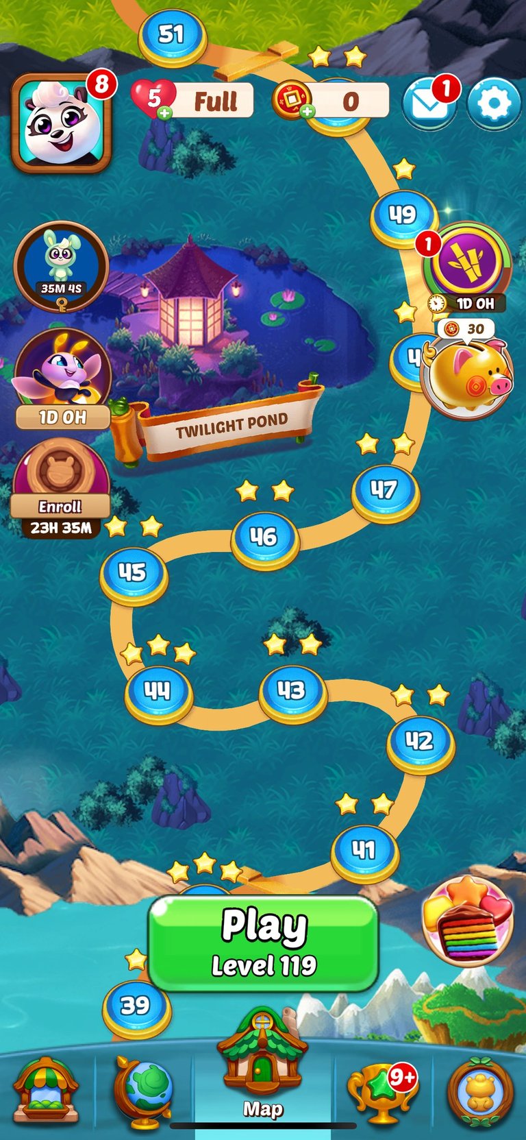
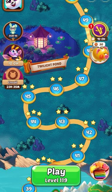
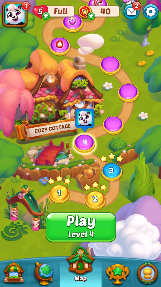
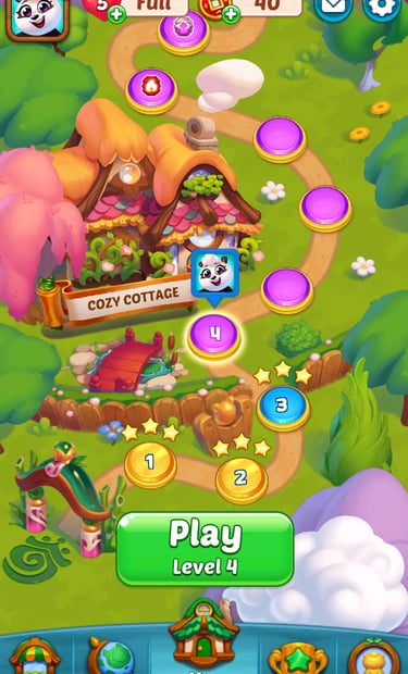
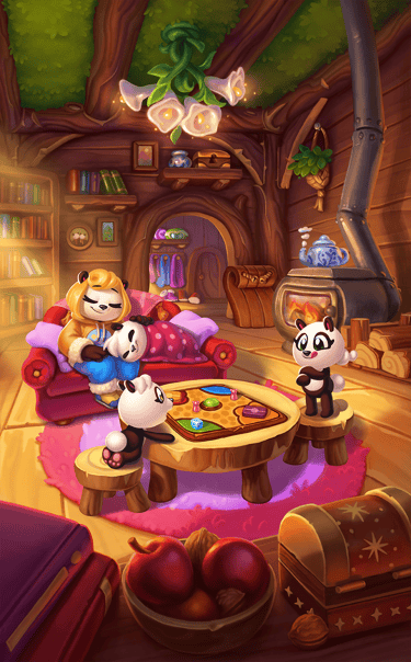
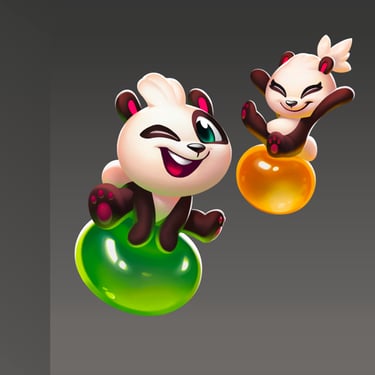
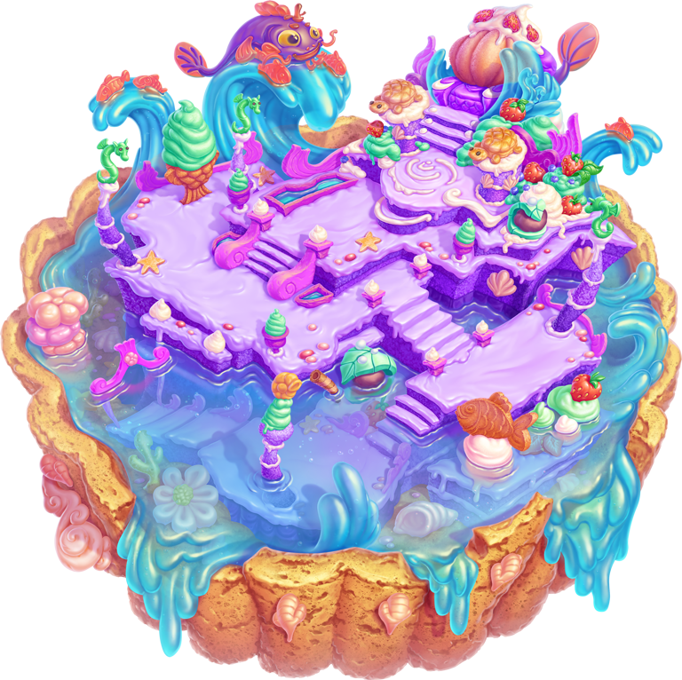
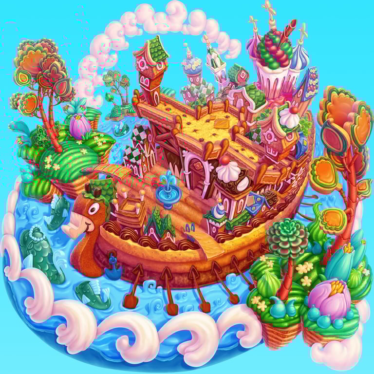
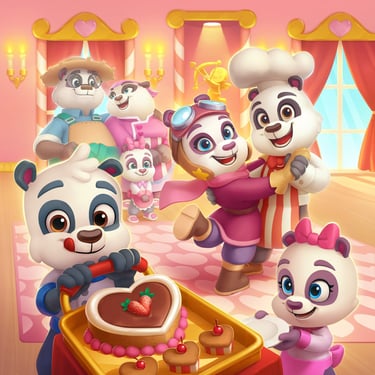
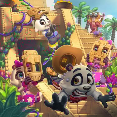
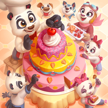
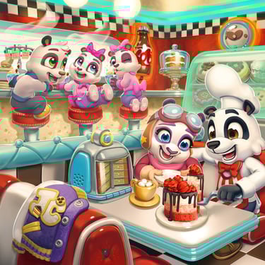
BUBBLE SHOOTER: PANDA POP!
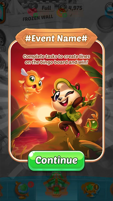
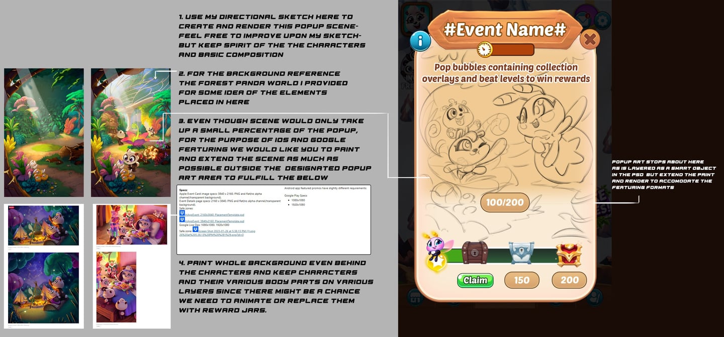
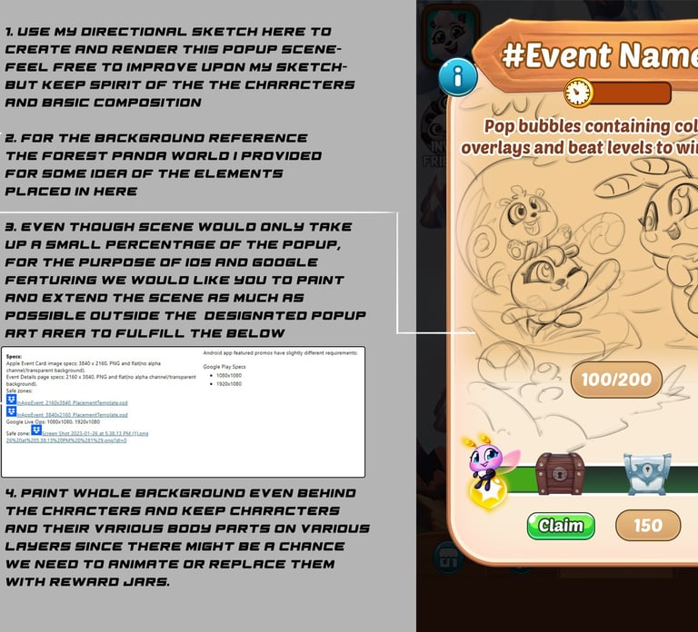
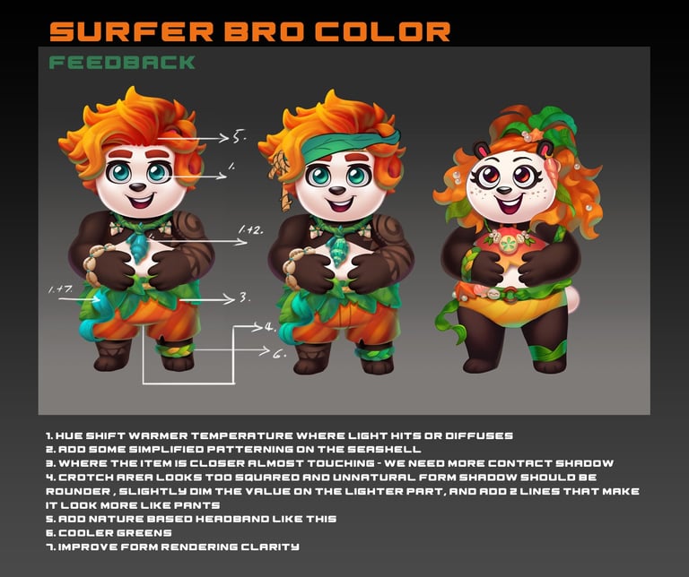
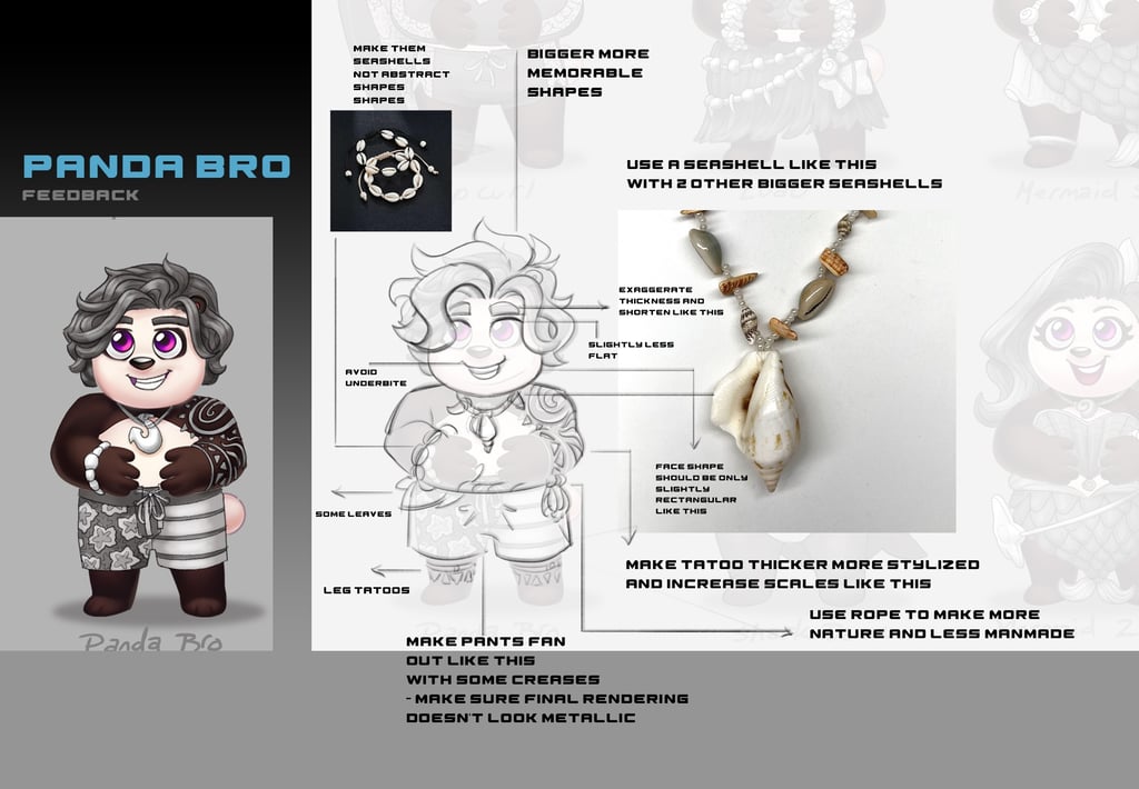
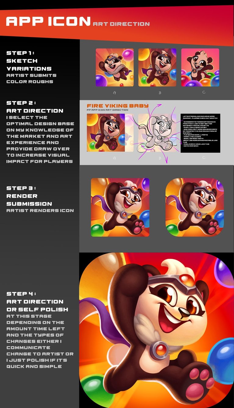
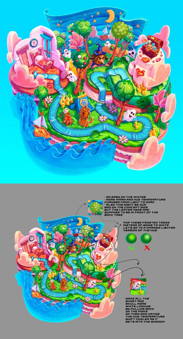
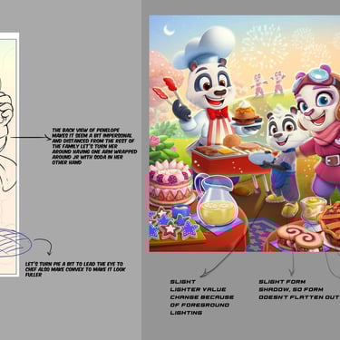
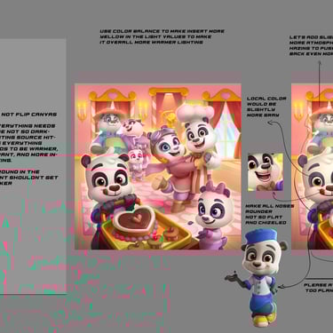
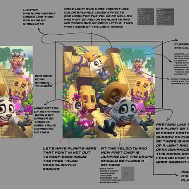
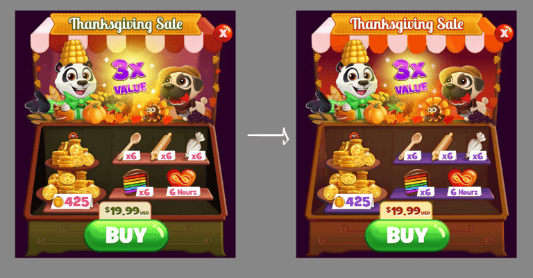
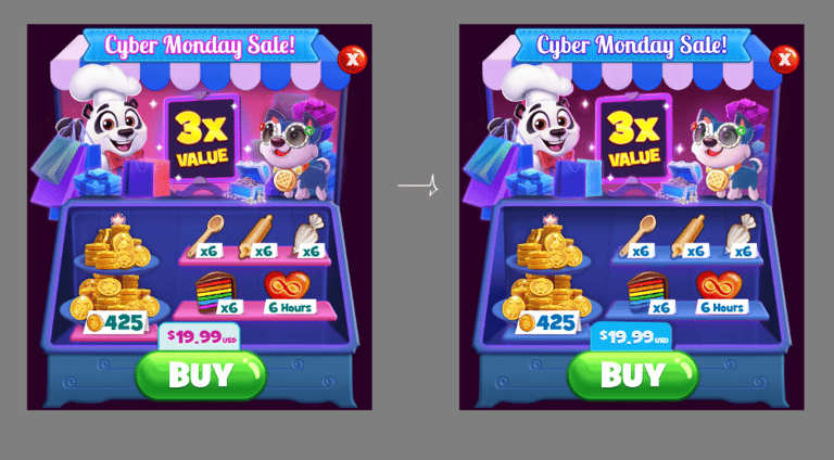
I work as the art director for a popular mobile game called Bubble Shooter: Panda Pop! My main role involves creating prompts, managing and collaborating with the art team to produce high-quality art for various aspects of the game such as content, features, seasonal themes, UI, loading screens, VFX, animations, saga maps, and characters. I make sure that all the artwork maintains a consistent style and reflects our core thematic pillars. In addition, I have developed and regularly updated a centralized style guide to ensure consistency across our art and brand, as well as to enhance efficiency in the art feedbacking process. Please note that the information provided is only a part of my art direction responsibilities, as there are many more decision-making and feedback steps (verbal or written) that I have omitted for simplicity and clarity.


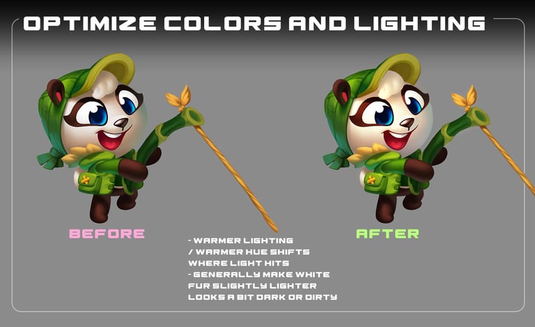
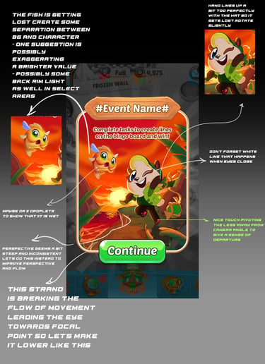
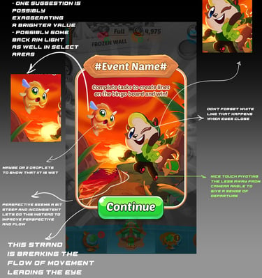
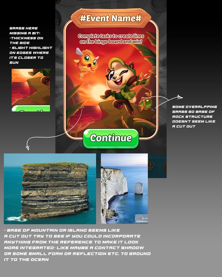
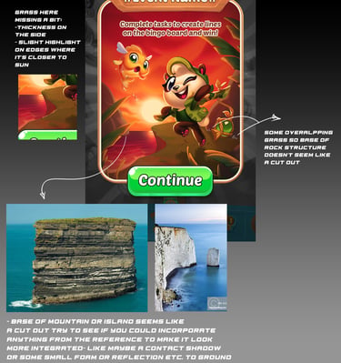
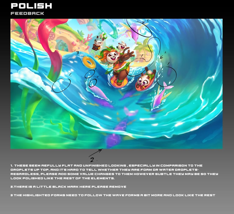
Here is a snippet of one of the win streak features I worked on named Keeping it Reel, which as the title implies, is a pun on fishing and reeling the fish in. Although I just showed the near-final result and some of the art direction I provided, the process was a lot more comprehensive and involved lots of communication between various divisions such as game design, UX, product, production, tech art, and engineer to work out the functionalities, formats, innovating parts, animatable pieces and much more. I also specifically worked with tech art, UX, and our animator to get some great VFX and character animations. I focused on differentiating the whole feel of each tier by making sure the color palettes and the moods differed impactfully to where users would feel a difference. Aside to that, I was working with the team to create eye candy and upholding the panda pop thematic pillars through the designs.
Challenges:
Since this was the first time I (and the team) ever created a tier-based win streak feature like this, one of the biggest challenges I faced was figuring out the thematic, technical, innovative, animated and visual aspects of this feature.
Limited mobile space provided an added challenge in terms of visual designs.
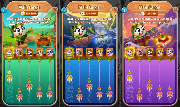
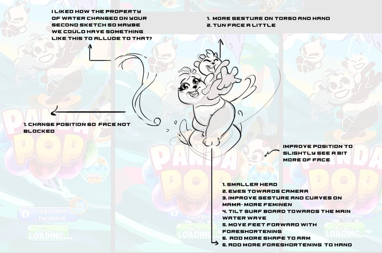
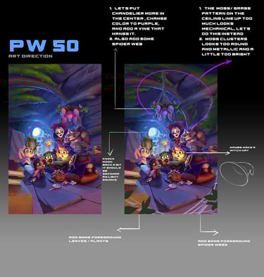
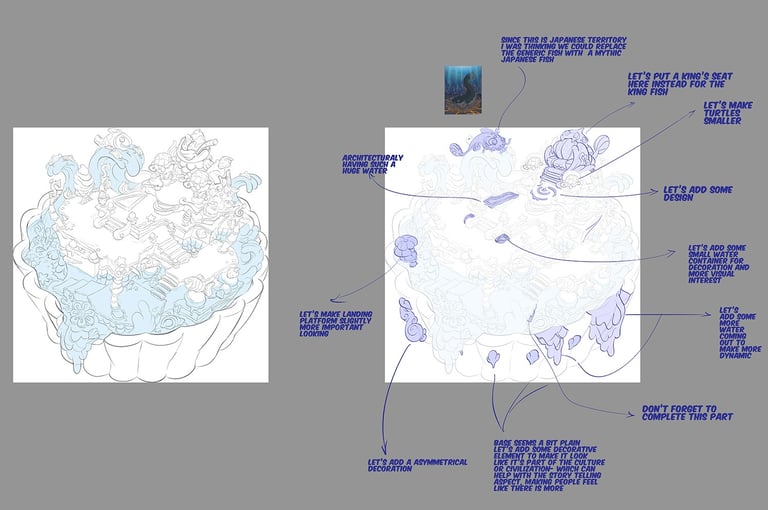
GAME FEATURE | WINSTREAK: KEEPING IT REEL
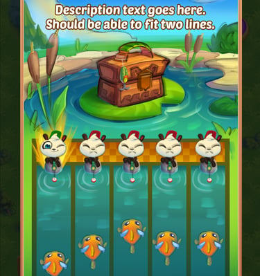
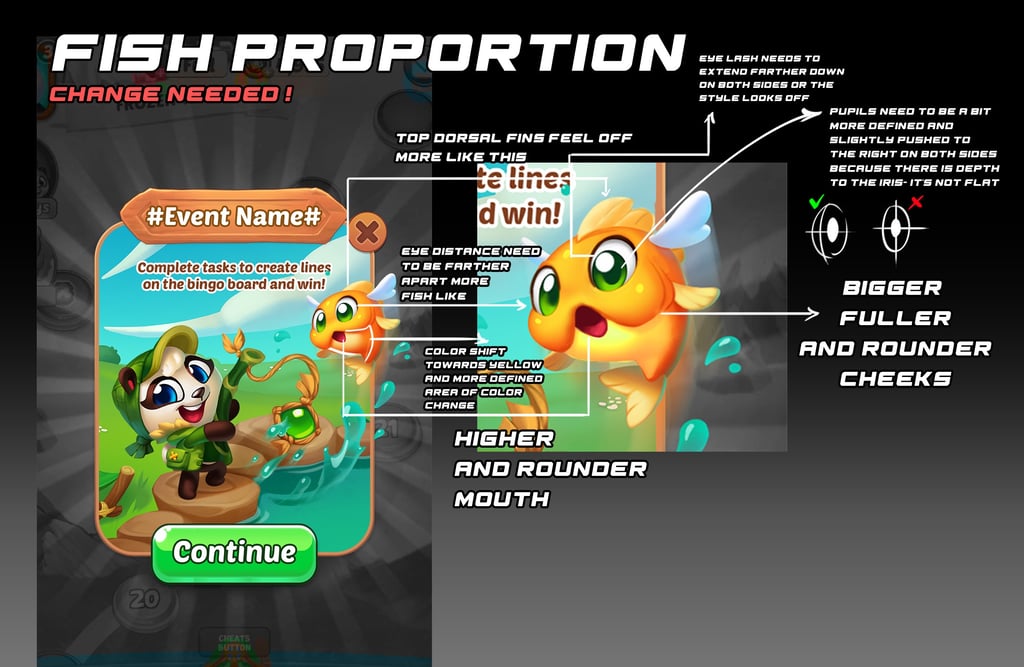
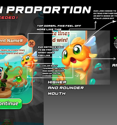
Thematic and format exploration for main popup: Before having the art team execute on the features, I needed to visualize quickly what each of our narrowed down theme would look like and determine the viability and novalty of them. Here are some quick color roughs I created to help me and the team determine that. As shown below I did quiet a bit of exploration around treasure hunt, under the sea, and fishing themes to figure out which worked better. In the end we went with the fishing theme shown above since it seemed more unique, but further discussions ended in a slightly different format.
Solutions:
Thematic: I held meetings with stakeholders and department leads to brainstorm and narrow ideas to explore. After that, I quickly mocked up what various directions might look like for further discussions with the same group of people to reach a consensus.
Technical: Going off of UX's lo-fis, I try to determine and asses whether the proportions were most optimal for art expression as well as identify what art pieces are needed which might affect animated pieces as well. Aside to that there were a lot of conversations between me and UX to figure out what was the best and most memory-saving way of cutting or reutilizing assets to get both art quality and performance.
Innovative: I strongly felt that we needed to add some novelty and things to these features that were different from similar features from other games. To me, the character and their personalities are such a vital part of the panda pop brand so I fought for characters that had some animated expression to be present instead of just having avatars and a chest.
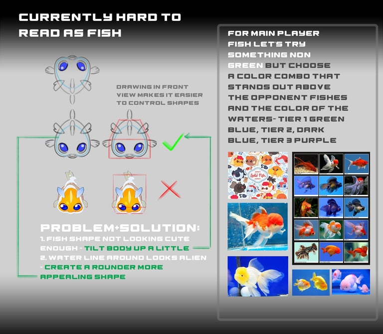
Animated: To me, this was one of the most challenging aspects to solve and plan for because of the limited time we had and categorizing them into elements that animate in the MVP state yet needing to plan and account for v1 and v2s where we would expand on the animations. For this there were lots of back and forth between various department stakeholders to determine based on time what we could realistically achieve. The production lead and I ended up making a call to limit the animation just for the leaderboard fishes which would have ripples, small body, and eye movements. Nonetheless, I did plan and had the art team to design and cut up the elements in such a way that for v1 and or v2 we could animate the facial expression, body movement, and surrounding objects and environment to convey various states of idle, winning, and loosing.
Visual: I focused on making decisions and pointing the team in a direction that produced attractive art, continued the panda pop culture, as well as elevate the emotional impact of what the win streak features was supposed to achieve. This included distinguishing the overall color palettes while not being monochromatic so the player feels a sense of leveling up while keeping the image exciting, purposefully putting the panda in bigger bodies of water with a more tumultuous weather conditions as well as upgrading the boat to achieve more of an emotional impact of increased challenge yet prestige that comes from having a better vessle. Otherwise it was guiding the art to retain the thematic nature and magic pillar while having forms that is recognizable and relevant to our modern day players. When it comes to the fishes it was all about making the designs simple and readable yet making the player fish stand out above the enemy fishes while working with all the background water colores.
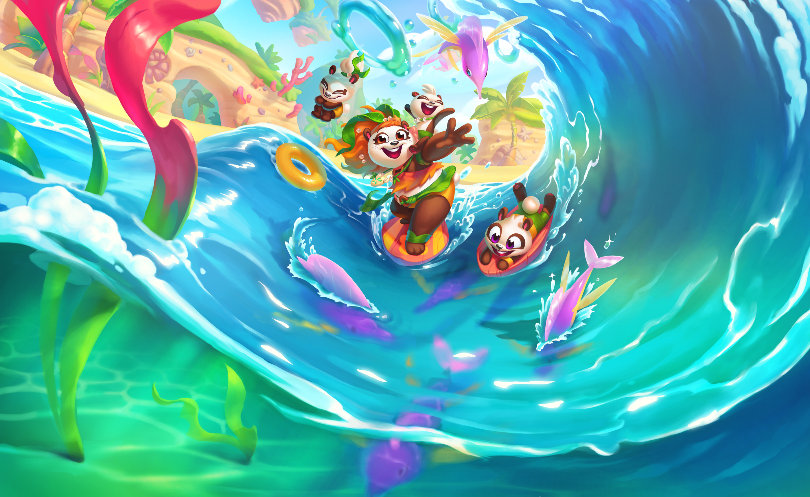
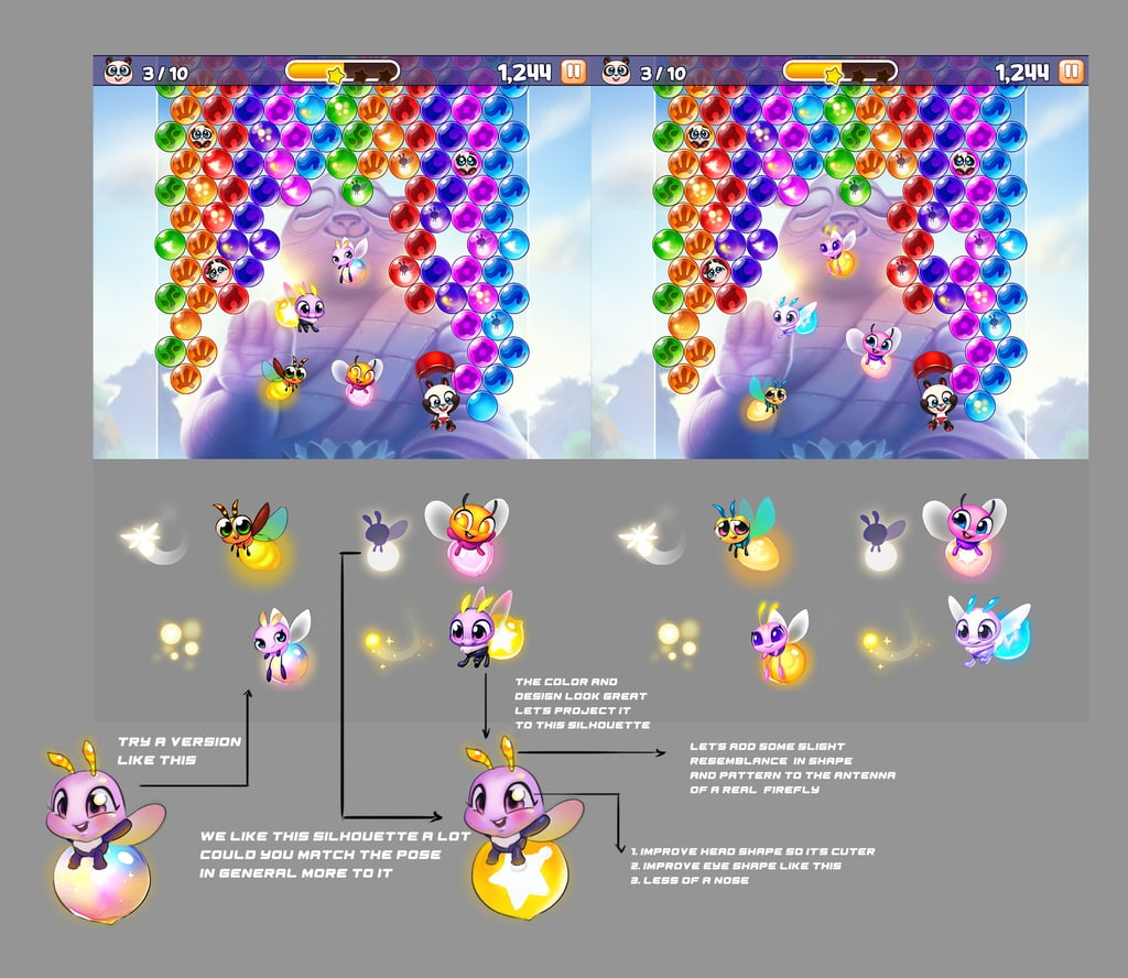
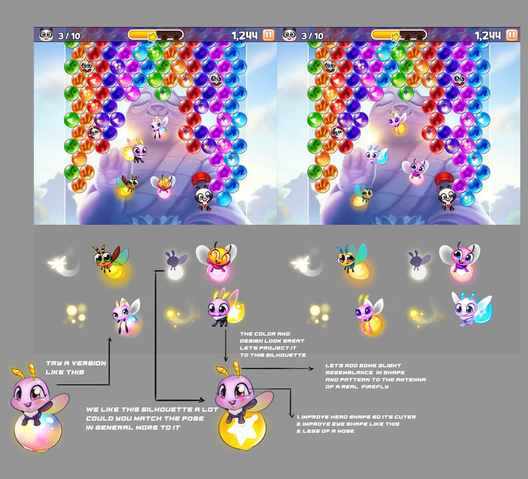
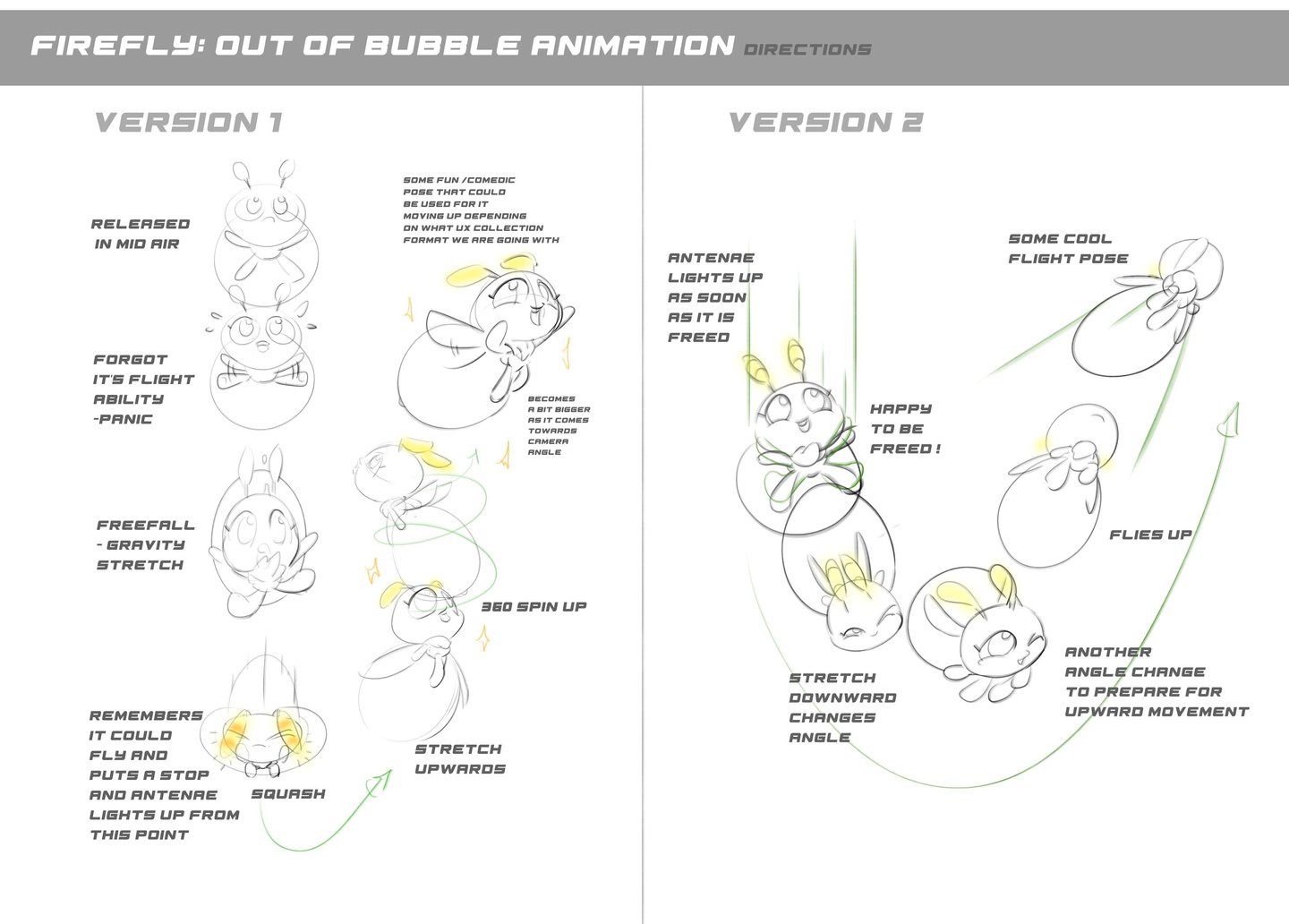
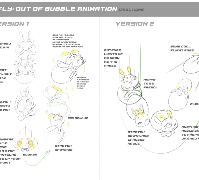
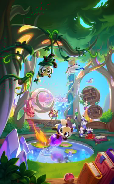
Gameplay Collection Feature: Firefly Festival

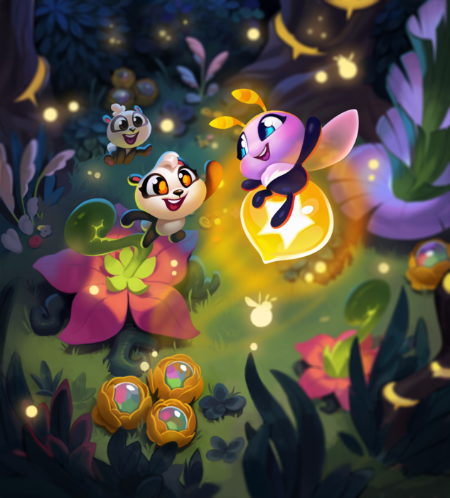
Challenges:
Although this was a fairly simple feature based on a scattered in-game collection element mechanic to provide an added layer of gameplay challenge for the player to achieve in addition to the game objectives to attain additional prizes, deciding the best theme, as well as executing the visuals and animation, was the most challenging aspect.
Execution and Problem Solving :
I held meetings with the team to brainstorm ideas and produced visualization sketches to help us decide what we ultimately wanted, which, based on numerous context considerations ended up being a firefly.
Since we had past environments that provided a great setting and mood for this creature I tried to continue some of the aesthetics, design sensibilities, and magic integration for the native environment.
In regards to deciding on in-game animations, a key factor in the key frame design was imagining what type of movements a firefly would do within the bubble and how we could exaggerate the movements during idle and bubble pop animations to maximize visual interest, reliability, and readability.
Once all the pieces were figured out I created a multi-paged prompt detailing all the specs, providing art directions, as well as templates needed to draw at the right format and proportions and sent it to the art team to execute, overseeing and providing feedback as needed.

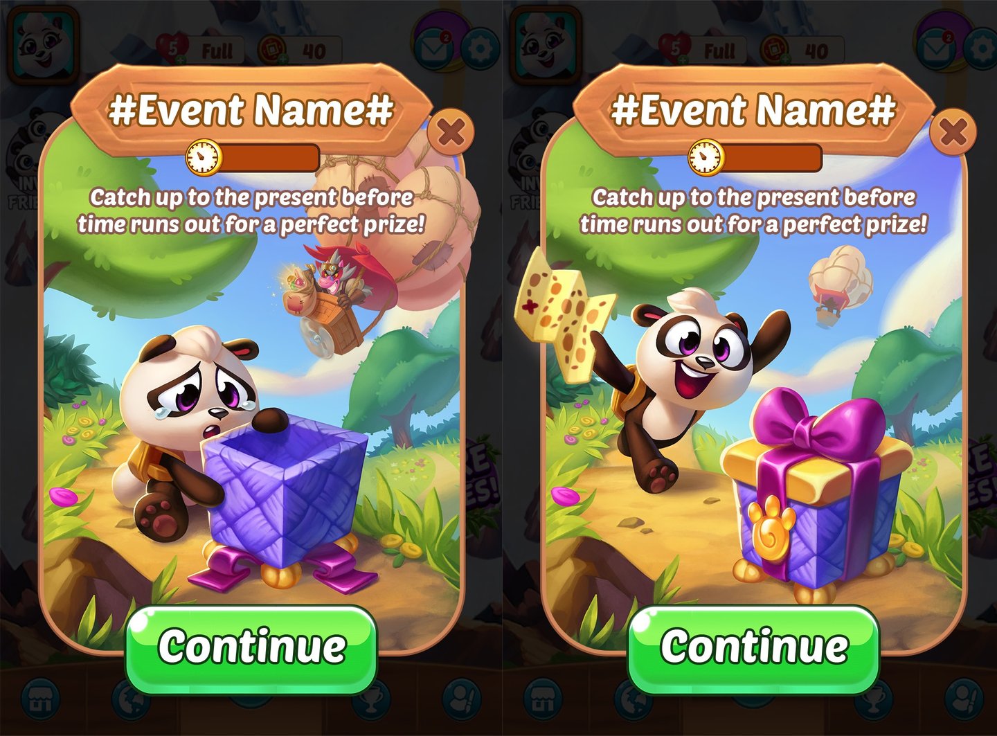
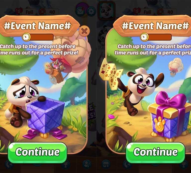
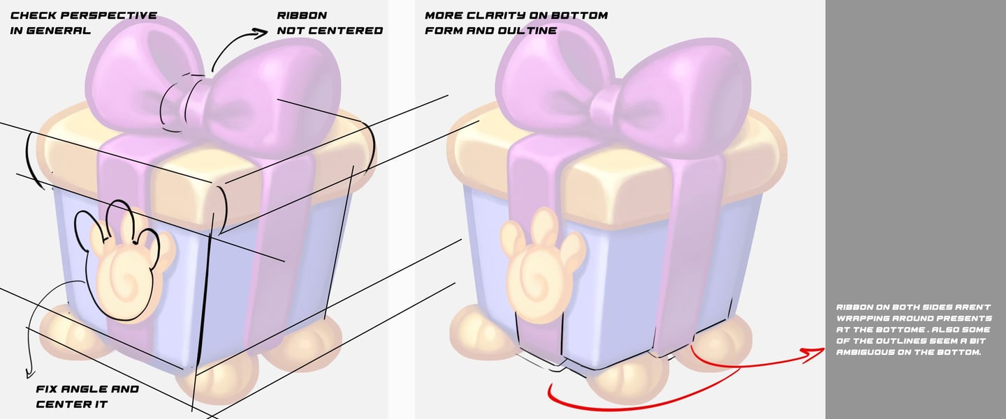
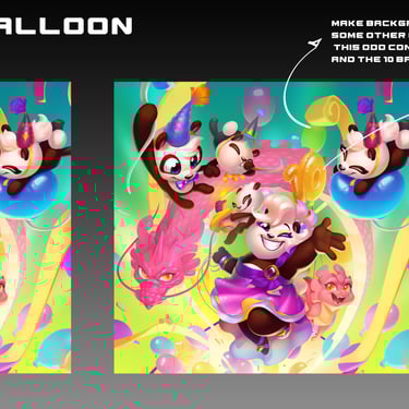
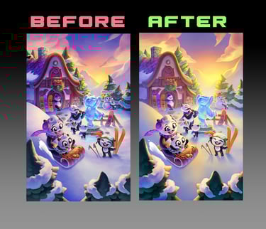
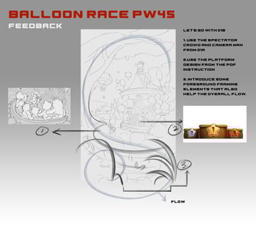
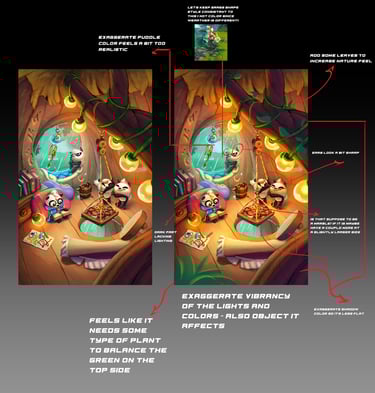
Other Features I worked on included Present Pursuit, Balloon Race, etc.


There were numerous other features I worked on from brainstorming, previsualizing, figuring out technicalities by myself and with various departments stakeholders, writing art direction prompts, to working with the art team to make key selections on design variations feedbacking art execution such as perspective, lighting, color choice, rendering quality , visual language consistency, flow, composition etc.
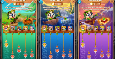
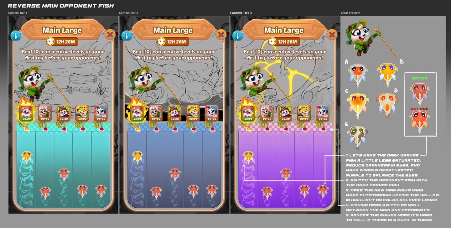
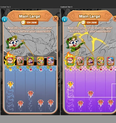
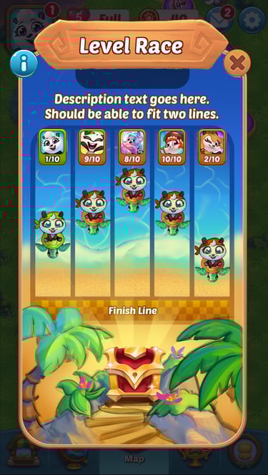
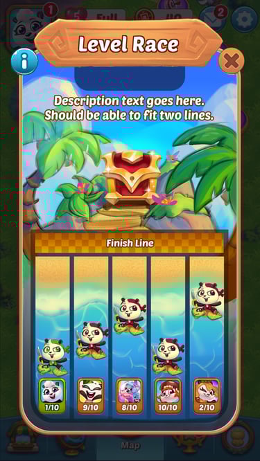
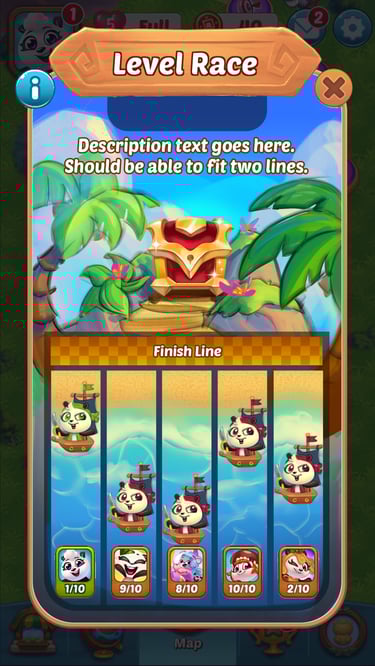
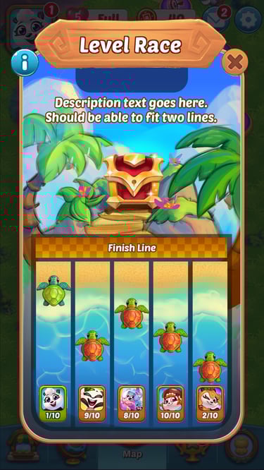
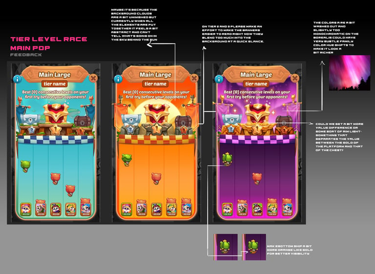
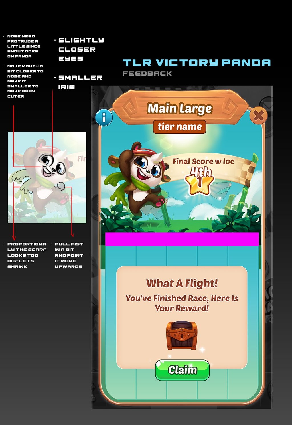
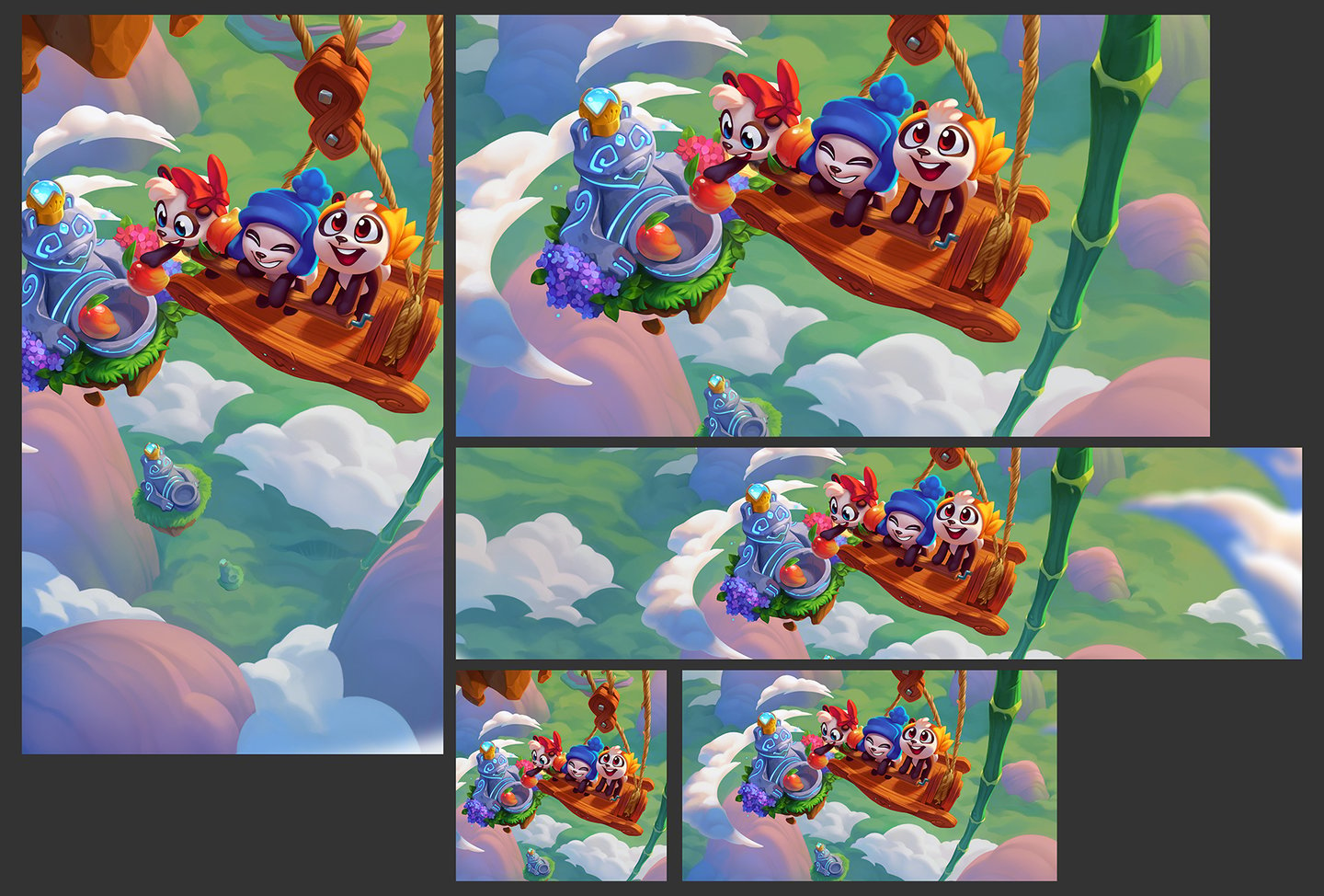
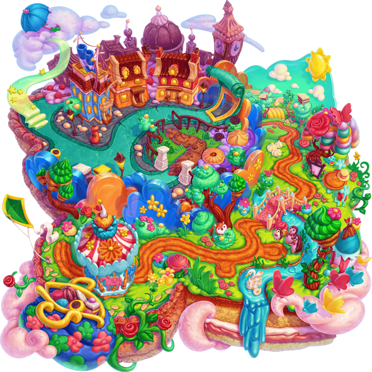
This is a V2 of the MVP( Most Viable Product) where our goals was to increase the amount of color theming and discrepancies between the 3 tiers to elevate the emotional impact, prestige, and distinguishability for the player as well as upgrade the look of the original podiums to make them more appealing yet more supporting of the treasure chests. An additional element that was added was differently shaped banners made of increasing quality material rods to increase the prestige as the player moves up the tiers. Aside to that, the position of the sun and sky color hint at the podiums being on higher level floating islands to hint at the upgraded tier.


PRESENT PURSUIT LEVEL PROGRESSION FEATURE
BALLOON RACE
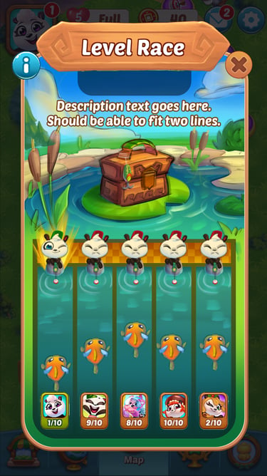
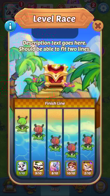
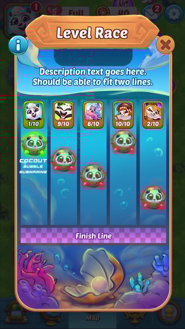
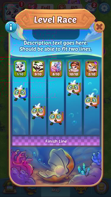
TIERED LEVEL RACE FEATURE
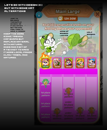
UI Revamp Explorational Art Direction
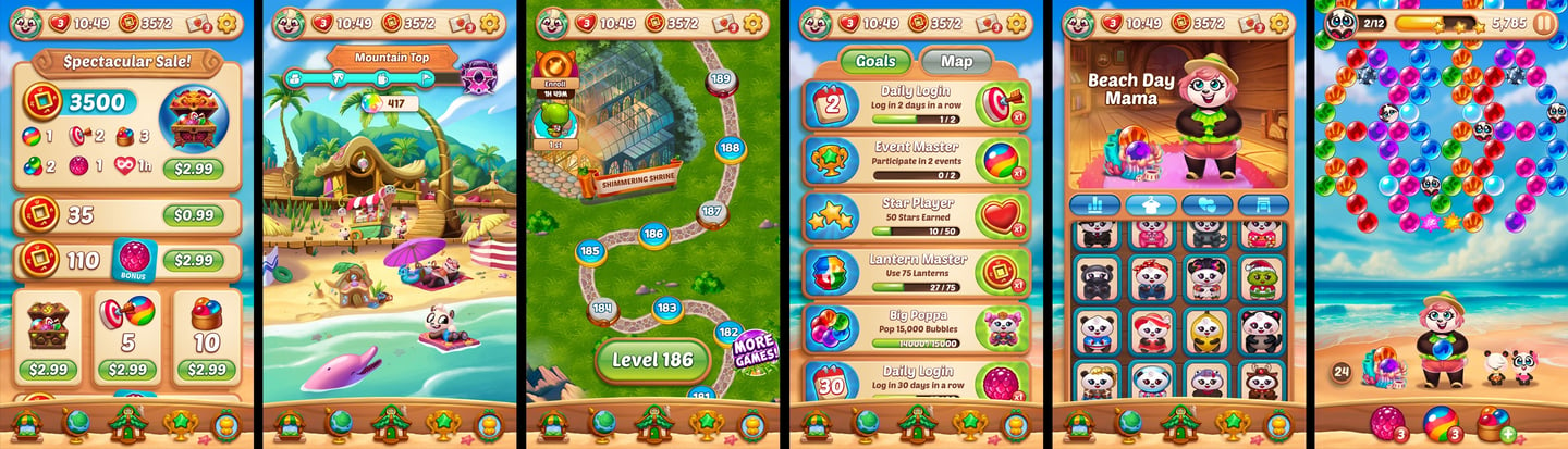
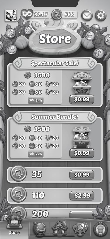
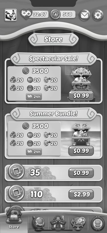
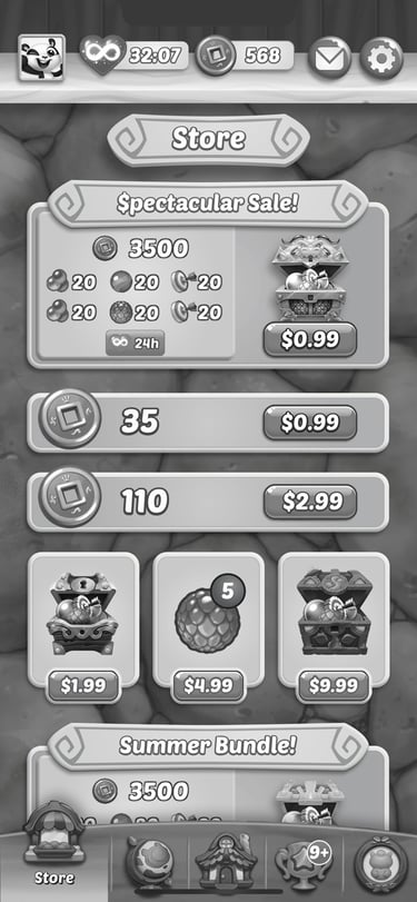
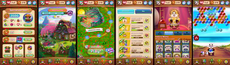
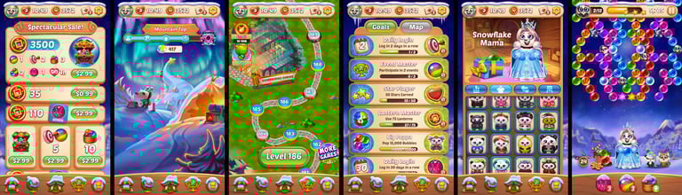
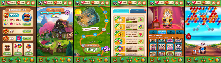
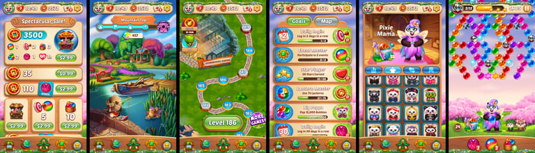
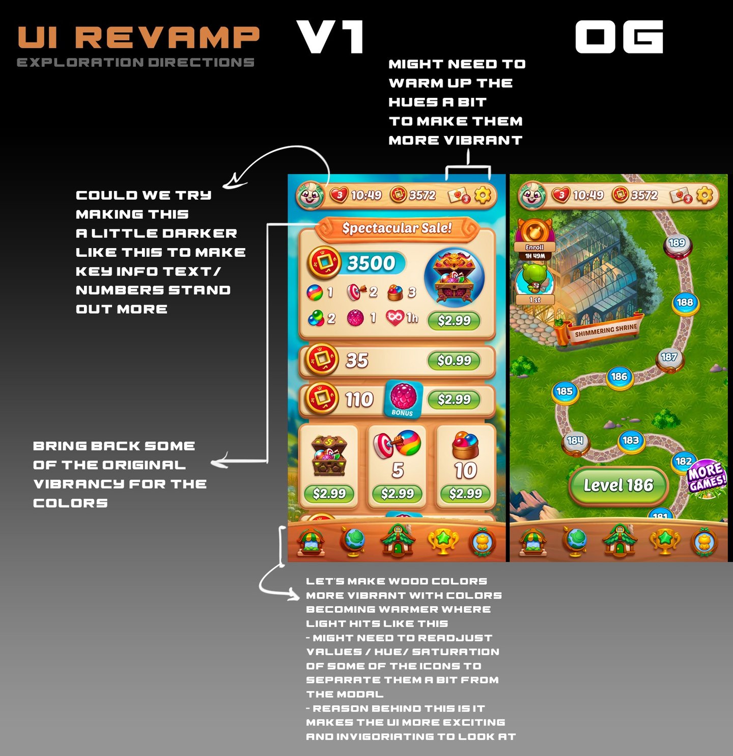
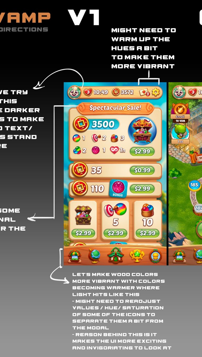
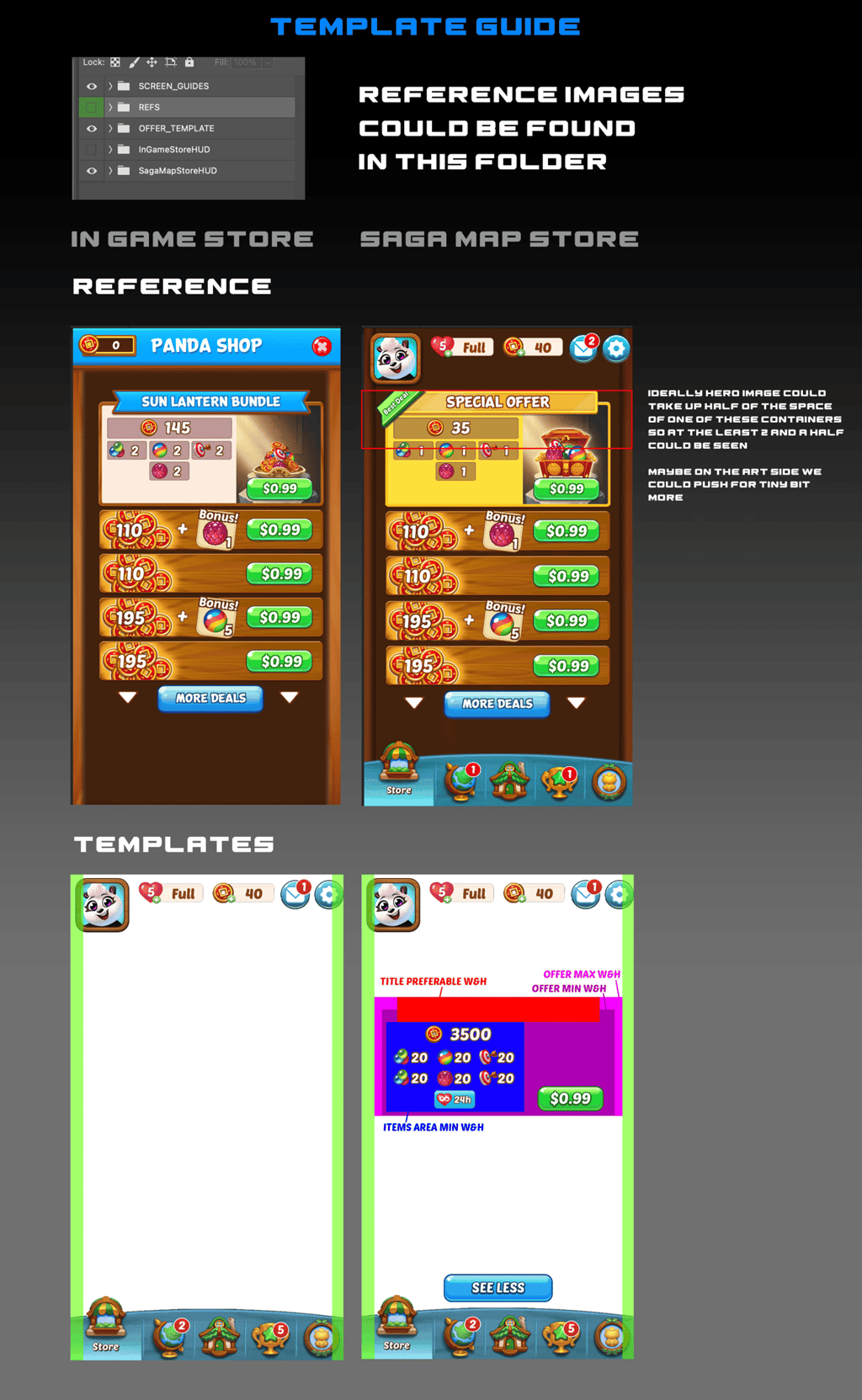
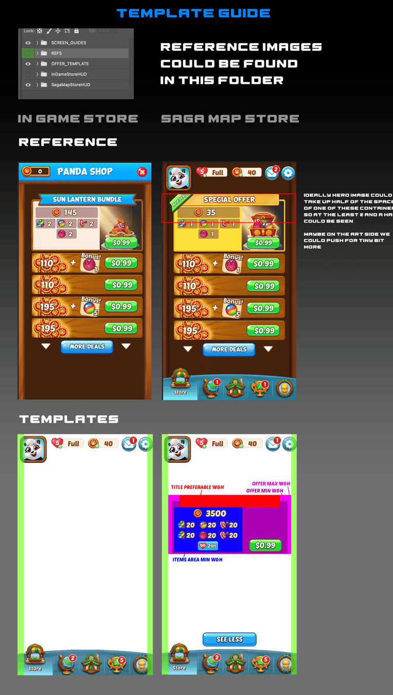
During the UI revamp effort there was a lot of back and forth between me and the UX lead where I requested templates from them to create UI mockups that worked in the right device dimensions using the worst aspect ratio as the standard so any other ratios worked automatically. Part of the job required me to layout and communicate the templates so the artist did not have any doubt whatsoever on what the format and layout would be.
I took part in art directing the UI Revamp. There were many initial UI explorations where I had the artist start from the store and create differently formatted store layouts that might or might not become the final layout. After discussing with the UX and product team to settle on a more content-focused UI layout, we went with a much simpler design. Then we explored various color themes and ended up liking the light brown wood colors the most thematically consistent and harmonizing with a lot of the green found in our saga maps. However, the initial brown color was a little too heavy so I had the artist incorporate more vibrancy and lightness to the UI. Eventually, I saw that the gap in between the top UI items made it a bit distracting from the content so I directed the artist to combine the containers into one wholistic bar that included everything. I also suggested that we incorporate seasonal theming to see what we get and it turned out very nicely like I imagined. It should be noted that these UI pages only represent a tiny fraction of all the work I art directed on the UI revamp effort.
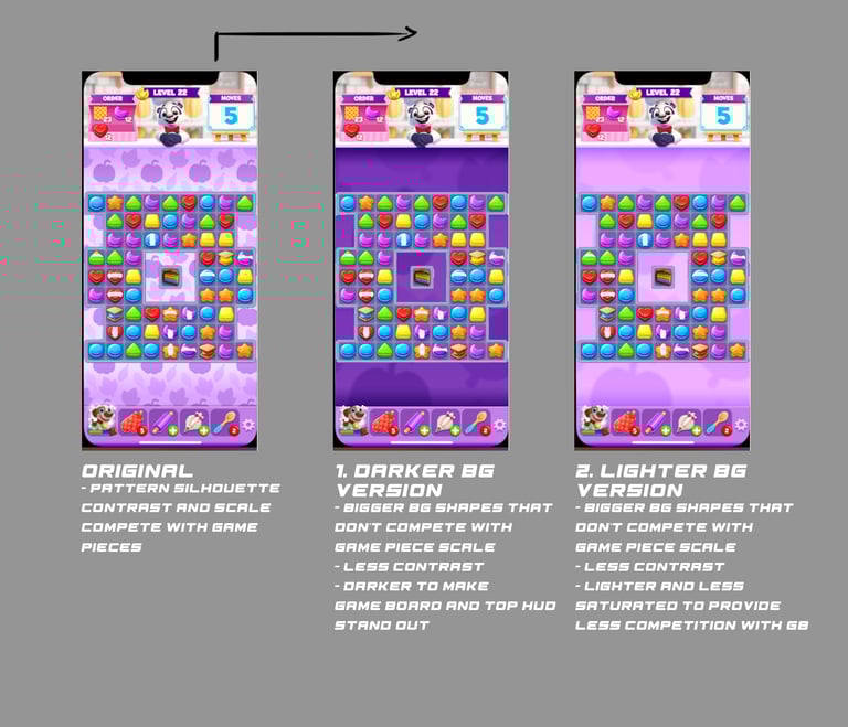
Game Pieces Art Direction
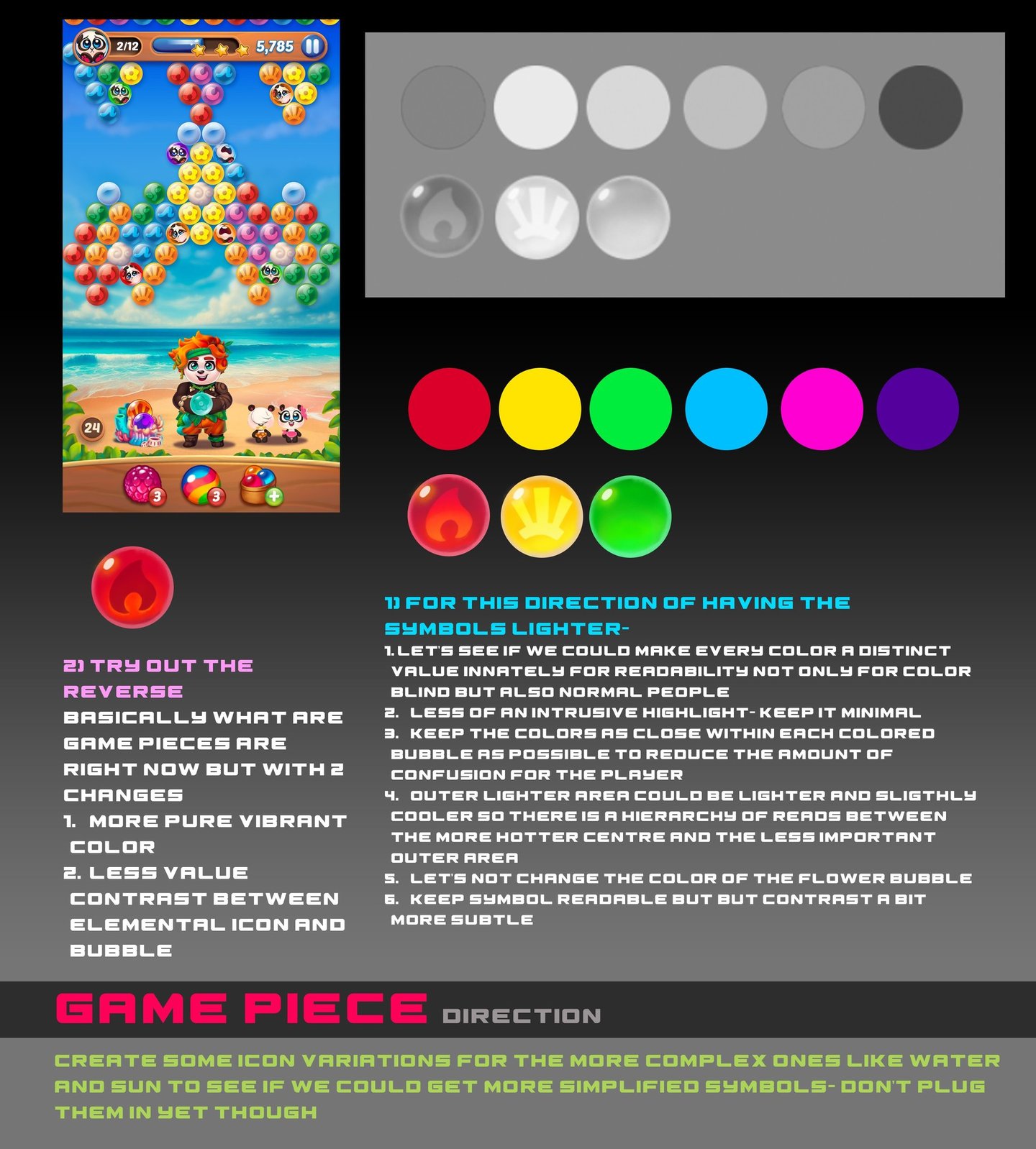

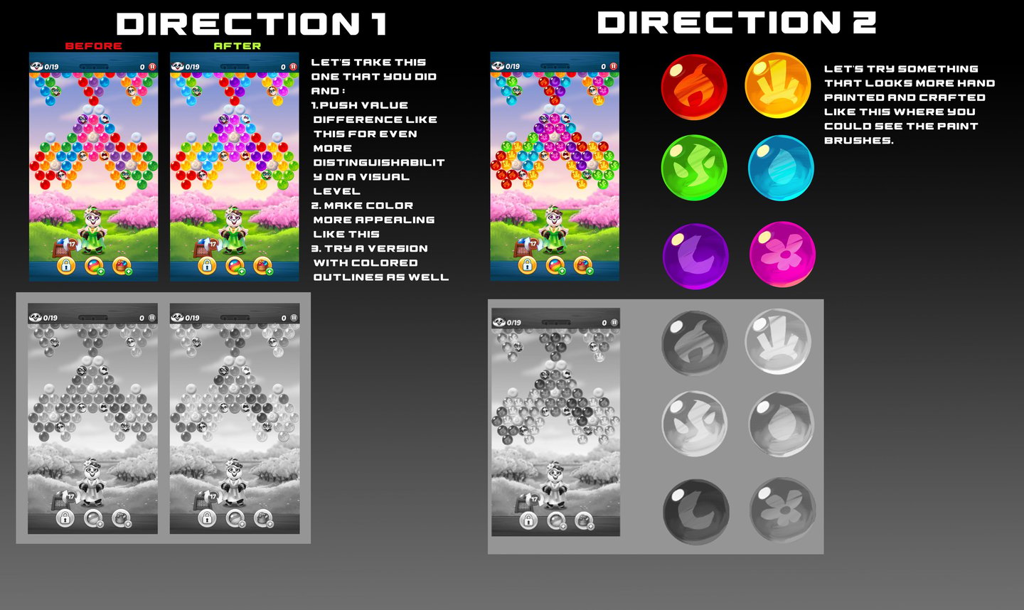
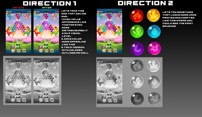
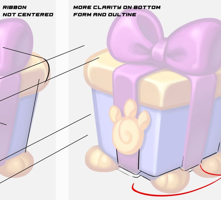
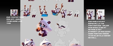
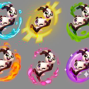
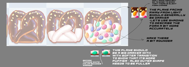
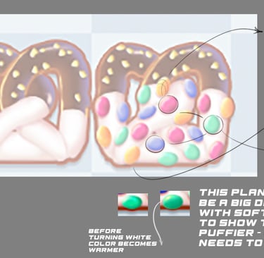
During my time on Panda Pop, I worked with our internal artist to explore various bubble game piece directions in an effort to refresh, demphasize the contrast between the symbol and the bubble, and increase the color distinction and values so when there are overlay items there were no confusion as to what colors the bubbles are. I am just showing the work in progress below and not the final products. On the art side, my vision was to increase the dimensionality, add movement, and make the elemental signs cuter. Also making the bubbles have great synergy with the game backgrounds and the rest of the game was also crucial in helping me and the other stakeholders choose the final design. Additionally, I strongly pushed for value and hue distinctions to ensure that even color-blind people would be able to tell the difference between the elemental bubbles.
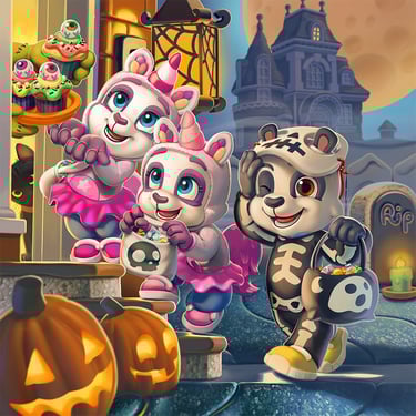
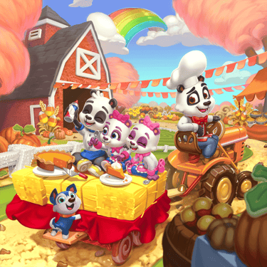
Thematic Reskin Events
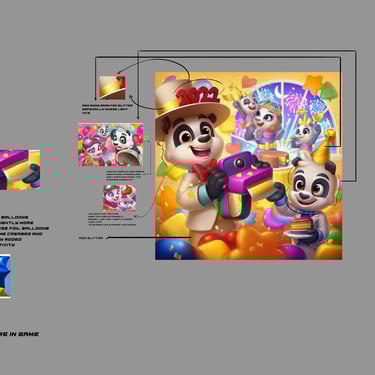
On a quarterly basis we would thematically, whether seasonal, special event, or gameplay oriented, do more involved reskins of our game, which includes splash screen, app store promotionals, crm, daily login characters, mama panda costumes. I had the opportunity to create the art direction prompt ( which includes past and present context, suggested color palettes, directional and inspiration sketches, reference guides, specs, templates, etc.) and work with the art team to execute on it. Below are a couple of samples of thematic reskins I themed, promoted, and art directed.
Challenges: One of the difficulties I faced was really just coming up with suitable themes weighing in how relatable, current, and eye-catching potential the theme has as well as how to execute it in a way that grabs the attention of existing and new players on the app store or in game.
Solutions: Extensive research, discussions, context examination, keeping our targeted audience in mind, and instinctually making a call based on all the previous items.
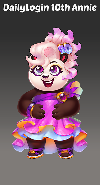
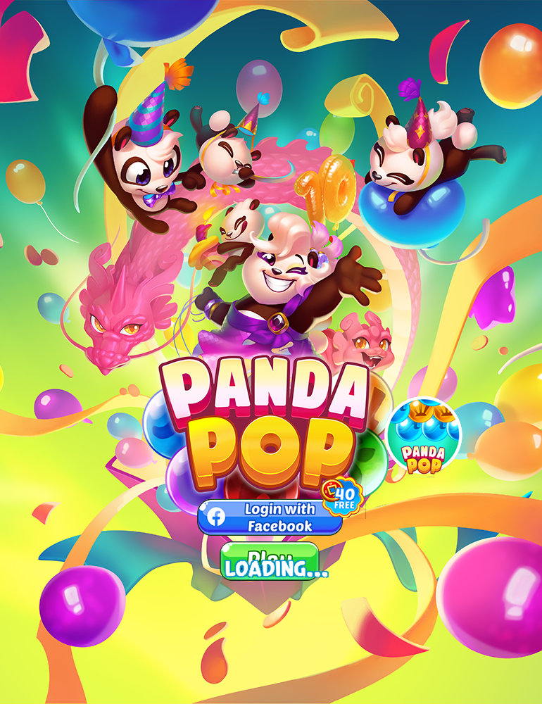
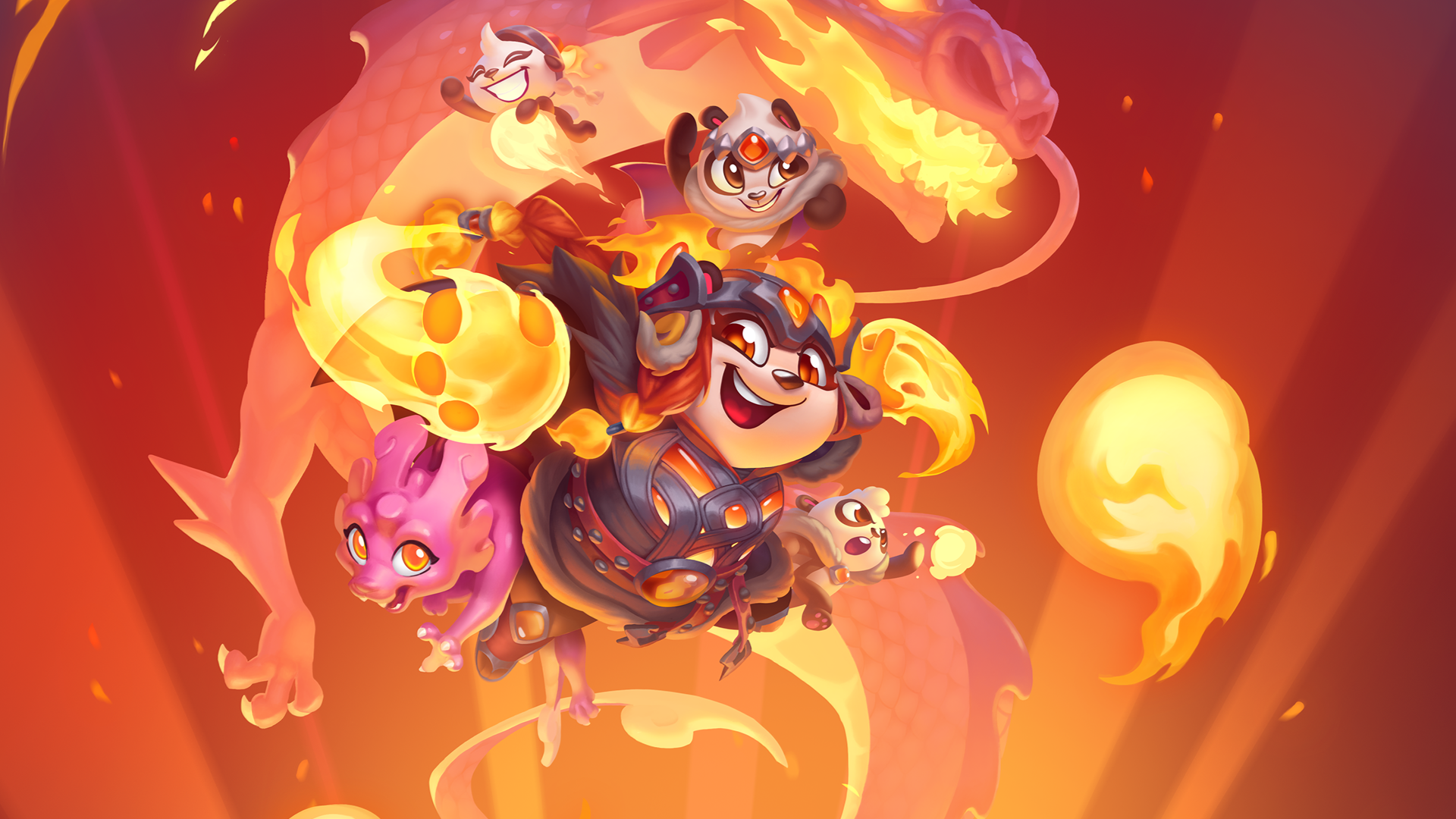
10th Anniversary Reskin
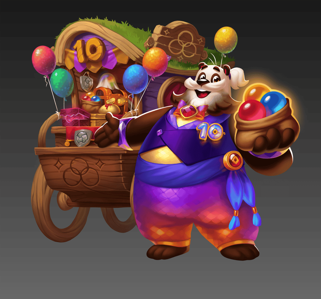
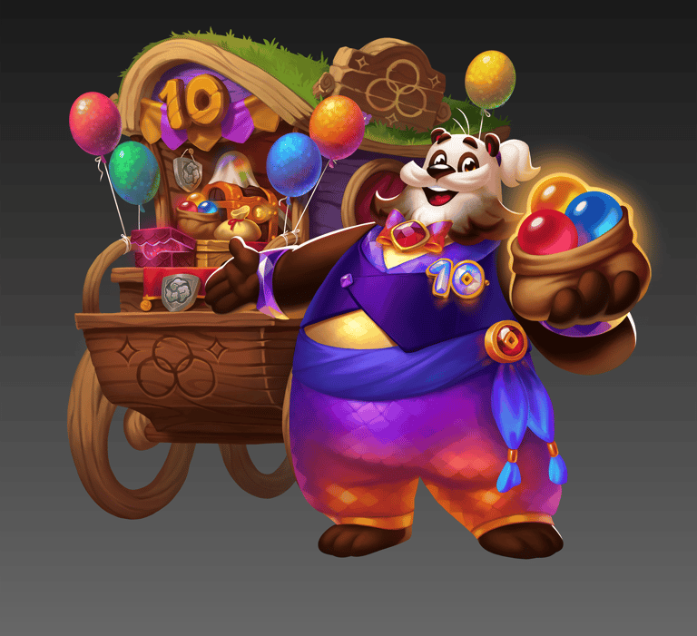
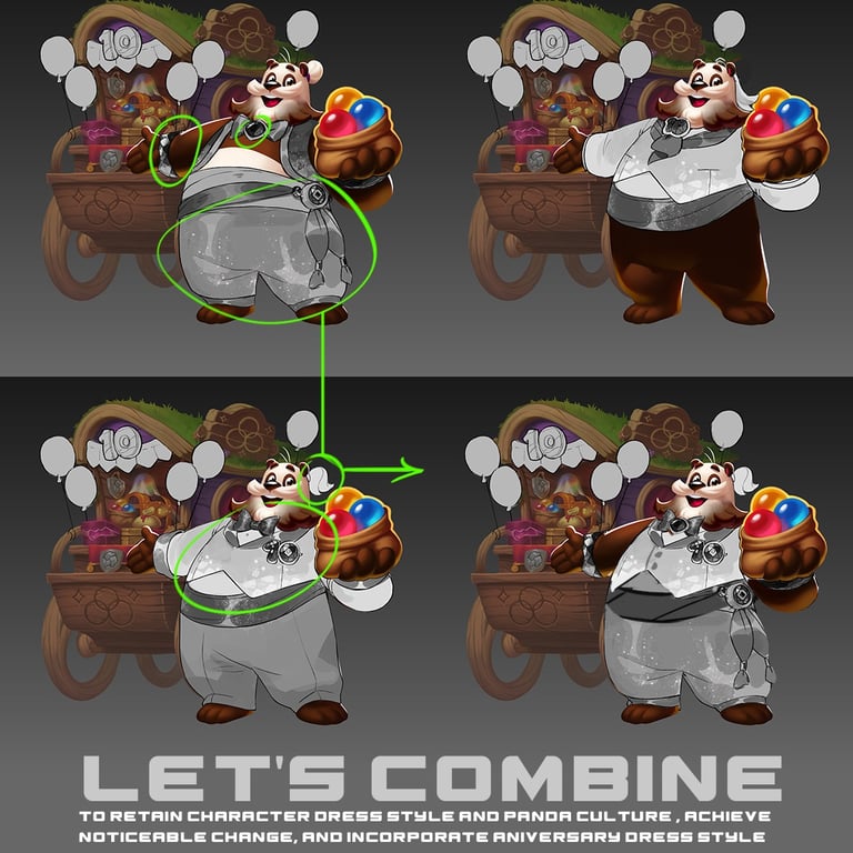
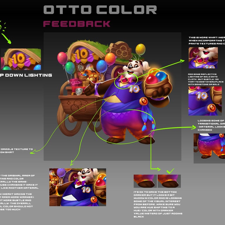
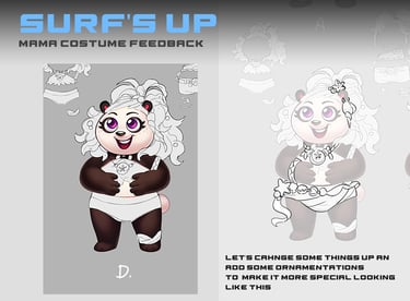
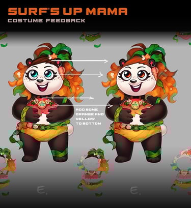
Surf's Up

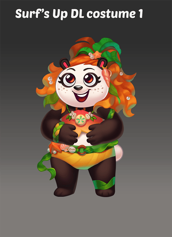


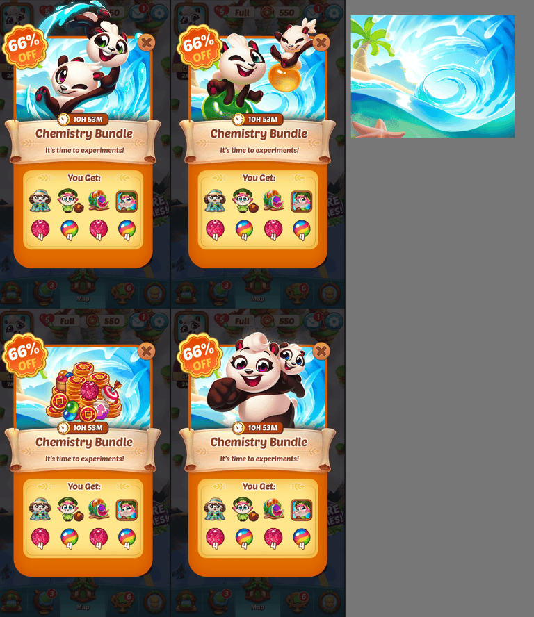


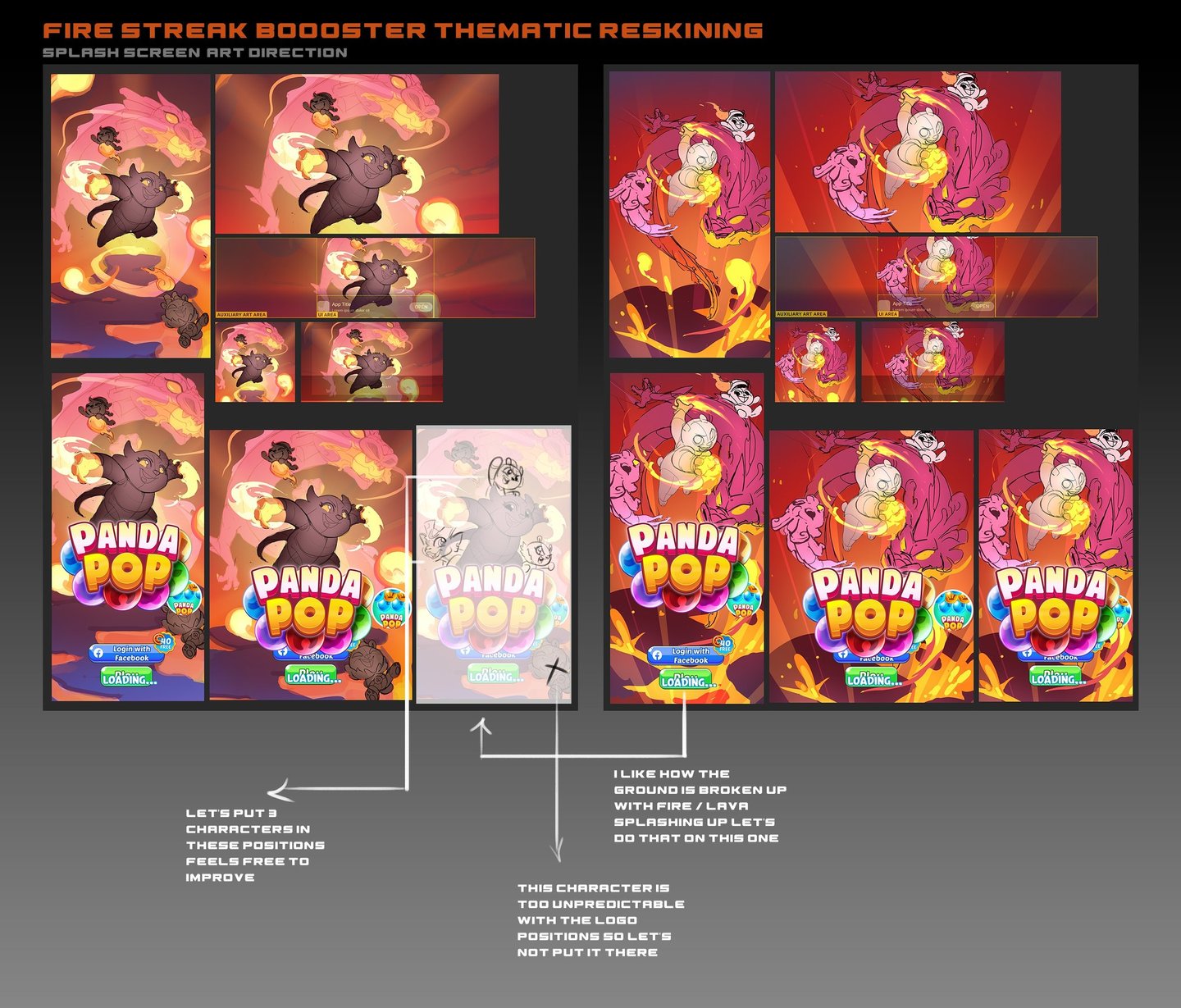
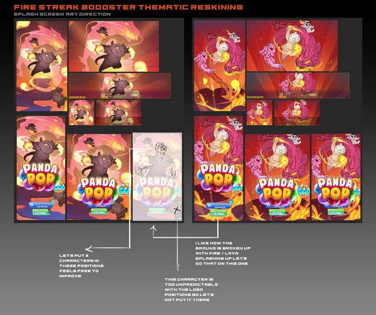
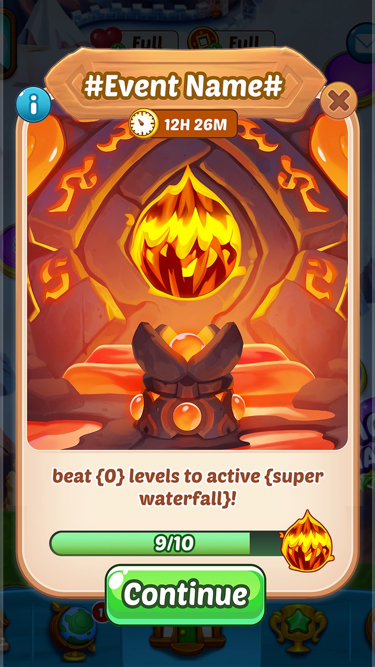

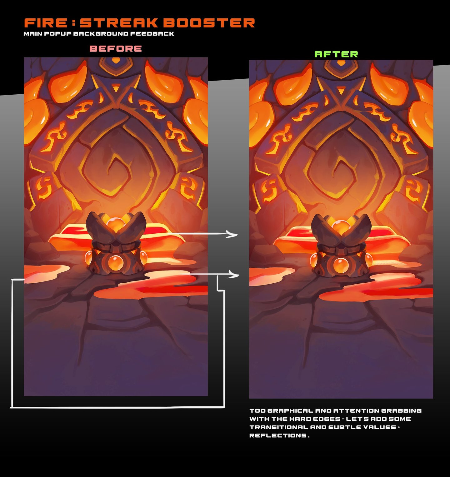
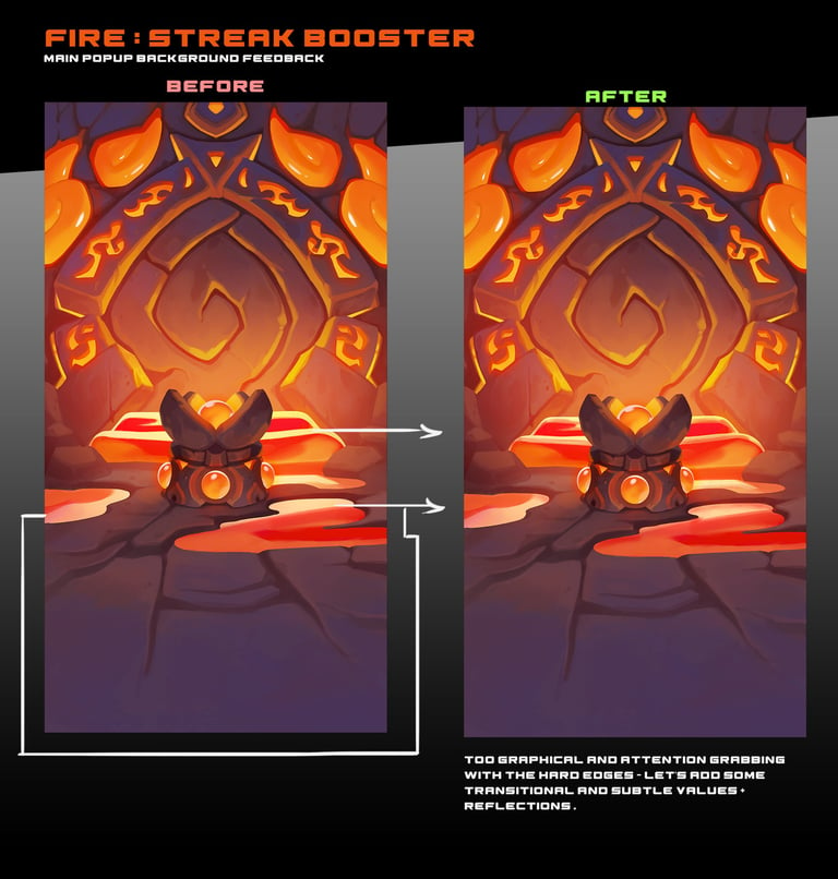
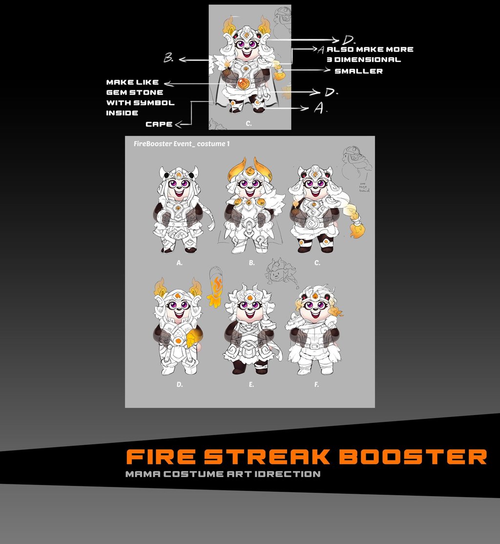
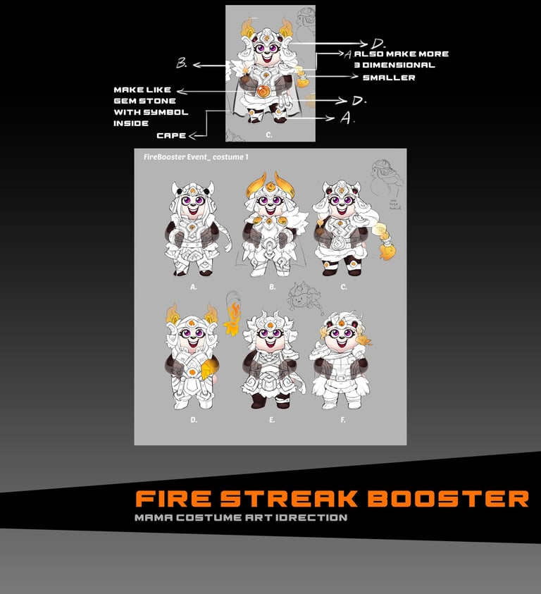
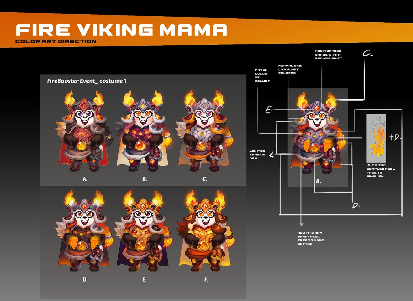

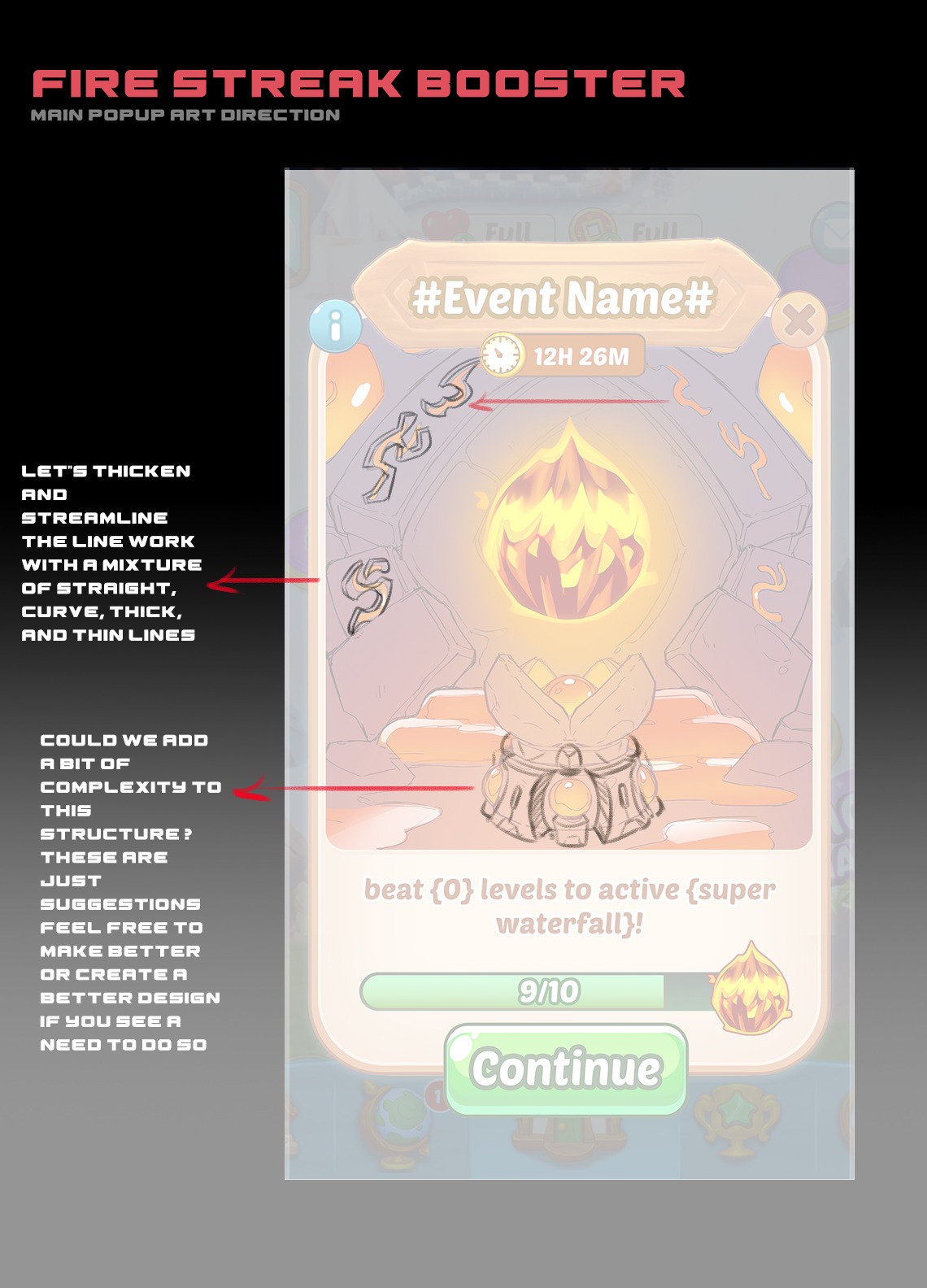
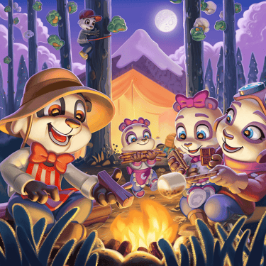
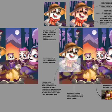
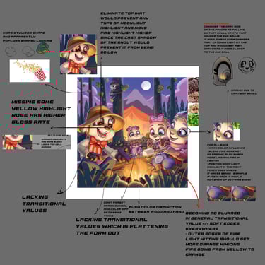
This reskin is based on our streak based booster feature where after the player loads up a certain amount of wins he or she gets a streak of fire boosters scattered randomly with each win.
After much research I decided that it be cool to do something based on fire festival, since it's more of a universal event. For the art direction and thematic reskinning I suggested tha the team go 90% viking and 10% samurai and this is the output! While in the environment I suggested we go with one of our panda world settings which is fire and dragon related.
Fire Festival
Feature Loading Screen + App Store Promotionals
Elevator Loading Screen + Promotional: The artist did a great job here starting from the sketch phase so the art direction came down to asking the artist to flesh out some of the rough sketches to help me make a sound decision, eliminating cropping issues, and making sure all the essential elements showed up to imply the functionality of the elevator feature. The Key decision was how well it translated to every promotional cutout instance, how attention-grabbing it was, how dynamic the composition was, and how well it captured the baby pandas. Ultimately this design checked all the marks and captured both the best view and personalities of the baby pandas to me while also not spelling out the full story leaving our current and or potential player base curious and hungry to find out what the baby panda is looking at in game.
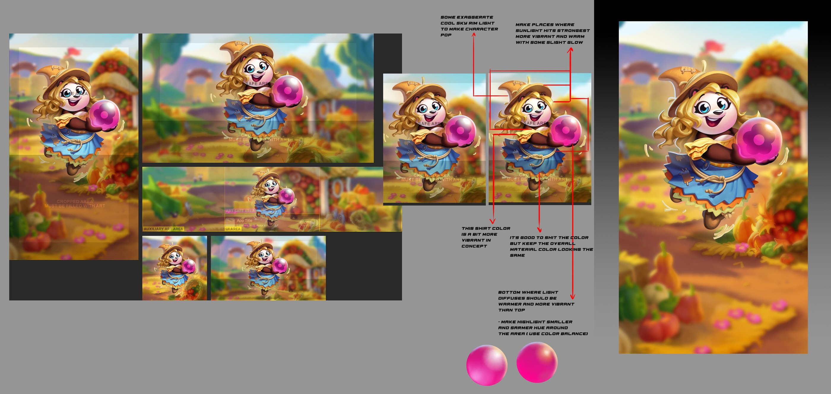
Hay Mama Costume Promotional featuring. This promotional was based on an autumn costume released in October that was based on a scarecrow-inspired concept. (below)
Challenge:
getting the colors of the costume to match that of the in-game version
getting the team to make her look richer in color, vibrancy, and sunlight. The colors were a bit muted and not attention-grabbing enough
Solution:
I demonstrated what I wanted and how to push the color and lighting to make the character more inviting and attention-grabbing
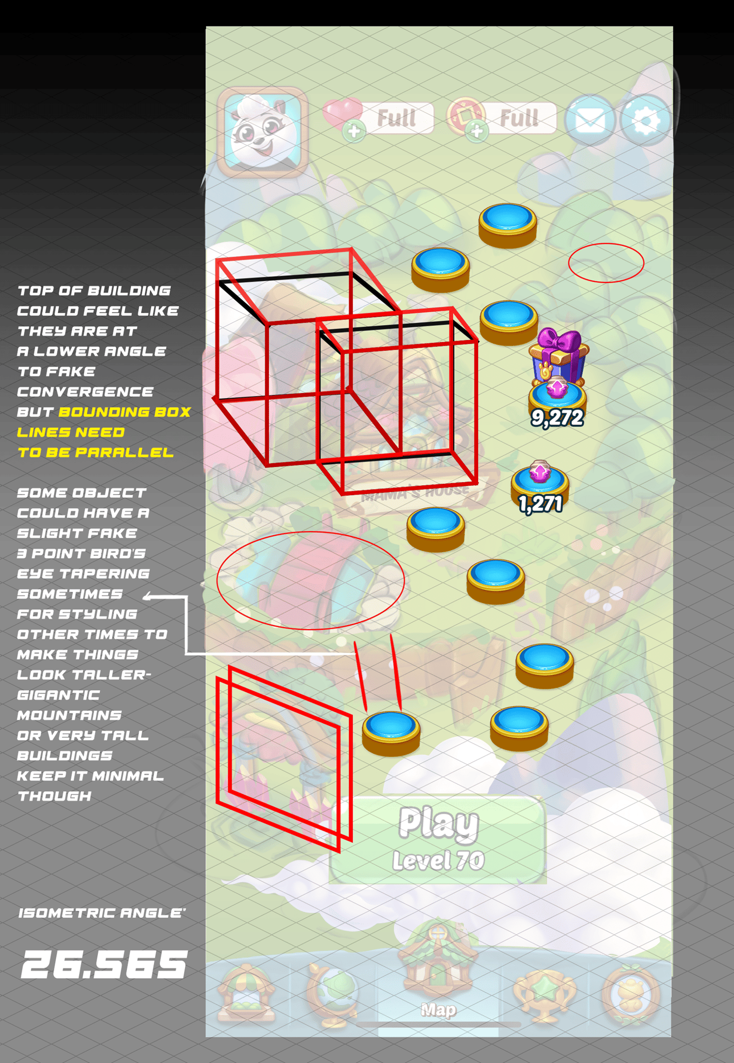
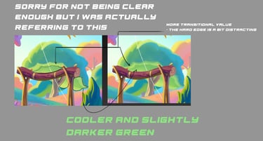
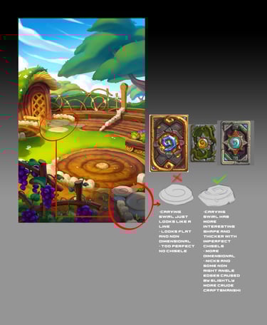
Saga Map Revamp
Solutions:
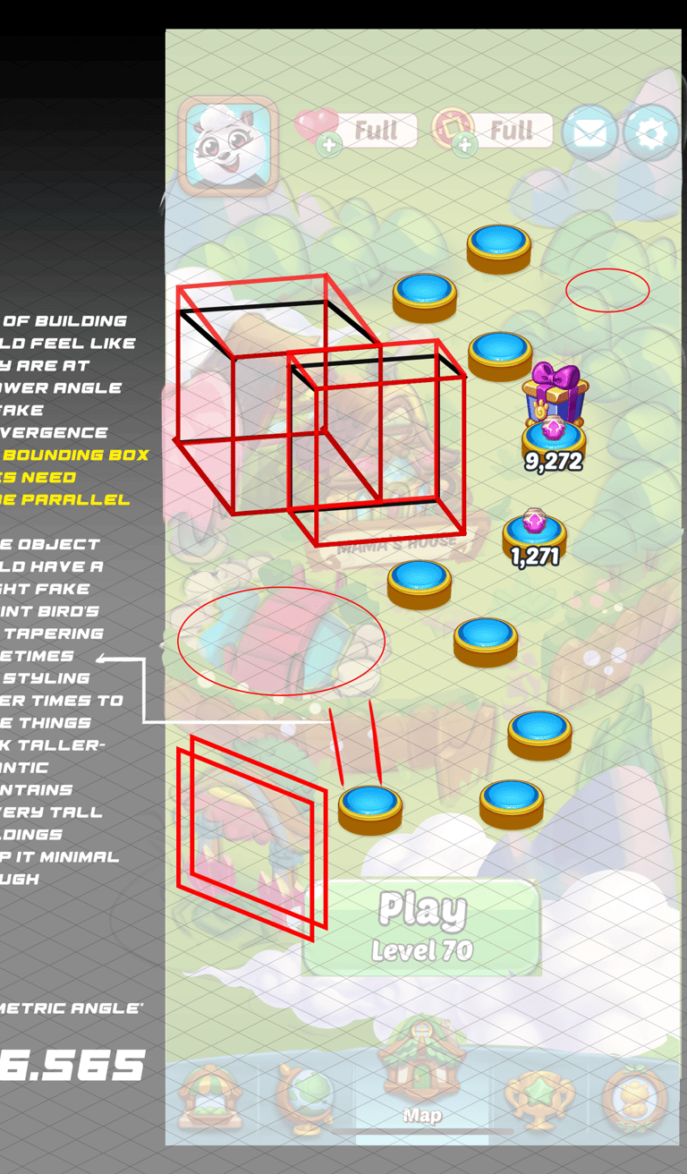
I ended up coming up with a fusion view that combined the classic isometric angle of 26.565( it made it easy to tile and repeat yet provided a medium angle that provided dimension yet retained great silhouettes)with a slightly flattening faux perspective near the top of buildings. I mocked it up and broke it down for the artists to go off of.
Our art style luckily had a natural dispensation of smooth and simplistic rendering style which worked well by nature but I made sure that the value range and contrast didn't go past a certain limit that would compete with the more graphical and detailed UI badges.
Since I have a deep expertise in this area I know that the lighting needed to be at an angle that made the landmarks dimensional while keeping the shadows short at the side and back so it wouldn't cause overlapping issues and break visual illusions
Before
After
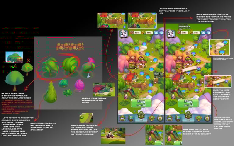
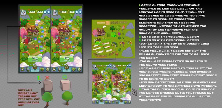
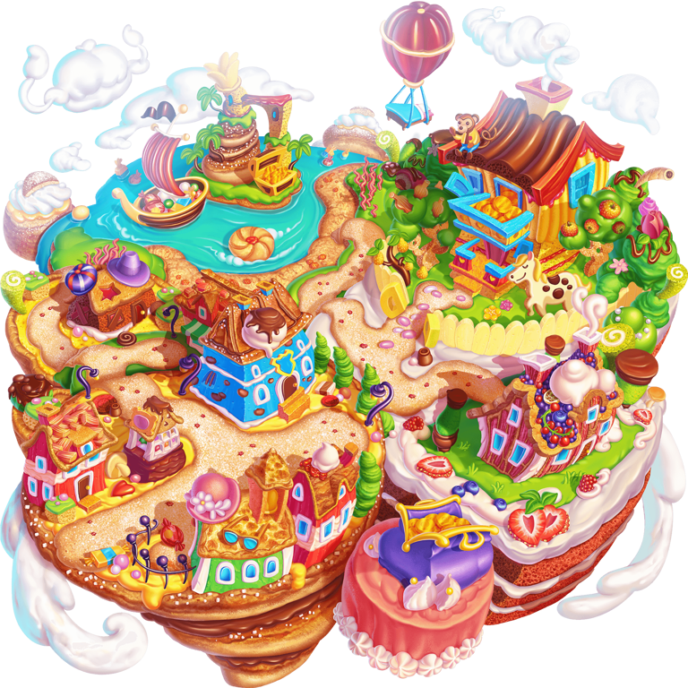
After joining Panda Pop I realized there was a huge discrepancy in art styles between the saga maps and the rest of the game, which was really bad for our brand image and player experience, so I initiated conversations with the other department leads and was able to get support to revamp the maps starting from the beginning maps.
Challenges:
How would we solve for the discrepancy in perspective between the ground and the buildings while keeping the modularity aspects? The legacy map landmarks looked very much like little cutout vignettes with much more
Artistically what could we do to ensure that the background does not interfere with the UI badges?
what angle of the light source should we use to highlight the building and also yield a shadow that is tileable in the long run?
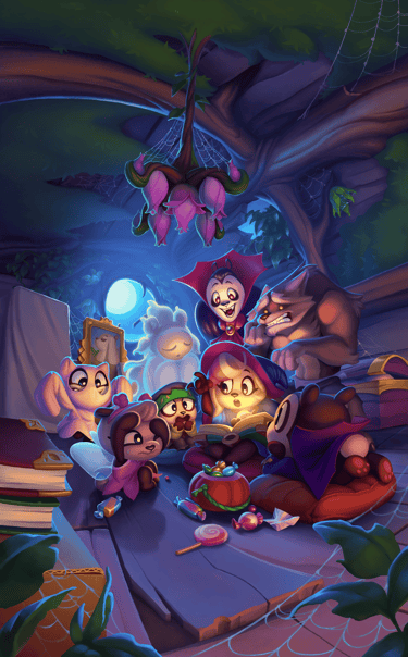

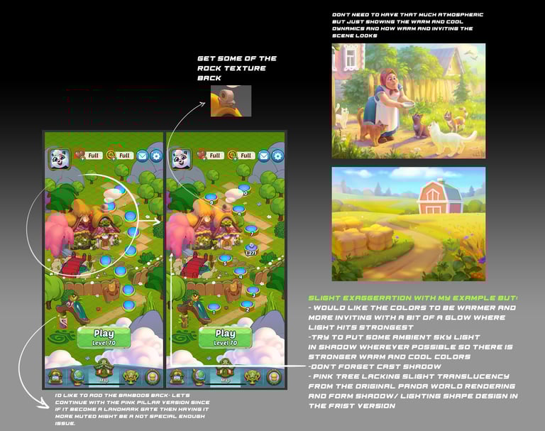
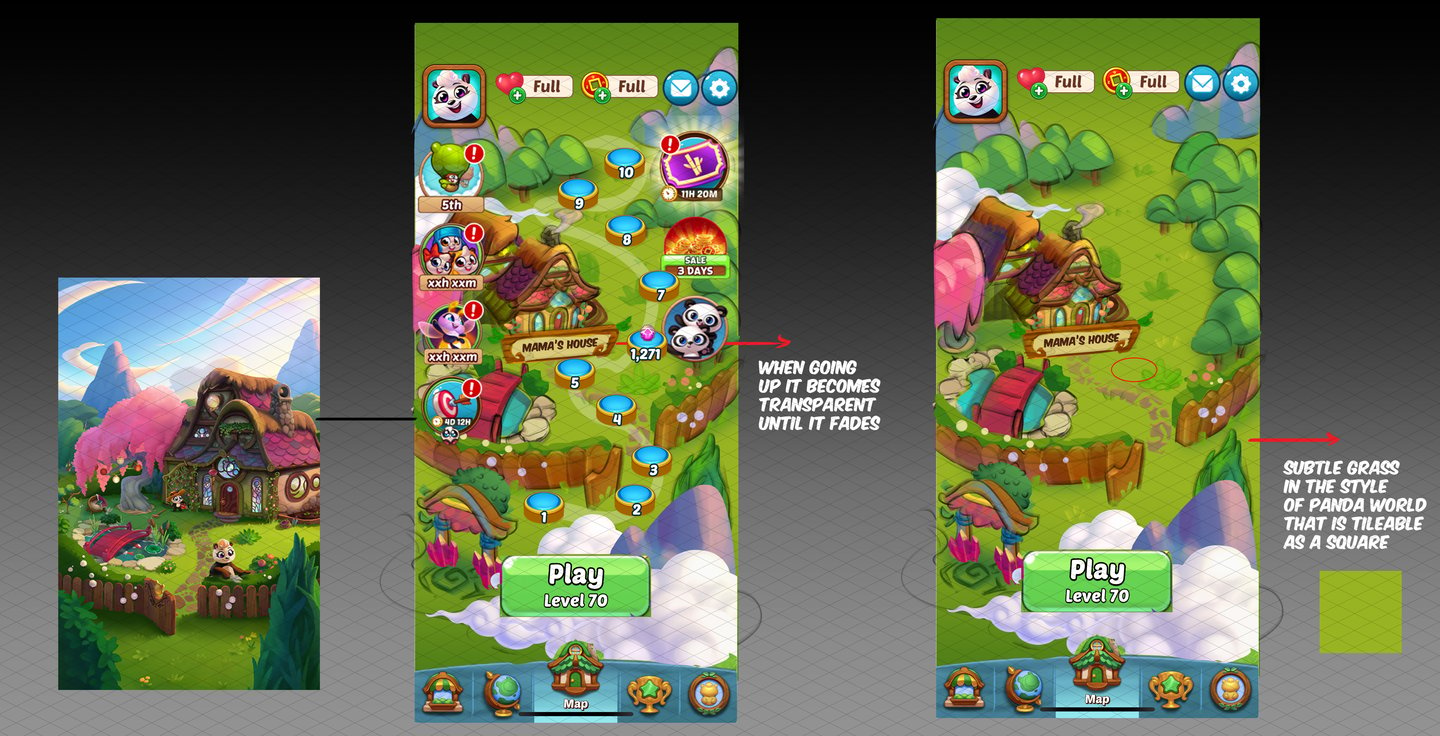
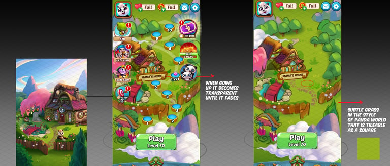
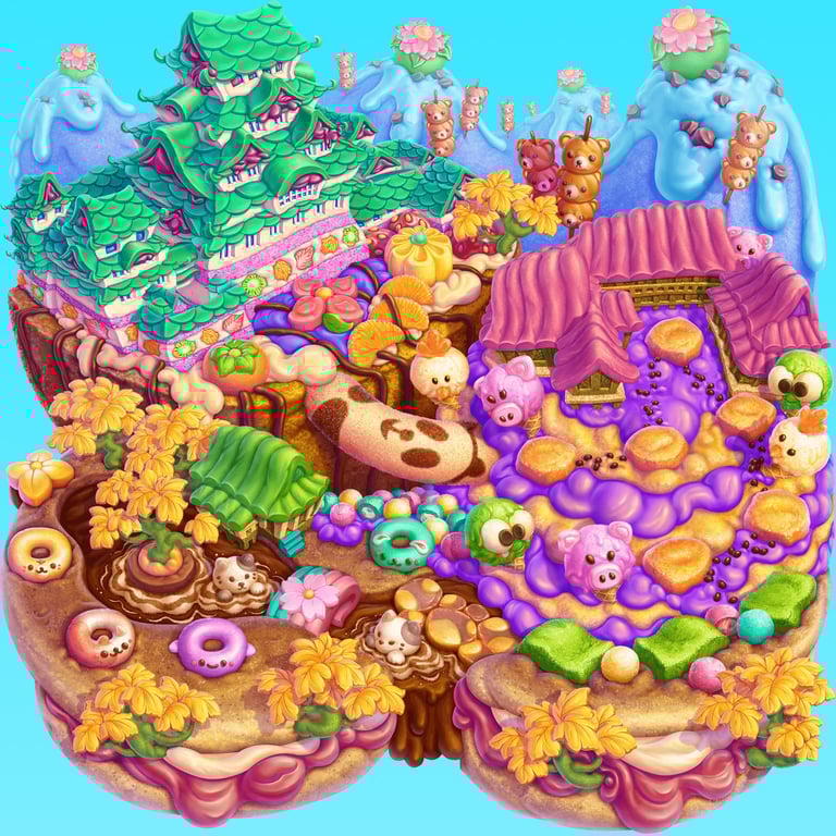
Panda Worlds
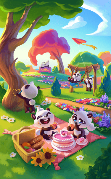
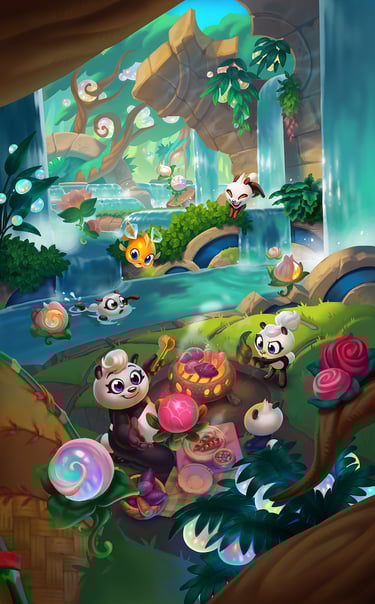
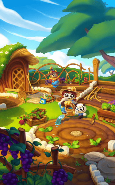
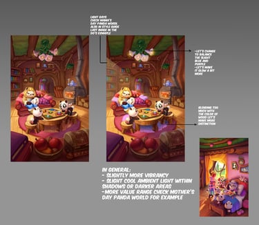
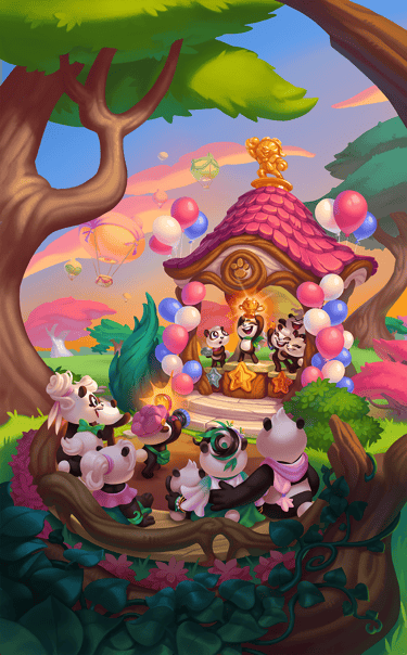
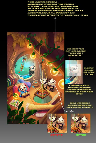
This is a feature of animated illustrations of various magical panda worlds that the panda family spends time in and explores. You unlock various items on each illustration by collecting gems on first-try wins.
My involvement here includes coming up with a seasonal prompt that includes the basic narrative of what is happening in the scene, where it is taking place what the place looks like, and what the unlockables are. Aside to that, I focus on visually upholding the legacy of the 3 core thematic pillars, magic, nature, and family, essential to Panda Pop, as well as ensuring that the artwork retains its high bar and contains my artistic vision of personality-driven characters and thematic mood. Lastly, I approve and feedback on the previsualization version of the animation of the unlockables with the concept & render team and afterwards work with our animator to ensure polished, natural, and lively character and object movments.
CRM Art Direction final and in progress samples
Part of my responsibility as an Art Director is also to oversee the creation of CRM character hero images and backgrounds whether generic or seasonal. Below is a snippet of some of my feedback process as well as final outputs. Since I've been working on these with the team we have seen a big revenue increase.
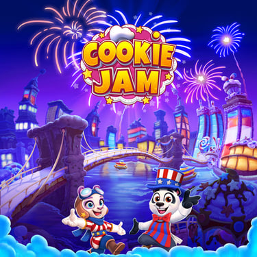
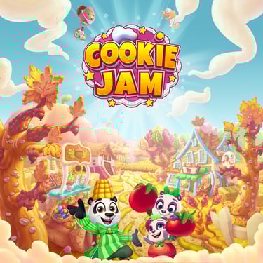
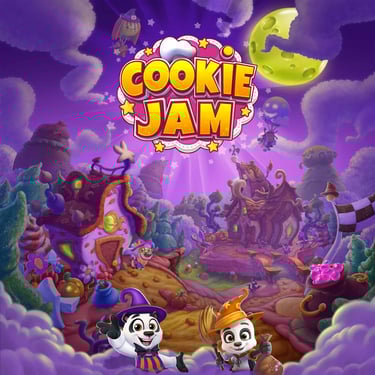
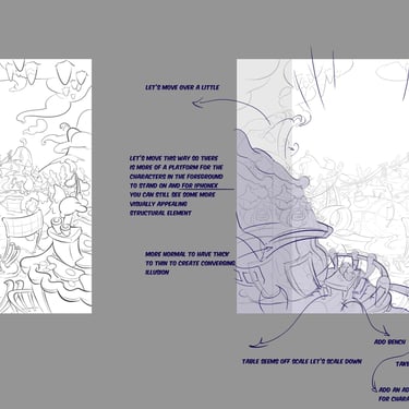
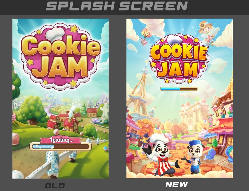
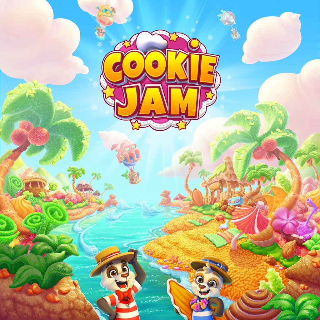
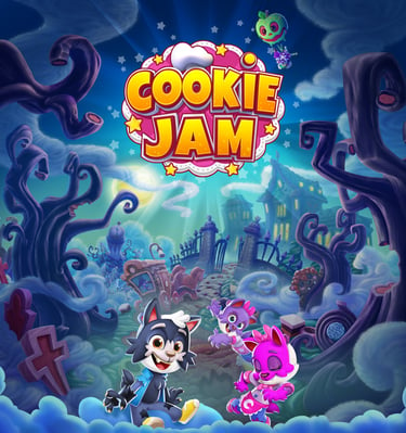
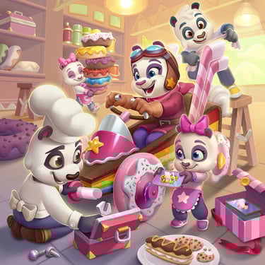
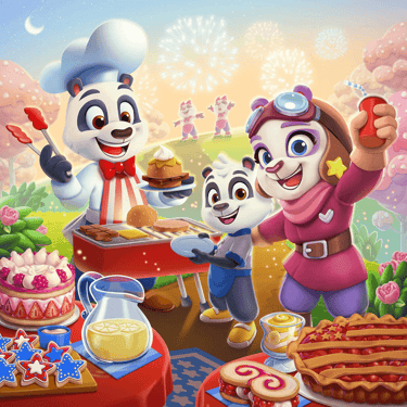
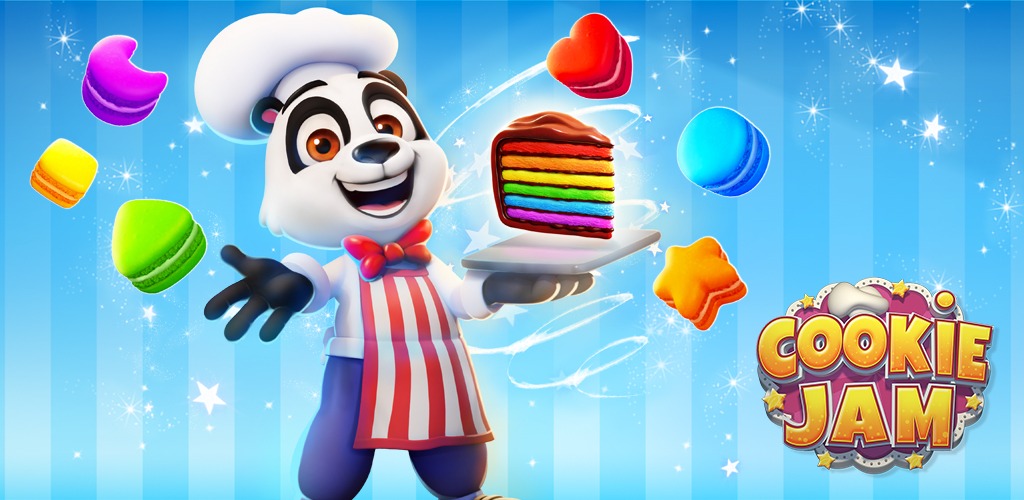
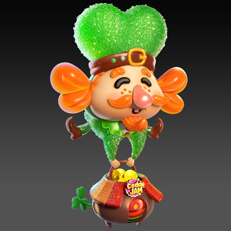
COOKIE JAM
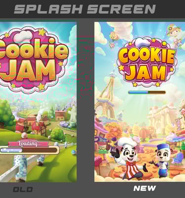
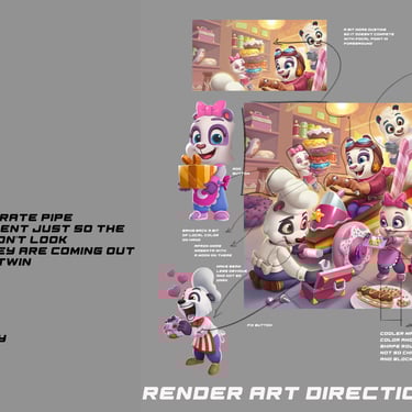
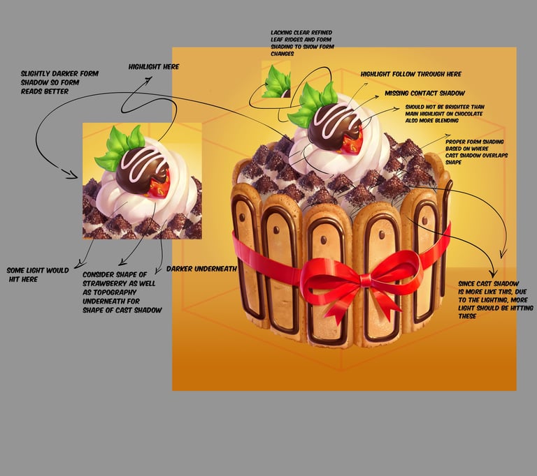
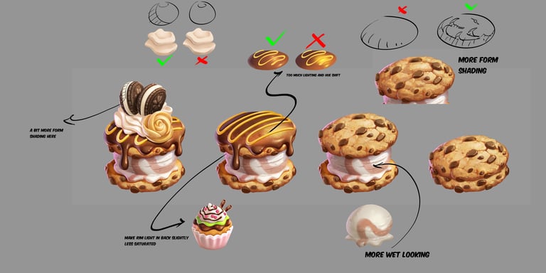
One of my tasks on Cookie Jam was resolving the issue of our splash screen being too bland and unnattractive. Effective splash screens pull players in to the game and become nice marketing material, killing 2 birds with one stone. So I worked with our team of character artist, concept artist and rendering teams to produce a workable format that accentuates the cookie jam culture, seasonal theming, as well as provide eye candy for existing and potential players. As an art director, delivering splash screens with unified color palettes, consistent art style and shape language, dynamic compositions, and conveying the brand essence of warm, fun, and uplifting mood was my main focus.
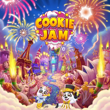
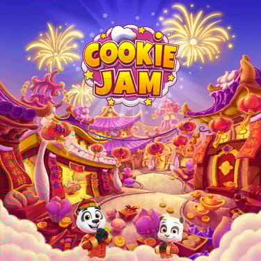
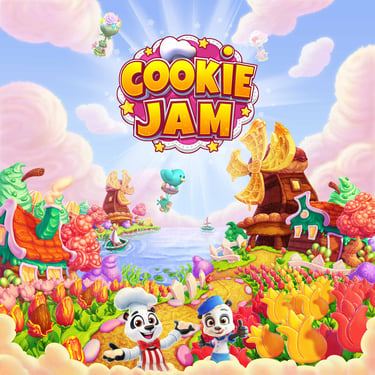
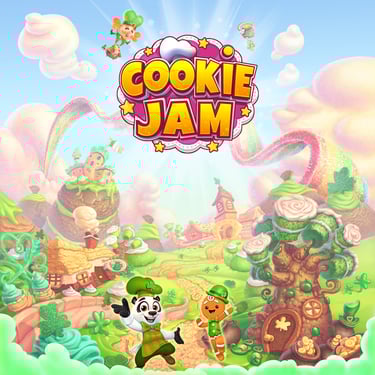
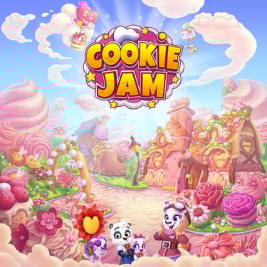

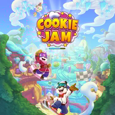
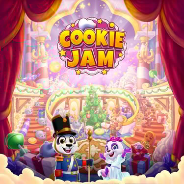
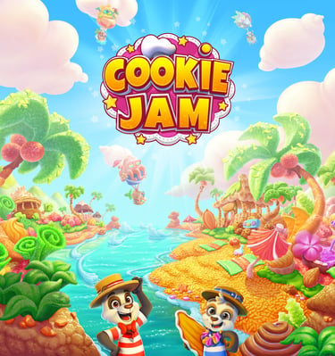
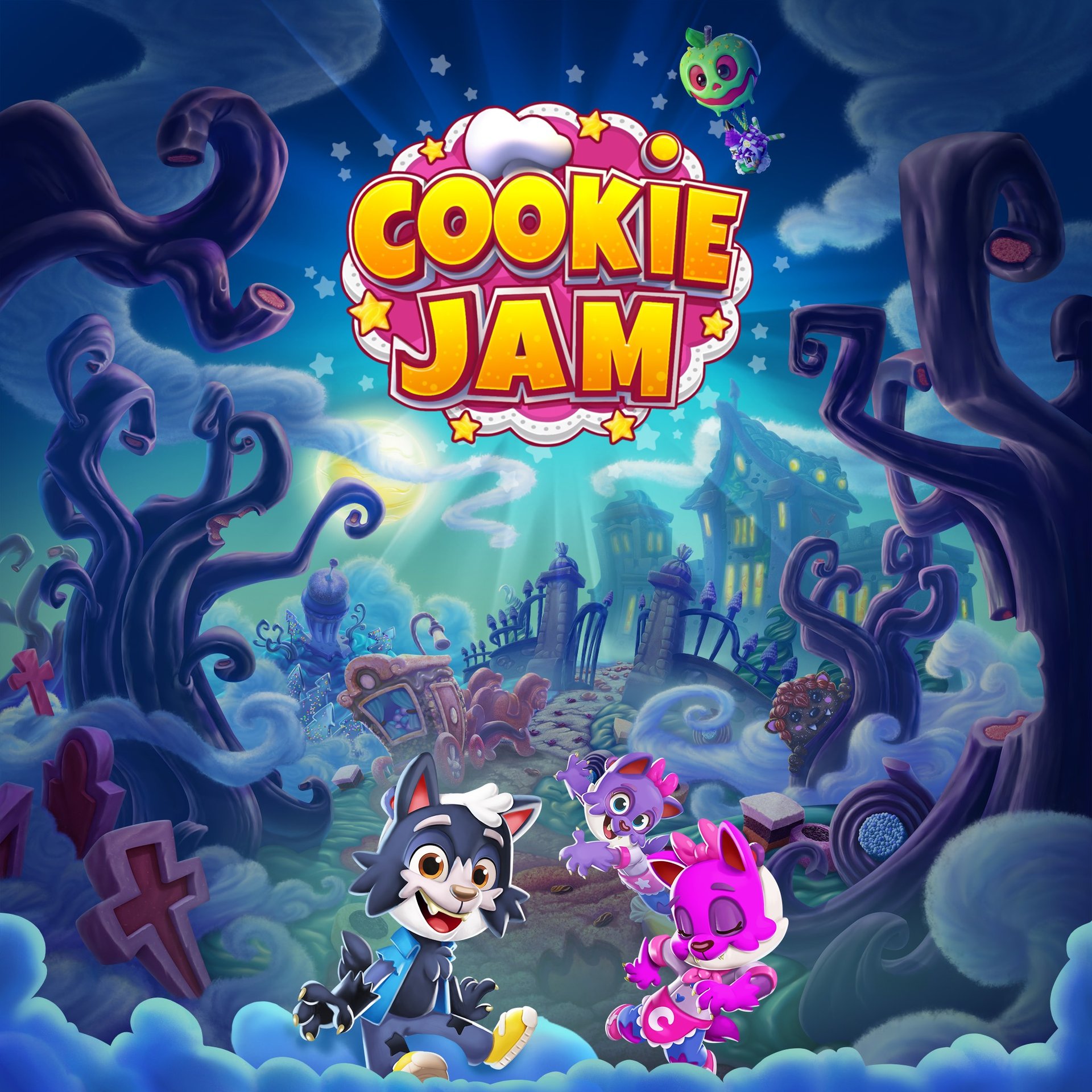
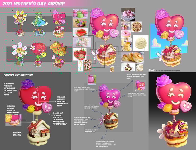
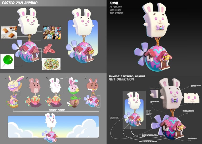
On Cookie Jam I had the opportunity to art direct many art assets such as maps, loading screens, airships, cookie walks, panda puzzles, pet power costumes, dessert collection itesm, crm, marketing images, user interface, vfx, animation.
Cookie Walks
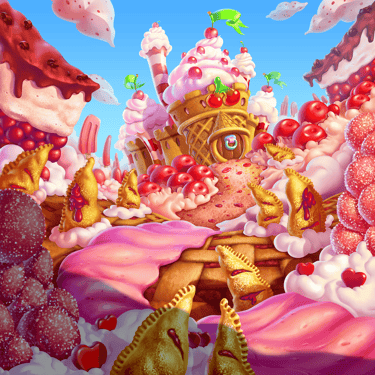
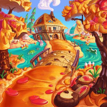
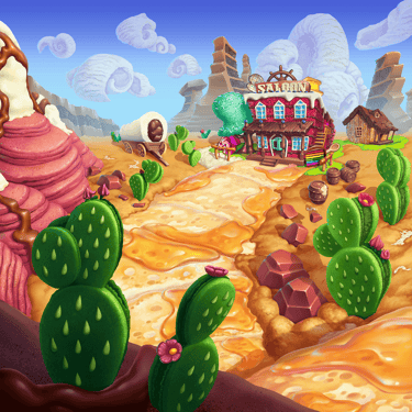
Cookie Jam Saga Map Islands
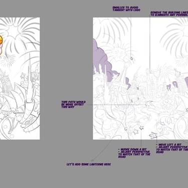
During my time on Cookie Jam, I searched for, tested, trained, onboarded, set up a map art pipeline, managed and art directed at the max 9 external art studios and or contracting artist at one time to produce over 400 maps from concept to render. To increase efficiency I created one style guide for the concept and another for the render detailing guidelines, processes, dos and don'ts, and etc.
challenge:
Challenge the teams to tackle such a complex design process to narrow the map down to a couple of key landmarks of the country or setting and translate the map into desserts from the local area of the same culture while retaining the iconic resemblance but simultaneously also designing a path that can fit 20 level pips on there.
Get more than a couple of studios with different styles to conform to the cookie jam style in concept and render
Solution:
Break down the processes into simple steps of how to look at one aspect at a time and which order to go to make it easier to design. For example, start with the path design, then topography, and then indicate landmarks using simple shapes first.
Create and send concept and render style guides to teams and artists, while consistently upholding and pointing out places they are falling out of the cookie jam concept and render guide as well as direct them to think in a certain headspace of creativity consistent with previous maps by making call outs and doing drawovers.
Panda Puzzles
Marketing Art Direction

During my time on cookie Jam I also got the chance to work with marketing to make sure the visuals style and feel of the characters aligned withthe ones in game.
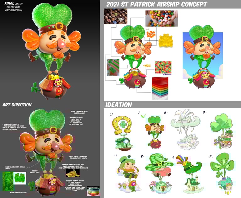
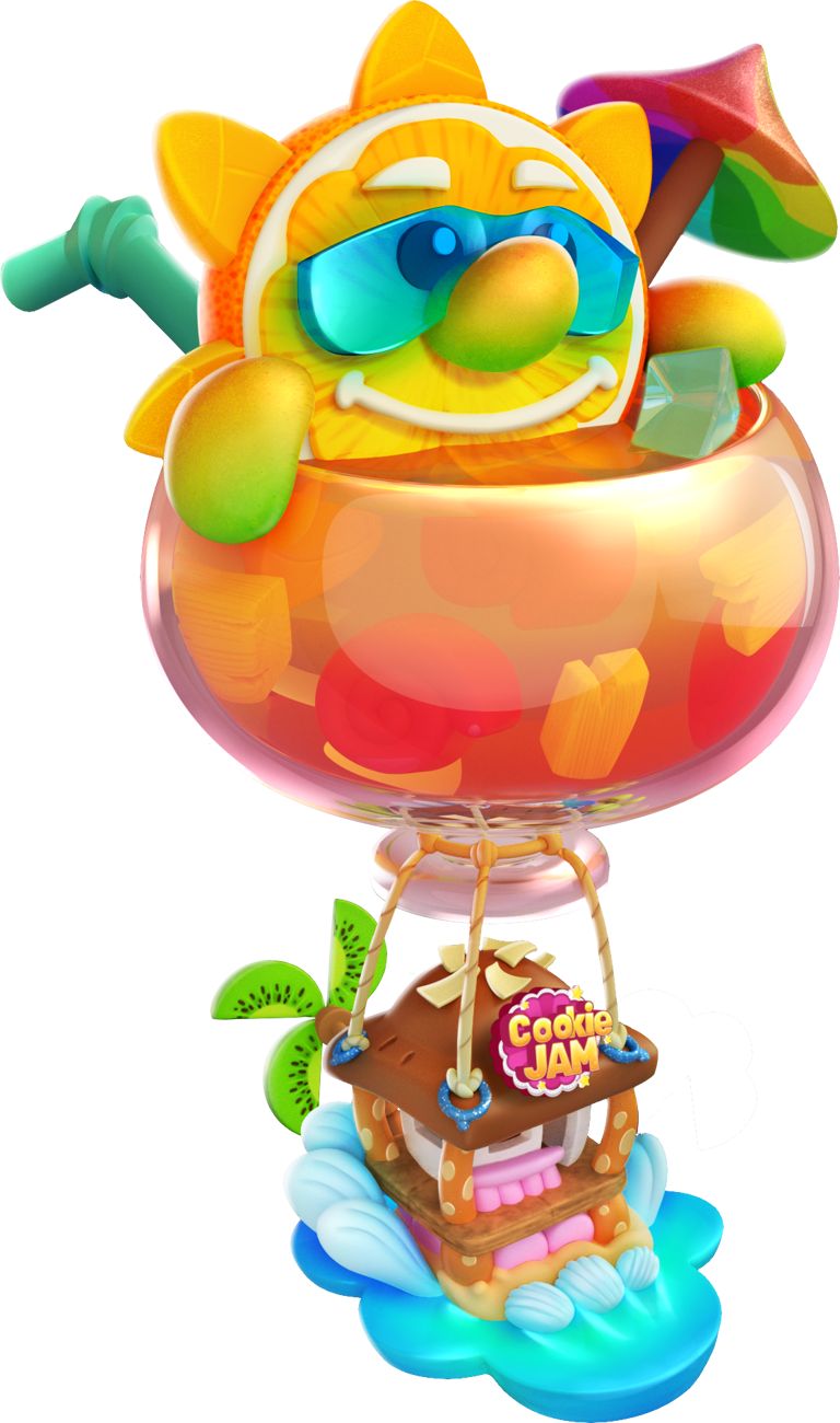
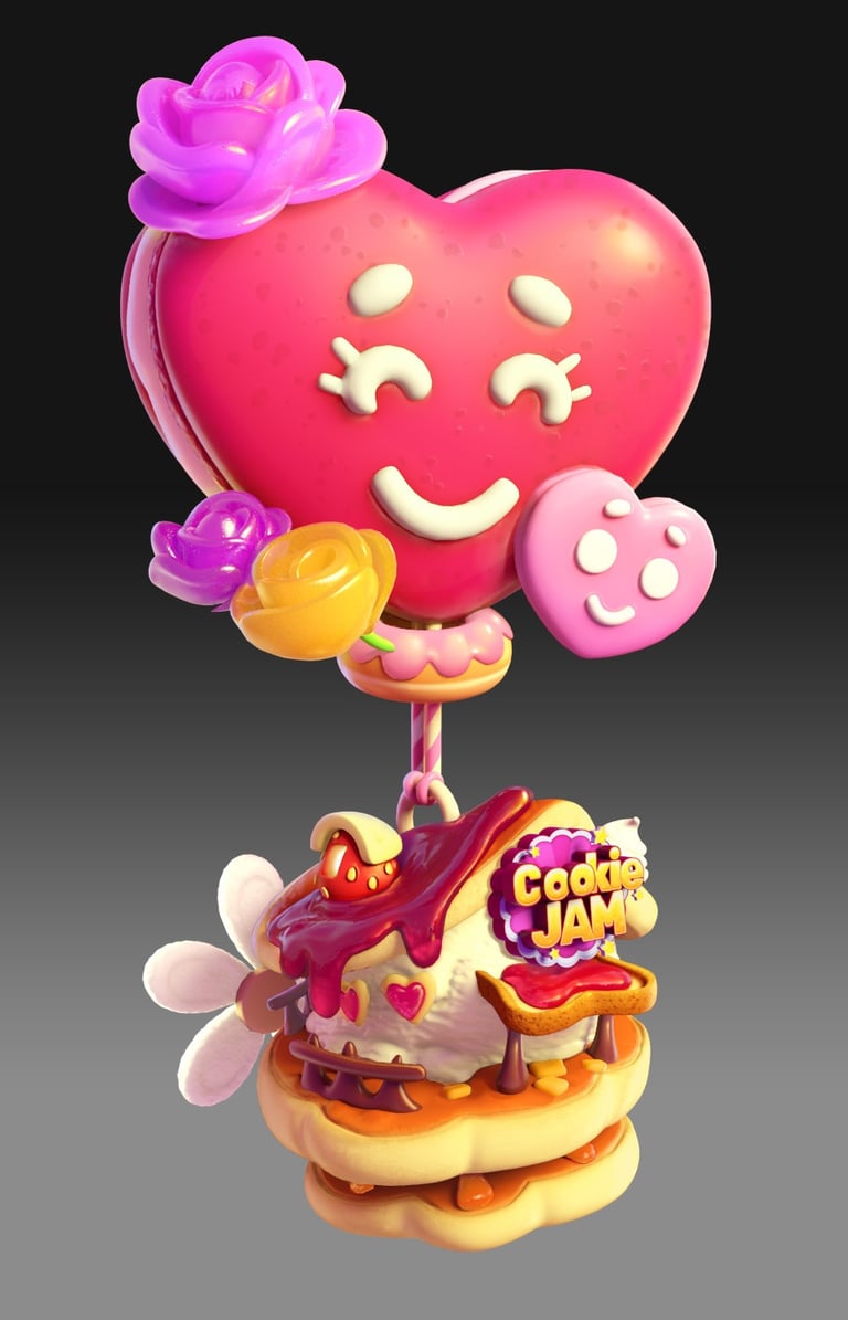
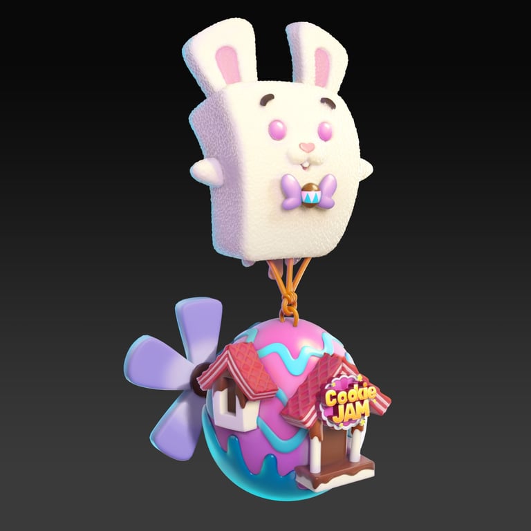
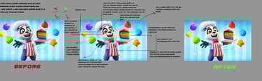
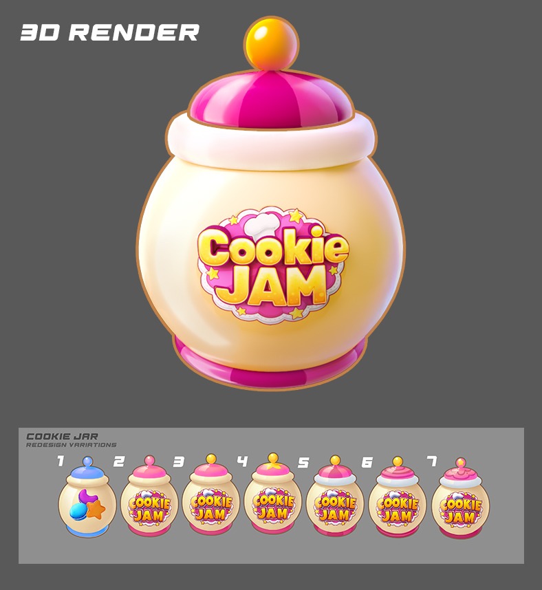
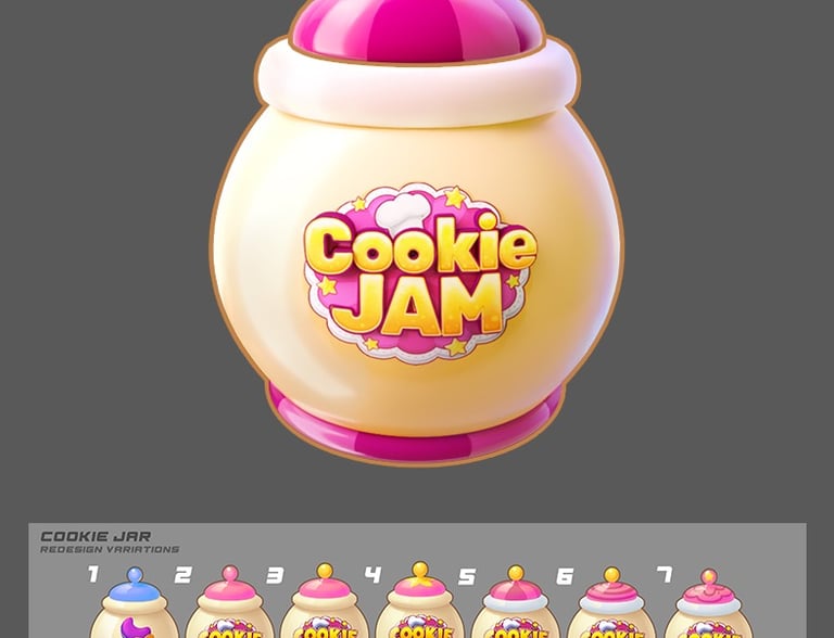
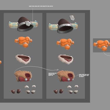
3D Pre-rendered Asset Art Directions
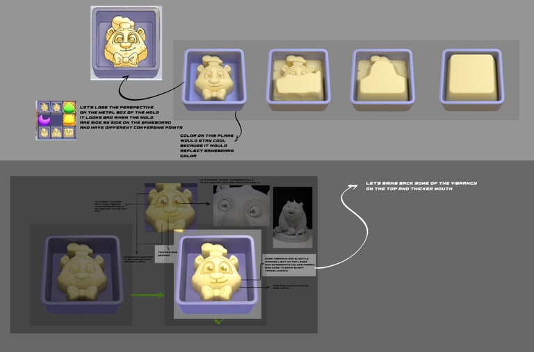
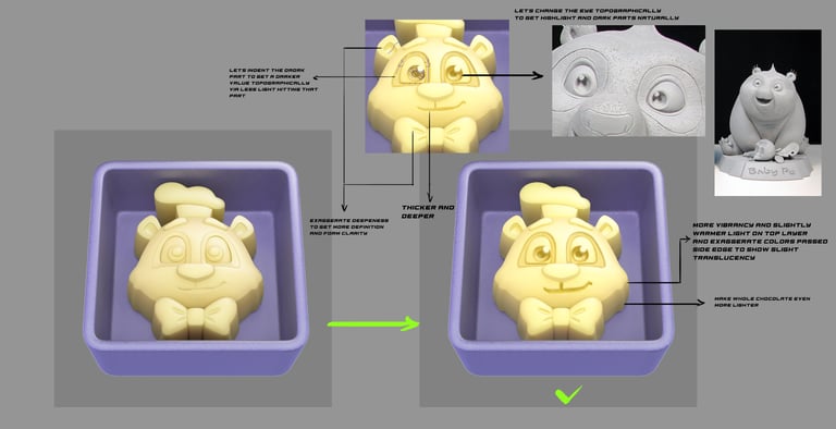
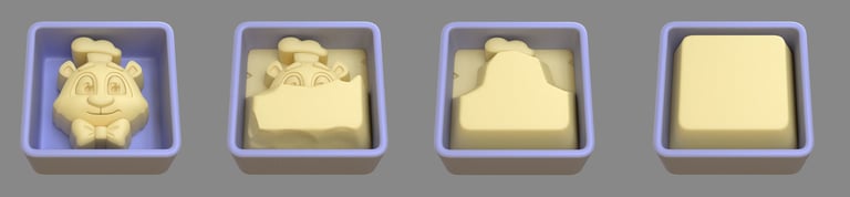
I worked with the 3D Artist to get the models to a more ideal form and render and polished them.
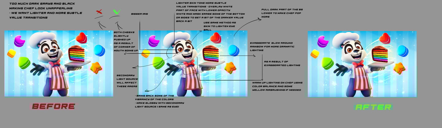
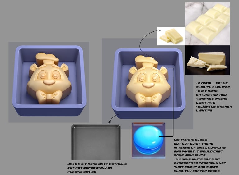
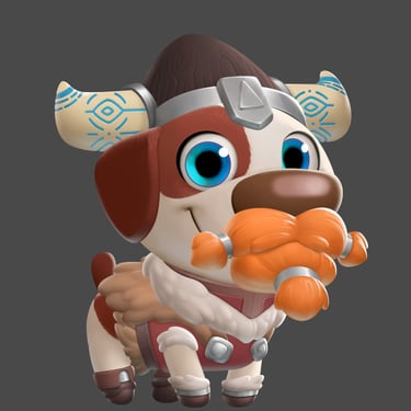
This was for Cookie Jam blast, but I concepted a white chocolate mold blocker in the form of Chef and worked with the 3D Artist to get a desired output improving the color as well as the readability at a small scale.
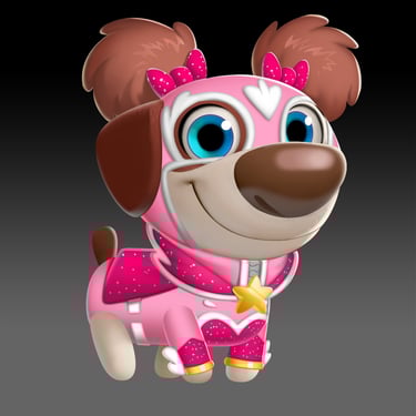
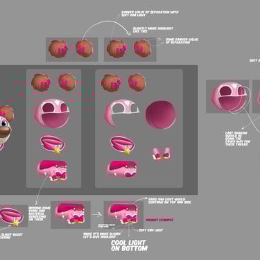
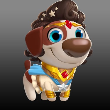
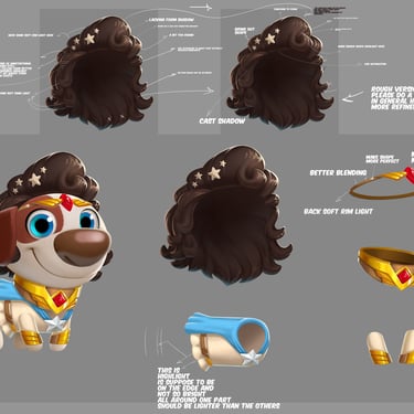
Pet Power Costumes Render Art Directions
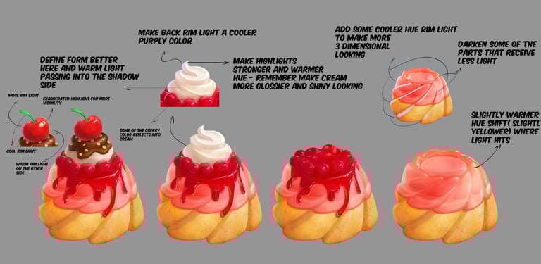
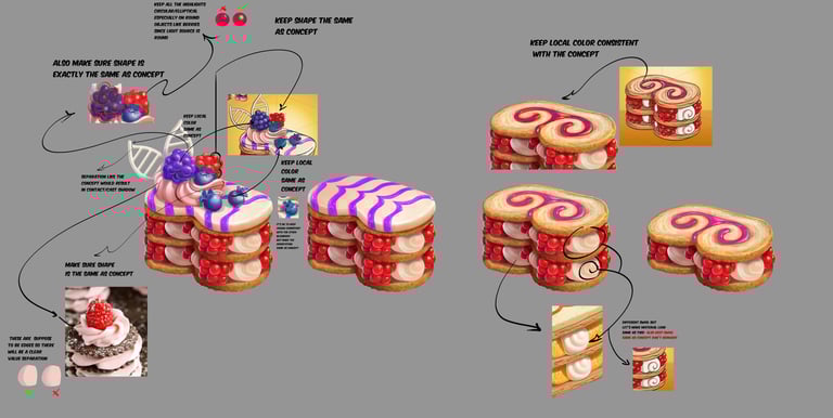
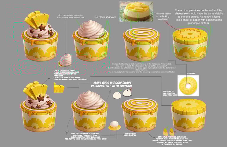
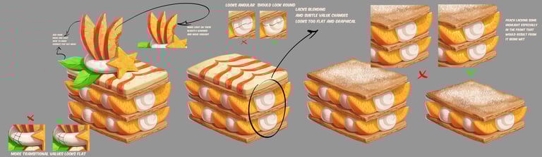
New Dessert Collection Item Art Directions
CRM Art Directions
For the art directions on crm I focus on guiding the team to achieve simple and clear reads, unified color palettes, and 1,2,3 reads using hue, value, saturation to direct the eyes.
UI + Misc Art Direction
Art Gallery
Check out what others say about Isaak's art director work.
I was blown away by the creativity and attention to detail in the art director's portfolio. Truly inspiring work that showcases a unique artistic vision.
Jenna Ortega
New York
The art director's portfolio page is a true masterpiece. Each piece of work tells a story and captures the essence of the artist's talent. Highly recommend checking it out!
Jake Dang
Los Angeles