GenAI Campaign 01
OBSIDIAN BRAND DESIGN
Born from molten heat. Refined for the game.
Hands-On + Pure Art Direction for the new Electronic Table Game Line


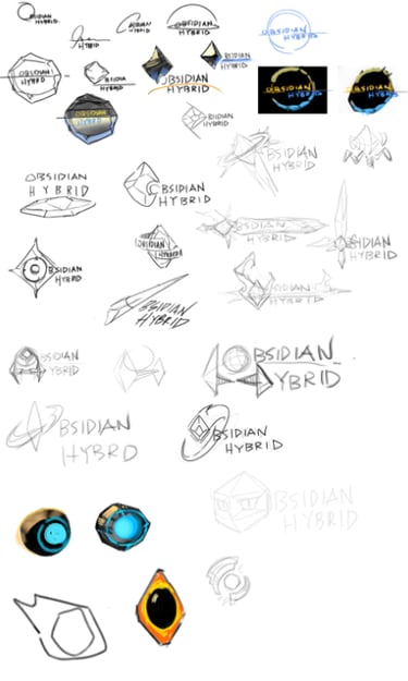
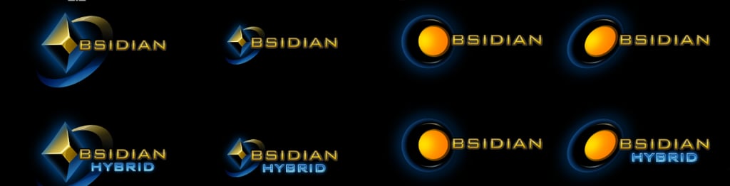
OBSIDIAN Identity Design
OBSIDIAN represents Light & Wonder’s Electronic Table Games (ETG) platform.
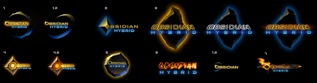
I spearheaded the end-to-end design lifecycle for this flagship logo—hands-on from the initial sketch to final production. To ensure total enterprise alignment, I guided the selection process alongside the PDM and executive leadership to arrive at the final mark.
The Brief: Develop a high-end corporate identity that directly reflects the sleek, dark aesthetic of the physical product line.
The Art Direction: Balance crisp, professional corporate structures with abstract, subtle textures that evoke the sharp geometry of natural obsidian.
The Result: A minimalist, highly versatile, and memorable brand asset tailored for dynamic digital and physical hardware integration.

Refinement Phase: OBSIDIAN Motion Direction
The Challenge: Initial iterations suffered from rendering style inconsistencies and an unbalanced focus on the starting letter 'O,' which created ambiguity around the full logo's legibility.
The Direction: Shifted the creative focus toward unified materialization and typographic clarity.
The Result: A polished, synchronized animation sequence where the 3D textures reveal the entire brand name harmoniously, maintaining absolute readability on screen.

G2E Trailer
Collaborative Trailer Direction: Partnered with the PDM to spearhead the visual narrative for the Obsidian product trailer debuted at G2E. To ensure a cohesive brand experience, I aligned the cinematic VFX—specifically the terminal-wide "digital shockwave"—with the signature materialization style of the logo animation, creating a seamless, unified visual language throughout the piece.
UI Exploraiton
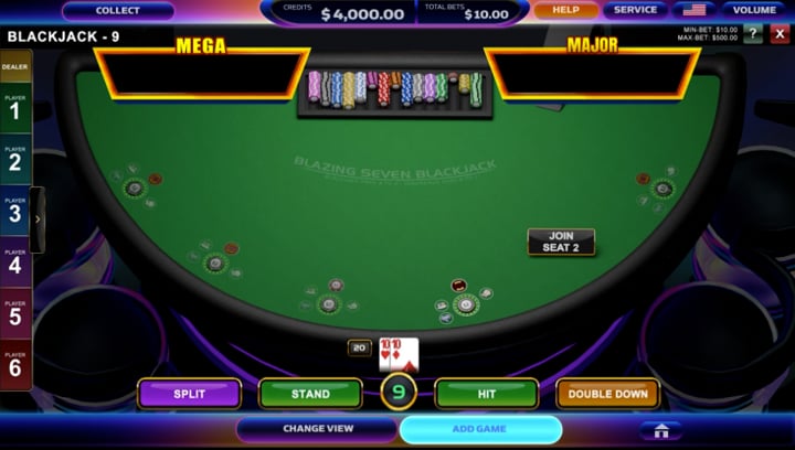
Strategic Brand Integration: Developed a next-generation UI evolution for Obsidian by bridging the gap between corporate identity and functional gaming design. My approach focused on synthesizing Light & Wonder’s core branding—specifically light-based thematic elements—into the UI architecture. The result is a proprietary, iconic interface that maintains high legibility while establishing a distinct visual presence in a crowded industry.
Director
Explore Isaak's impressive art director and art portfolio pieces.
About me
isaaklien@gmail.com
626.592.0697
© 2024. All rights reserved.